Beautiful CSS Stack Bar Graphs

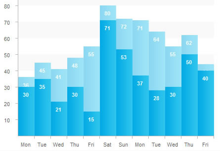
To design the stats feature of Backbone, our Ruby on Rails CMS, we needed to show a stacked bar graph of page views vs unique visitors. I looked around for a sample of how others did stacked bar graphs and came up empty handed. There are plenty of CSS bar graph interpretations, but none of them did stacked bar graphs.
The Markup
The first thing I do anytime I start HTML/CSS work is code the HTML. It’s a personal preference to make sure it’s all going to look good for screen readers and be as semantic as possible, and since it’s my article we’re going to do the HTML first.
<dl id="csschart">
<dt>Mon</dt>
<dd>36</dd>
<dd>30</dd>
</dl>
Like Alen Grakalic’s implementation, I used a definition list. I found it to be the most semantic way of presenting data like this. To explain, each day of the week is in a <dt> tag and the data for that day is in a <dd> tag. There are two <dd> tags for each day, one for our page views and one for our unique visitors.
<dt>Mon</dt>
<dd class="p36"><span><b>36</b></span></dd>
<dd class="sub p30" ><span><b>30</b></span></dd>
</dl>
Each <dd> is given a class that corresponds to the percentage of that bar. p100 is 100% the height of the graph and p0 is 0% the height of the graph. Making 100 classes is a pain and a lot of CSS but it makes it so easy when you’re turning these graphs out dynamically.
The other class to which we’ve added some of the <dd> tags is “sub”. This denotes the stacked bars in the graph that will be put on top of the other <dd>.
Finally, we wrap our data in <b> and <span> tags so we have enough to work with when we’re styling it.
Styling the Graph.
dl#csschart, dl#csschart dt, dl#csschart dd{
margin:0;
padding:0;
}
dl#csschart{
background:url(../images/bg_chart.gif) no-repeat 0 0;
width:454px;
height:360px;
padding-left:11px;
}
dl#csschart dt{
display:none;
}
dl#csschart dd{
position:relative;
float:left;
display:inline;
width:33px;
height:330px;
margin-top:22px;
}
dl#csschart span{
position:absolute;
display:block;
width:33px;
bottom:0;
left:0;
z-index:1;
color:#555;
text-decoration:none;
}
dl#csschart span b{
display:block;
font-weight:bold;
font-style:normal;
float:left;
line-height:200%;
color:#fff;
position:absolute;
top:5px;
left:3px;
text-align:center;
width:23px;
}

/* Styling the Bars. */

dl#csschart span{
height:50%;
background:url(../images/bar.png) repeat-y;
}
dl#csschart .sub{
margin-left:-33px;

}
dl#csschart .sub span{
background:url(../images/subBar.png) repeat-y;
}

dl#csschart .p0 span{height:0%}
dl#csschart .p1 span{height:1%}
dl#csschart .p2 span{height:2%}
dl#csschart .p3 span{height:3%}
dl#csschart .p4 span{height:4%}
dl#csschart .p5 span{height:5%}

/*This continues until 100%*/
The first thing we do is reset all the margins and padding to make it look the same on all browsers. Then we define the width and height of our chart in dl#csschart. We’re using a background image to help with the tick marks on the axes and for some background gridlines. One important thing to note is the padding-left. This moves the first bar over past the tick marks on the left of the background image.
Next, we hide the dt tags. There is really no good way to make them do what we want. Position the dd tags to float left and use margins to push them to the correct place in our background image. Now, just to be clear, the dd tags are not our bars, they are simply containers for our bars. They are all 100% of the height of our graph. We use the span tags inside the dd tags to fill in our bars. Since they’re positioned absolute inside our positioned dd tags we can use bottom:0; to place them on the x-axis and have them grow in height from there. We use the b tag to display the actual data value inside the bar.
At the bottom we define the background image for the bars in dl#csschart span (you can easily just make it a background color instead), then we position our .sub bars overtop by giving them a margin-left of -33px (the exact width of the bars).
Finally, we make our 101 classes for each percentage point from 0% to 100% to give our bars their height.
I’ve made a diagram to explain what each tag is doing.
Add the Axes.
Ok now you’ll notice we don’t have labels on our axes. So we use some simple unordered lists. One before the cssChart
<ul class="yAxis">
<li>100</li>
<li>90</li>
<li>80</li>
<li>70</li>
<li>60</li>
<li>50</li>
<li>40</li>
<li>30</li>
<li>20</li>
<li>10</li>
</ul>
and one after the cssChart:
<ul class="xAxis">
<li>Mon</li>
<li>Tue</li>
<li>Wed</li>
<li>Thu</li>
<li>Fri</li>
<li>Sat</li>
<li>Sun</li>
</ul>
Styling the Axes.
ul.xAxis{
margin:0 0 0 27px;
padding:0;
float:left;
clear:left;
display:inline;
width:454px;
}
ul.yAxis{
margin:14px 0 0 0;
padding:0;
display:inline;
float:left;
}
ul.xAxis li{
float:left;
list-style:none;
width:33px;
text-align:center;
}
ul.yAxis li{
list-style:none;
height:33px;
text-align:right;
float:left;
clear:left;
}
Styling the axes is really just floating the the y-axis left and using some margins to push it in place. Then you can use some margins to push the li tags to line up with the tick marks of your background image.
You might also like
Tags
accordion accordion menu animation navigation animation navigation menu carousel checkbox inputs css3 css3 menu css3 navigation date picker dialog drag drop drop down menu drop down navigation menu elastic navigation form form validation gallery glide navigation horizontal navigation menu hover effect image gallery image hover image lightbox image scroller image slideshow multi-level navigation menus rating select dependent select list slide image slider menu stylish form table tabs text effect text scroller tooltips tree menu vertical navigation menu

 Subscribe
 Follow Us
 14 years ago
 18294
18294 3417
3417


