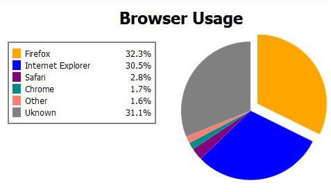
Pure CSS3 Pie Charts effect

Keep in mind that this technique is currently cutting-edge. It only works in the latest versions of Firefox, Chrome,and Safari UPDATE and Opera; and requires browser-specific extensions to CSS to pull off, but it does use elements in the current CSS3 specification, so it stands that eventually the rest of the web will catch up.
First off, you need to draw a circle, which is easy enough, simply create a square <div> and set border-radius to be half it's height/width
.circle {
    position:absolute;
    background-color:red;
    width:200px;
    height:200px;
    -moz-border-radius:100px;
    -webkit-border-radius:100px;
    border-radius:100px;
}
Next, we have to cut that in half. Normally, one would smply draw a half circle like so:
.half-circle {
    position:absolute;
    background-color:red;
    width:100px;
    height:200px;
    -moz-border-radius:100px 0 0 100px;
    -webkit-border-radius:100px 0 0 100px;
    border-radius:100px 0 0 100px;
}
However, this method becomes problematic, since we'll have to rotate it. The half-circle above would rotate at it's centre (left-50,top-100). Combine that with the difference in width and length, it would require a lot of horizontal shifting to ensure the centres line up properly. That's a bunch of math or annoying trial and error. Thankfully, there's an easier way. Draw a full circle and use the old-school clip property to only show half:
.pie {
 position:absolute;
 width:200px;
 height:200px;
 clip:rect(0px,100px,200px,0px);
 -moz-border-radius:100px;
 -webkit-border-radius:100px;
 border-radius:100px;
}
NOTE: you could use the original half-circle method and set the CSS3 transform-origin property to right, center to move the rotation point. But experimentation with this method revealed that using transform-origin in Safari caused that browser to ignore the border-radius setting (in Safari ver. 4.04 on Windows at least). So for now, stick with full circle and clip.
Now we have a half circle that will rotate around the centre of it's flat edge.
Next, we need to hide it in a way that allows us to show only the part we need to see. So we drop it into another square <div> and clip it too, to display the opposite half.
.hold {
 position:absolute;
 width:200px;
 height:200px;
 clip:rect(0px,200px,200px,100px);
}
We're clipping the hold <div>, because we need it to rotate around the same point as the circle.
now we stack all the pie elements on top of each other, and rotate the pie pieces by their appropriate percentage amount — (360*(x*100)) where x is the percentage value — and also rotate each hold div the cumulative amount of each previous pie piece's rotation. So given the following html:
<div id="piece1" class="hold">
    <div class="pie"></div>
</div>
<div id="piece3" class="hold">
    <div class="pie"></div>
</div>
<div id="piece3" class="hold">
    <div class="pie"></div>
</div>
we can add the following CSS to create a pie chart with three equal pieces:
#piece1 {

}
#piece1 .pie {
   color:red;
   -moz-transform:rotate(120deg);
   -webkit-transform:rotate(120deg);
   -o-transform:rotate(120deg);
   transform:rotate(120deg);
}
#piece2 {
  -moz-transform:rotate(120deg);
   -webkit-transform:rotate(120deg);
   -o-transform:rotate(120deg);
   transform:rotate(120deg);
}
#piece2 .pie {
   color:green;
   -moz-transform:rotate(120deg);
   -webkit-transform:rotate(120deg);
   -o-transform:rotate(120deg);
   transform:rotate(120deg);
}
#piece3 {
  -moz-transform:rotate(240deg);
   -webkit-transform:rotate(240deg);
   -o-transform:rotate(240deg);
   transform:rotate(120deg);
}
#piece3 .pie {
   color:blue;
   -moz-transform:rotate(120deg);
   -webkit-transform:rotate(120deg);
   -o-transform:rotate(120deg);
   transform:rotate(120deg);
}
Now, the more astute readers will notice that this works great for pie pieces that are 50% of the pie or less. How can you draw larger pieces? There are two methods. The easiest is to simply draw a full circle and then overlay the other pieces on top. But if you want a discrete piece that you can potentially move out for emphasis, you'll need to do two things: remove the clip on the hold <div>, and add a second pie piece as filler.
.hold.gt50 {
 clip:rect(auto, auto, auto, auto);
}
.pie.fill {
 -moz-transform:rotate(180deg) !important;
 -webkit-transform:rotate(180deg) !important;
 transform:rotate(180deg) !important;
}
That's it.
You might also like
Tags
accordion accordion menu animation navigation animation navigation menu carousel checkbox inputs css3 css3 menu css3 navigation date picker dialog drag drop drop down menu drop down navigation menu elastic navigation form form validation gallery glide navigation horizontal navigation menu hover effect image gallery image hover image lightbox image scroller image slideshow multi-level navigation menus rating select dependent select list slide image slider menu stylish form table tabs text effect text scroller tooltips tree menu vertical navigation menu

 Subscribe
 Follow Us
 14 years ago
 21591
21591 3123
3123


