Very Beautiful CSS3 And JQuery progress bar
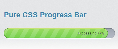
The new features introduced in CSS3 allows developers to create stunning visual effects. Today, let’s create a fancy progress bar using CSS3 and jQuery, but no Flash or even images.
Please note: The original CSS3 progress bar shown in this tutorial has been created by Ivan Vanderbyl, which hereby gave me the right to reproduce and document his work.
The following tutorial and the demo works best on Chrome and Safari, correctly on Firefox and very badly in Internet Explorer (eh…I’m sure you hadn’t guessed that).
Getting ready
Let’s start by organizing our work. To achieve the effect of this tutorial, we’ll need to create 3 files:
progress.html, which will contain our markup.ui.csswhich will contain our CSS styles.progress.jswhich will contain some additional jQuery animations.
Create a directory on your webserver (or hard drive) and create the files.
The HTML markup
Here we go. Open your progress.html file and paste the following markup in it:
<!DOCTYPE html>
<html>
<head>
    <meta charset="utf-8">
    <title>Pure CSS Progress Bar</title>

    <link rel="stylesheet" href="stylesheets/ui.css">
    <link rel="stylesheet" href="stylesheets/ui.progress-bar.css">
</head>
<body>
    <div id="container">
        <div id="progress_bar" class="ui-progress-bar ui-container">
            <div class="ui-progress" style="width: 79%;">
                <span class="ui-label" style="display:none;">Processing <b class="value">79%</b></span>
            </div><!-- .ui-progress -->
        </div><!-- #progress_bar -->

        <div class="content" id="main_content" style="display: none;">
            <p>Hello, World!</p>
        </div><!-- #main_content -->
    </div><!-- #container -->
</body>
</html>
Let me explain the code a bit: On line 1, I’ve declared a HTML5 doctype. Then, lines 12 to 16 contains the markup for the progress bar itself. If you save the file and view it in your browser right now, you’ll see that nothing appears. Don’t worry, we’re going to apply so CSS3 magic in a minute.
Diving into CSS3
Open your ui.css file and paste the following code in it. There’s nothing fancy there, just some basic styles (that I’ve simplified from the original source) for the layout.
body {
  background:#eee;
  padding: 30px;
  font-size: 62.5%;
  font-family: 'Helvetica Neue', Helvetica, Arial, sans-serif;
  position: relative;
  margin: 0;
}

#container {
  margin: 0 auto;
  width: 460px;
  padding: 2em;
  background: #DCDDDF;

}

.ui-progress-bar {
  margin-top: 3em;
  margin-bottom: 3em;
}

.ui-progress span.ui-label {
  font-size: 1.2em;
  position: absolute;
  right: 0;
  line-height: 33px;
  padding-right: 12px;
  color: rgba(0,0,0,0.6);
  text-shadow: rgba(255,255,255, 0.45) 0 1px 0px;
  white-space: nowrap;
}
Once you are done, we can finally get into more serious things. The code below will make your progress bar come to life. I’ll explain it in details in a minute. For now, copy it and paste it in your ui.css file.
@-webkit-keyframes animate-stripes {
  from {
    background-position: 0 0;
  }

  to {
   background-position: 44px 0;
  }
}

.ui-progress-bar {
  position: relative;
  height: 35px;
  padding-right: 2px;
  background-color: #abb2bc;
  border-radius: 35px;
  -moz-border-radius: 35px;
  -webkit-border-radius: 35px;
  background: -webkit-gradient(linear, left bottom, left top, color-stop(0, #b6bcc6), color-stop(1, #9da5b0));
  background: -moz-linear-gradient(#9da5b0 0%, #b6bcc6 100%);
  -webkit-box-shadow: inset 0px 1px 2px 0px rgba(0, 0, 0, 0.5), 0px 1px 0px 0px #FFF;
  -moz-box-shadow: inset 0px 1px 2px 0px rgba(0, 0, 0, 0.5), 0px 1px 0px 0px #FFF;
  box-shadow: inset 0px 1px 2px 0px rgba(0, 0, 0, 0.5), 0px 1px 0px 0px #FFF;
}

.ui-progress {
  position: relative;
  display: block;
  overflow: hidden;
  height: 33px;
  -moz-border-radius: 35px;
  -webkit-border-radius: 35px;
  border-radius: 35px;
  -webkit-background-size: 44px 44px;
  background-color: #74d04c;
  background: -webkit-gradient(linear, 0 0, 44 44,
    color-stop(0.00, rgba(255,255,255,0.17)),
    color-stop(0.25, rgba(255,255,255,0.17)),
    color-stop(0.26, rgba(255,255,255,0)),
    color-stop(0.50, rgba(255,255,255,0)),
    color-stop(0.51, rgba(255,255,255,0.17)),
    color-stop(0.75, rgba(255,255,255,0.17)),
    color-stop(0.76, rgba(255,255,255,0)),
    color-stop(1.00, rgba(255,255,255,0))
  ), -webkit-gradient(linear, left bottom, left top, color-stop(0, #74d04c), color-stop(1, #9bdd62));
  background: -moz-repeating-linear-gradient(top left -30deg,
    rgba(255,255,255,0.17),
    rgba(255,255,255,0.17) 15px,
    rgba(255,255,255,0) 15px,
    rgba(255,255,255,0) 30px
  ), -moz-linear-gradient(#9bdd62 0%, #74d04c 100%);
  -webkit-box-shadow: inset 0px 1px 0px 0px #dbf383, inset 0px -1px 1px #58c43a;
  -moz-box-shadow: inset 0px 1px 0px 0px #dbf383, inset 0px -1px 1px #58c43a;
  box-shadow: inset 0px 1px 0px 0px #dbf383, inset 0px -1px 1px #58c43a;
  border: 1px solid #4c8932;
  -webkit-animation: animate-stripes 2s linear infinite;
}
Save your ui.css file and view progress.html in your web browser, and you’ll see your gorgeous progress bar, done without using any image.
So, what’s inside? Let me explain the code a bit.
First, we have two CSS classes: .ui-progress-bar and .ui-progress. The first is the container, and the second is the green progress bar.
- Lines 1 to 9: These lines define a webkit-specific animation, which allows us to move an element from a pint to another.
For more details about webkit animations - Line 16: The
border-radiusCSS3 property allows you to define a radius and get rounded corners. - Line 17: Mozilla specific property for
border-radius. - Line 18: Webkit specific property for
border-radius. - Line 19: The -webkit-gradient property allows you to add a gradient to an element. It works only on Webkit, other browsers will ignore this property.
- Line 20: Mozilla specific property, similar to
-webkit-gradientwith a different syntax. - Lines 21 to 23:
box-shadow(and its browser specific alternatives) allows you to add a shadow to an element. - Line 34: Webkit specific property, based on the standard
background-sizeproperty, which allows you to specify the size of a background image. - Line 56: Triggers webkit animation defined on line 1.
Final touch: Using jQuery to animate the progress bar
A pure CSS3 progress bar is a very cool thing, but progress bars are here to show progress, so we have to animate it. We’re going to use jQuery to do so.
Open your progress.html file and paste the two line below just above the closing</body> tag.
<script src="http://ajax.googleapis.com/ajax/libs/jquery/1.4.2/jquery.min.js" type="text/javascript" charset="utf-8"></script>
<script src="progress.js" type="text/javascript" charset="utf-8"></script>
This code will load jQuery from Google (Which I recommend to do instead of loading your own copy) as well as your progress.js file, which will contain the required code to animate the progress bar.
Now, paste the code below in your progress.js file:
(function( $ ){
  $.fn.animateProgress = function(progress, callback) {
    return this.each(function() {
      $(this).animate({
        width: progress+'%'
      }, {
        duration: 2000,

        easing: 'swing',

        step: function( progress ){
          var labelEl = $('.ui-label', this),
              valueEl = $('.value', labelEl);

          if (Math.ceil(progress) < 20 && $('.ui-label', this).is(":visible")) {
            labelEl.hide();
          }else{
            if (labelEl.is(":hidden")) {
              labelEl.fadeIn();
            };
          }

          if (Math.ceil(progress) == 100) {
            labelEl.text('Done');
            setTimeout(function() {
              labelEl.fadeOut();
            }, 1000);
          }else{
            valueEl.text(Math.ceil(progress) + '%');
          }
        },
        complete: function(scope, i, elem) {
          if (callback) {
            callback.call(this, i, elem );
          };
        }
      });
    });
  };
})( jQuery );

$(function() {
  $('#progress_bar .ui-progress .ui-label').hide();
  $('#progress_bar .ui-progress').css('width', '7%');

  $('#progress_bar .ui-progress').animateProgress(43, function() {
    $(this).animateProgress(79, function() {
      setTimeout(function() {
        $('#progress_bar .ui-progress').animateProgress(100, function() {
          $('#main_content').slideDown();
        });
      }, 2000);
    });
  });

});
Save the file, and view progress.html in your web brower: Wow, the progress bar is now animated. How cool is that?
This Javascript code makes the progress bar go from 0 to 100, and then, it displays a message, which is simply “Hello World” in our tutorial.
I hope you enjoyed reading this tutorial as much as I enjoyed writing it. Have fun with CSS3!
You might also like
Tags
accordion accordion menu animation navigation animation navigation menu carousel checkbox inputs css3 css3 menu css3 navigation date picker dialog drag drop drop down menu drop down navigation menu elastic navigation form form validation gallery glide navigation horizontal navigation menu hover effect image gallery image hover image lightbox image scroller image slideshow multi-level navigation menus rating select dependent select list slide image slider menu stylish form table tabs text effect text scroller tooltips tree menu vertical navigation menu

 Subscribe
 Follow Us
 14 years ago
 74434
74434 15137
15137
