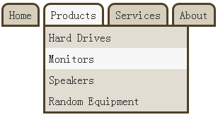
Simple jQuery Drop-Down Menu

The biggest problem with javascript is that we can’t completely rely on it. It can easily be disabled, and once this happens, websites should still function correctly. Javascript powered sub-navigation menus are a big problem, because if javascript is disabled, your website’s navigation suddenly goes out the door. But fear not, there is a solution!
CSS ‘popups’ do exist, but are almost never used (Well, I barely ever see them). Their only problem, is the IE6 and IE7 compatibility. The selectors used to achieve this ‘popup’ effect are not supported in IE6, however it does work in IE7 . People tend to stay away from this because IE6 doesn’t support it, but I think this is a terrible reason not to use it.
If we are going to use jQuery/javascript to handle the navigation menu’s ‘popup’ effect, there will be no fallback alternative for any browser. People will just have to live with an incomplete navigation menu. So why not use CSS to achieve this when javascript is turned off? There might be no backup plan for IE6, but it does work with javascript enabled.
Let’s get started!
The HTML
<ul id="nav">
    <li><a href="#">Home</a></li>
    <li>
        <a href="#">Products</a>
        <ul class="child">
            <li><a href="#">Hard Drives</a></li>
            <li><a href="#">Monitors</a></li>
            <li><a href="#">Speakers</a>
                <ul>
                    <li><a href="#">10 watt</a></li>
                    <li><a href="#">20 watt</a></li>
                    <li><a href="#">30 watt</a></li>
                </ul>
            </li>
            <li><a href="#">Random Equipment</a></li>
        </ul>
    </li>
    <li>
        <a href="#">Services</a>
        <ul class="child">
            <li><a href="#">Repairs</a></li>
            <li><a href="#">Installations</a></li>
            <li><a href="#">Setups</a></li>
        </ul>
    </li>
    <li><a href="#">About</a></li>
    <li><a href="#">Contact</a></li>
</ul>
This is a very simple nested Unordered List. The second level Unordered List will be hidden until the parent List Item is hovered on and the third level will be revealed once the second level <li> is hovered on.
The classes of “child” and “grandchild” are added to the sub-menus so that the CSS and javascript don’t handle this at the same time. The CSS hover function specifically targets these classes, however, if the javascript is enabled, it will remove these classes in order to reduce conflict.
The CSS
/* Targeting both first and second level menus */
#nav li {
	float: left;
	position: relative;
}
#nav li a {
	background: #d6cfbd;
	border: 3px solid #4f4026;
	color: #333;
	display: block;
	margin: 0 5px 0 0;
	padding: 5px 8px;
}
#nav li a:hover {
	background: #f7f7f7;
	text-decoration: none;
}

/* Targeting the first level menu */
#nav {
	display: block;
	height: 35px;
	padding: 10px 0;
	width: 500px;
	z-index: 100;
	position: absolute;
}
#nav > li > a {
	border-top-left-radius: 10px;
	border-top-right-radius: 10px;
	-moz-border-radius-topleft: 10px;
	-moz-border-radius-topright: 10px;
	-webkit-border-top-left-radius: 10px;
	-webkit-border-top-right-radius: 10px;
}

/* Targeting the second level menu */
#nav li ul {
	background: #e1ddd3;
	border: 3px solid #4f4026;
	color: #333;
	display: none;
	margin: -3px 0 0 0;
	width: 200px;
	position: absolute;
}
#nav li ul li {
	width: 100%
}
#nav li ul li a {
	background: none;
	border: none;
	line-height: 30px;
	margin: 0;
	padding: 0 0 0 5px;
}
#nav li ul li a:hover {
	background: #f7f7f7;
}

/* Third level menu */
#nav li ul li ul{
	right: -200px; top: 0;
}

/* A class of current will be added via jQuery */
#nav li.current > a {
	background: #f7f7f7;
}
/* CSS fallback */
#nav li:hover > ul.child {
	display: block;
}
#nav li:hover > ul.grandchild  {
	display: block;
}
As you can see, there is only one line of CSS needed for the CSS fallback. The style is simply saying: When you hover on an <li> element, make it’s children (specifically the ul.child) display as a block.
The CSS3 properties are only applied to the <a> links that are children of the <li> which are children of #nav. This is done so that rounded corners are not given to the sub-menu’s <a> links.
Almost there, so far this is a fully functional menu with a sub-menu in IE7+ and all modern browsers.
The jQuery/Javascript
Now it’s time for some minor fade effects and support in IE6.
$(document).ready(function(){

	// Remove the class of child and grandchild
	// This removes the CSS 'falback'
	$("#nav ul.child").removeClass("child");
	$("#nav ul.grandchild").removeClass("grandchild");

	// When a list item that contains an unordered list
	// is hovered on
	$("#nav li").has("ul").hover(function(){

		//Add a class of current and fade in the sub-menu
		$(this).addClass("current").children("ul").fadeIn();
	}, function() {

		// On mouse off remove the class of current
		// Stop any sub-menu animation and set its display to none
		$(this).removeClass("current").children("ul").stop(true, true).css("display", "none");
	});

)};
And that’s it!
The article source:http://css-plus.com/2010/06/how-to-make-a-jquery-drop-down-menu-with-a-css-fall-back/
You might also like
Tags
accordion accordion menu animation navigation animation navigation menu carousel checkbox inputs css3 css3 menu css3 navigation date picker dialog drag drop drop down menu drop down navigation menu elastic navigation form form validation gallery glide navigation horizontal navigation menu hover effect image gallery image hover image lightbox image scroller image slideshow multi-level navigation menus rating select dependent select list slide image slider menu stylish form table tabs text effect text scroller tooltips tree menu vertical navigation menu

 Subscribe
 Follow Us
 13 years ago
 9671
9671 2931
2931


