Nice Date Picker with jQuery UI Framework

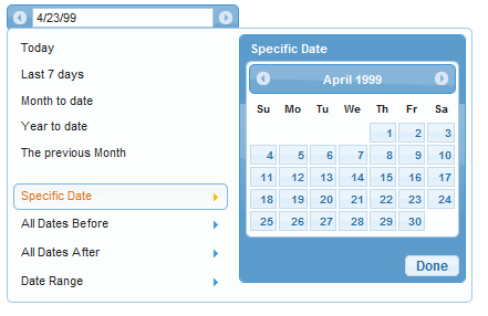
This plugin wraps the jQuery UI datepicker into an interactive component specifically designed for choosing date ranges.
Features and Updates
- Uses jQuery UI 1.7.1: The range picker now uses the latest version of jQuery UI's datepicker, and allows passing of native datepicker options.
- Date.js Integration: We've integrated the fantastic date.js library to allow for easy preset development.
- Optional Range Advancing Arrows: Optional forward and back arrows allow a user to jump forward and backward by range duration.
- jQuery UI CSS Framework-Driven: Our range picker uses jQuery UI CSS Framework classes, making it ThemeRoller-Ready.
HTML
<input type="text" />
jQuery:
$('input').daterangepicker();
Developer Options
The following options are available in this plugin:
-
presetRanges: Array of objects to be made into menu range presets. Each object requires 3 properties:
- text: string, text for menu item
- dateStart: date.js string, or function which returns a date object, start of date range
- dateEnd: date.js string, or function which returns a date object, end of date range
- presets: Object, datepicker toggle links. Available options are: 'specificDate', 'allDatesBefore', 'allDatesAfter', 'dateRange'. Each can be passed a string for link and label text. (example: presets: {specificDate: 'Pick a date'} ).
- rangeStartTitle: string, text for label above start calendar in a range.
- rangeEndTitle: string, text for label above end calendar in a range.
- doneButtonText: string, text for the done/close button.
- prevLinkText: string, text for the previous arrow (used in title attr of links as well).
- nextLinkText: string, text for the next arrow (used in title attr of links as well).
- earliestDate: Date.js string, earliest date allowed in system
- latestDate: Date.js string, latest date allowed in system
- rangeSplitter: String, character between two dates in a range.
- dateFormat String, date formatting, see available values
- closeOnSelect: Boolean, true will close the rangepicker when a full range is selected.
- arrows: Boolean, true will add date range advancing arrows to input.
- posX: int or string, left absolute position of rangepicker. Defaults to bottom left of input.
- posY: int or string, top absolute position of rangepicker. Defaults to bottom left of input.
- appendTo: jQuery selector or element, element to append range picker to.
- onOpen: function, callback that executes the moment the range picker starts to open.
- onClose: function, callback that executes when the datepicker closes.
- onChange: function, callback that executes whenever the date input changes (can happen twice on range selections).
- datepickerOptions: Object, accepts all jQuery UI Datepicker options. See UI datepicker options.
The article source:http://www.filamentgroup.com/lab/date_range_picker_using_jquery_ui_16_and_jquery_ui_css_framework/
You might also like
Tags
accordion accordion menu animation navigation animation navigation menu carousel checkbox inputs css3 css3 menu css3 navigation date picker dialog drag drop drop down menu drop down navigation menu elastic navigation form form validation gallery glide navigation horizontal navigation menu hover effect image gallery image hover image lightbox image scroller image slideshow multi-level navigation menus rating select dependent select list slide image slider menu stylish form table tabs text effect text scroller tooltips tree menu vertical navigation menu

 Subscribe
 Follow Us
 13 years ago
 31225
31225 5124
5124


