MooTools Color Picker

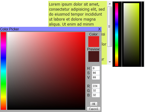
The JavaScript Color Picker is a feature-rich color picker that supports many options. The Color Picker displays a Hue selection bar Saturation/Value selection box, Text fields for entering HSV and RGB fields. The dialog for the color picker is drag-able and there are many actions that you can attach function calls to in order to allow your application to respond to events in the Color Picker. The size of the Hue Bar and the SV Box can be set to any size using options. The elements of the Color Picker can be styled to match the design of your site. The Color Picker uses many features from MooTools so you will need to download mootools from them.
Requirements
Mootools with the Element, Color, Drag.base and Drag.move components.
this has been tested in IE 7.0 and FireFox 2.0.x on Windows.
Supported Browsers
FireFox 2.0, IE 7.0, and Opera 9.10
Features
- HueBar: Allows the selecting of Hue with the mouse.
- SVBox: Allows the selecting of Saturation and Value (Brightness) with the mouse.
- Selected Color Box: Displays the currently Selected Color.
- Color Preview Box: Displays the color the mouse is over.
- HSV text entry: Allows the user to enter HSV values.
- RGB text entry: Allows the user to enter RGB values.
- Title Bar: Allows the dialog to be dragged and closed.
Options
Options are passed in at the creation of the color picker as and object e.g. {InitialColor: “#88aabb”, initialState: “Closed”}; the available options are:
- attachTo: Specify the element in the document to append the color dialog to.
- initialColor: Sets the initial color of the color picker.
- initialState: Specifies whether the Color Picker’s is open or closed initially.
- left: Specifies the initial left of the Color Picker’s dialog box.
- top: Specifies the initial top of the Color Picker’s dialog box.
- showHueBar: Specifies whether or not to add the HueBar.
- hueBarWidth: Specifies the width of the Hue Bar.
- hueBarHeight: Specifies the height of the Hue Bar.
- showSVBox: Specifies whether or not to add the SVBox.
- svBoxWidth: Specifies the width of the SV Box.
- svBoxHeight: Specifies the height of the SV Box.
- showColorInfo: Specifies wether or not to show any of the controls in the Color Info Column (Swatches, Text Fiels and buttons).
- showSelectedSwatch: Specifies whether or not to add the Selected Color Swatch.
- showPreviewSwatch: Specifies whether or not to add the Preview Color Swatch.
- showHSVFields: Specifies whether or not to add the HSV fields.
- showRGBFields: Specifies whether or not to add the RGB fields.
- showOKButton: Specifies whether or not to add the Ok button.
- showCancelButton: Specifies whether or not to add the Cancel button.
- showTitleBar: Specifies whether or not to add the Title bar.
- isDraggable: Specifies whether or not the dialog is drag-able.
- OKCallback: Specifies a function pointer to call when the Ok button is clicked.
- CancelCallback: Specifies a function pointer to call when the Cancel button is clicked.
- HBClickCallback: Specifies a function pointer to call when the Hue Bar is clicked.
- SVClickCallback: Specifies a function pointer to call when the SV Box is clicked.
- SVPreviewCallback: Specifies a function pointer to call when the mouse is moved around the SV Box.
Styling
Many of the elements in the Color Picker have a CSS class associated with them allowing you to style the color picker. Some of the styles of the elements in the Color Picker have default values and you will need to use the !important key word in your style sheet. Following are the CSS classes that are available:
- .cpDialog: Styles for the parent level container for the Color Picker Dialog.
- .cpTitleBar: Styles for the Title bar.
- .cpHueBar: Styles for the Hue Bar, Some styles, such as width and height, may have unpredictable results.
- .cpSVBox: Styles for the SV Box, Some styles, such as width and height, may have unpredictable results.
- .cpColorInfoContainer: This is a div element that is the parent to the Color swatches, HSV and RGB input fields and the OK and Cancel buttons.
- .cpSelectedColor: Styles the Selected Color Swatch.
- .cpPreviewColor: Styles the Preview Color Swatch.
- .cphInput: Styles the Hue Text entry box.
- .cpsInput: Styles the Saturation Text entry box.
- .cpvInput: Styles the Value Text entry box.
- .cprInput: Styles the Red Text entry box.
- .cpgInput: Styles the Green Text entry box.
- .cpbInput: Styles the Blue Text entry box.
- .cpokInput: Styles the Ok button:
- .cpcancelInput: Styles the Cancel button:
History
v1.0.2 Changes
- Added the showColorInfo Option
- Fixed a couple of table layout issues that could cause problems with some styling configurations.
v1.0.1 Changes
- Enhanced support for Opera browsers
You might also like
Tags
accordion accordion menu animation navigation animation navigation menu carousel checkbox inputs css3 css3 menu css3 navigation date picker dialog drag drop drop down menu drop down navigation menu elastic navigation form form validation gallery glide navigation horizontal navigation menu hover effect image gallery image hover image lightbox image scroller image slideshow multi-level navigation menus rating select dependent select list slide image slider menu stylish form table tabs text effect text scroller tooltips tree menu vertical navigation menu

 Subscribe
 Follow Us
 14 years ago
 9671
9671 2414
2414


