Recreating the MLB.com Content Switcher with jQuery and CSS3

This project was to try to recreate the switcher without any extraneous images or other non-essential elements that tend to make stuff less maintainable.
This version uses CSS3′s border-radius, RGBA colors, opacity, and a small use of a gradient, and still looks acceptable in non-supportive browsers (). Be sure to look at the real version on MLB.com for comparison; there are quite a few small differences, but generally speaking, aside from one major thing missing (see below), mine is basically the same.
this is not a step-by-step tutorial, for those interested in the JavaScript/jQuery used, I’ve provided extensive commenting in the JavaScript file, so you can see exactly what each line does. The data is contained in a JavaScript object in order to keep the code clean, and to separate it from the main code. Normally, the data would be pulled from a database, and/or accessed via Ajax
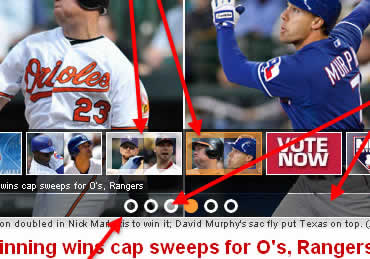
In order to illustrate which parts are done with CSS3, here is an infographic that points those elements out:
You might also like
Tags
accordion accordion menu animation navigation animation navigation menu carousel checkbox inputs css3 css3 menu css3 navigation date picker dialog drag drop drop down menu drop down navigation menu elastic navigation form form validation gallery glide navigation horizontal navigation menu hover effect image gallery image hover image lightbox image scroller image slideshow multi-level navigation menus rating select dependent select list slide image slider menu stylish form table tabs text effect text scroller tooltips tree menu vertical navigation menu

 Subscribe
 Follow Us
 14 years ago
 11566
11566 2310
2310


