Clingify - a jQuery plugin that allows you to easily create sticky headers and navigation

Clingify is a jQuery plugin that allows you to easily create “sticky” headers and navigation elements. Once you scroll past the targeted element, the plugin will toggle a CSS class that gives the element a fixed position, pinning it to the top of the page.
Features
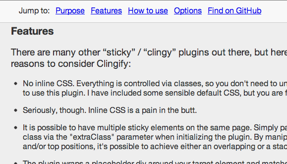
There are many other “sticky” / “clingy” plugins out there, but here are a few reasons to consider Clingify:
- No inline CSS. Everything is controlled via classes, so you don't need to understand Javascript to use this plugin. I have included some sensible default CSS, but you are free to edit it.
- Seriously, though. Inline CSS is a pain in the butt.
- It is possible to have multiple sticky elements on the same page. Simply pass an additional class via the "extraClass" parameter when initializing the plugin. By manipulating z-index and/or top positions, it's possible to achieve either an overlapping or a stacking effect.
- The plugin wraps a placeholder div around your target element and matches its height. This keeps your content from shifting when the element becomes fixed position and is removed from the page flow.
- It also creates a wrapper around your element to give you another hook for CSS position.
- Optional breakpoint parameter makes it easy to suppress Clingify behavior below a certain screen width for smart phones and tablets.
- Optional callback functions for when the element is attached or detached.
- Optional callback function for when the page is resized. This is helpful for fluid widths and responsive design.
- The window scroll and resize events are throttled to improve performance. The amount of throttle is a configurable option.
How to use
Just initialize the script somewhere after you’ve included jQuery (1.7+) and the plugin.
Simple:
<script type="text/javascript" src="/js/jquery.js"></script>
<script type="text/javascript" src="/js/jquery.clingify.js"></script>
<script type="text/javascript">
$(function() {
    $('.some-selector').clingify();
});
</script>
Here are the default settings:
$('.some-selector').clingify({
    breakpoint: 0,  // in pixels
    extraClass: '',
    throttle: 100,  // in milliseconds

    // Callback functions:
    detached: $.noop,
    locked: $.noop,
    resized: $.noop
});
Example with callback functions:
$(function() {
    var $clingifyTarget = $('.some-selector'),
        $parent = $('.some-fluid-width-parent-container'),
        matchWidths = function($elem) {
            $elem.width($parent.width());
        };

    $clingifyTarget.clingify({
        locked : function() {
            matchWidths($clingifyTarget);
        },
        resized : function() {
            matchWidths($clingifyTarget);
        }
    });
});
A version of the above example is being used on this page to keep the width of the clingy nav aligned with the main content. (Try resizing the browser window.)
Options
| Propery | Value Types | Default | Notes |
|---|---|---|---|
| breakpoint | integer | 0 | At screen sizes narrower than this number (of pixels), suppress Clingify behaviors. |
| extraClass | string | '' |
Add another class to the wrapper and placeholder divs. This allows for different CSS rules for different Clingify elements. |
| throttle | integer | 100 | How often, in milliseconds, to check for scroll and resize events |
| detached | function | $.noop | Callback fires just before an element is un-Clingified. |
| locked | function | $.noop | Callback fires just before an element is Clingified. |
| resized | function | $.noop | Callback fires just after window is resized. |
You might also like
Tags
accordion accordion menu animation navigation animation navigation menu carousel checkbox inputs css3 css3 menu css3 navigation date picker dialog drag drop drop down menu drop down navigation menu elastic navigation form form validation gallery glide navigation horizontal navigation menu hover effect image gallery image hover image lightbox image scroller image slideshow multi-level navigation menus rating select dependent select list slide image slider menu stylish form table tabs text effect text scroller tooltips tree menu vertical navigation menu

 Subscribe
 Follow Us
 11 years ago
 8782
8782 2033
2033


