Pure CSS3 drop-shadows without images

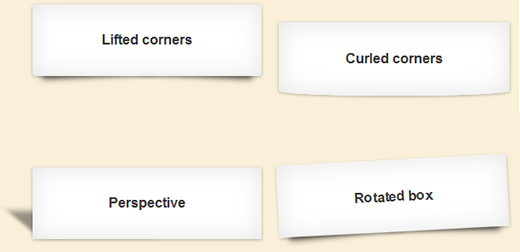
Drop-shadows are easy enough to create using pseudo-elements. It’s a nice and robust way to progressively enhance a design. this example documenting and explaining the parts that make up this technique.
browser support: Firefox 3.5+, Chrome 5+, Safari 5+, Opera 10.6+
The basic technique
There is no need for extra markup, the effect can be applied to a single element. A couple of pseudo-elements are generated from an element and then pushed behind it.
.drop-shadow {
   position:relative;
   width:90%;
}

.drop-shadow:before,
.drop-shadow:after {
   content:"";
   position:absolute;
   z-index:-1;
}
The pseudo-elements need to be positioned and given explicit or implicit dimensions.
.drop-shadow:before,
.drop-shadow:after {
   content:"";
   position:absolute;
   z-index:-1;
   bottom:15px;
   left:10px;
   width:50%;
   height:20%;
}
The next step is to add a CSS3 box-shadow and apply CSS3 transforms. Different types of drop-shadow can be produced by varying these values and the types of transforms applied.
.drop-shadow:before,
.drop-shadow:after {
   content:"";
   position:absolute;
   z-index:-1;
   bottom:15px;
   left:10px;
   width:50%;
   height:20%;
   -webkit-box-shadow:0 15px 10px rgba(0, 0, 0, 0.7);
   -moz-box-shadow:0 15px 10px rgba(0, 0, 0, 0.7);
   box-shadow:0 15px 10px rgba(0, 0, 0, 0.7);
   -webkit-transform:rotate(-3deg);
   -moz-transform:rotate(-3deg);
   -o-transform:rotate(-3deg);
   transform:rotate(-3deg);
}
One of the pseudo-elements then needs to be positioned on the other side of the element and rotated in the opposite direction. This is easily done by overriding only the properties that need to differ.
.drop-shadow:after{
   right:10px;
   left:auto;
   -webkit-transform:rotate(3deg);
   -moz-transform:rotate(3deg);
   -o-transform:rotate(3deg);
   transform:rotate(3deg);
 }
The final core code is as shown below. There is just one more addition – max-width – to prevent the drop-shadow from extending too far below very wide elements.
.drop-shadow {
   position:relative;
   width:90%;
}

.drop-shadow:before,
.drop-shadow:after {
   content:"";
   position:absolute;
   z-index:-1;
   bottom:15px;
   left:10px;
   width:50%;
   height:20%;
   max-width:300px;
   -webkit-box-shadow:0 15px 10px rgba(0, 0, 0, 0.7);
   -moz-box-shadow:0 15px 10px rgba(0, 0, 0, 0.7);
   box-shadow:0 15px 10px rgba(0, 0, 0, 0.7);
   -webkit-transform:rotate(-3deg);
   -moz-transform:rotate(-3deg);
   -o-transform:rotate(-3deg);
   transform:rotate(-3deg);
}

.drop-shadow:after{
   right:10px;
   left:auto;
   -webkit-transform:rotate(3deg);
   -moz-transform:rotate(3deg);
   -o-transform:rotate(3deg);
   transform:rotate(3deg);
 }
No Firefox 3.0 problems this time
Some pseudo-element hacks require a work-around to avoid looking broken in Firefox 3.0 because that browser does not support the positioning of pseudo-elements. This usually involves implicitly setting their dimensions using offsets.
However, as Divya Manian pointed out to me, in this case we’re only using box-shadow – which Firefox 3.0 doesn’t support – and Firefox 3.0 will ignore the position:absolute declaration for the pseudo-elements. This leaves them with the default display:inline style. As a result, there is no problem explicitly setting the pseudo-element width and height because it won’t be applied to the pseudo-elements in Firefox 3.0.
Further enhancements
From this base there are plenty of ways to tweak the effect by applying skew to the pseudo-elements and modifying the styles of the element itself. A great example of this was shared by Simurai. By adding a border-radius to the element you can give the appearance of page curl.
.drop-shadow {
   -moz-border-radius: 0 0 120px 120px / 0 0 6px 6px;
   border-radius: 0 0 120px 120px / 0 0 6px 6px;
}
That's all.
You might also like
Tags
accordion accordion menu animation navigation animation navigation menu carousel checkbox inputs css3 css3 menu css3 navigation date picker dialog drag drop drop down menu drop down navigation menu elastic navigation form form validation gallery glide navigation horizontal navigation menu hover effect image gallery image hover image lightbox image scroller image slideshow multi-level navigation menus rating select dependent select list slide image slider menu stylish form table tabs text effect text scroller tooltips tree menu vertical navigation menu

 Subscribe
 Follow Us
 14 years ago
 17019
17019 3978
3978


