Pure CSS Animated Progress Bar
 14 years ago
  14426
14426  2289
2289
 n/a
n/a

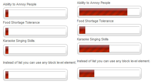
Here's a simple demonstration of how you can create animated progress bar using pure css. The trick is very simple. We need 3 elements, one container and 2 nested elements.
The Concept
We'll put a cool background image in the container and define fixed width and height. First child (SPAN) will act as a progress bar. We'll absolutely position second child (EM) above the progress bar and shift it to the left to a desired value. EM has the same background as the container so it gives an effect of progress bar stopping at certain percentage.

Markup
To keep it as meaningful as possible I used definition list (DL) to list for several values. For single progress bar you can use any element you want. I love paragraphs so I used P in my example.
<dd>
 <span><em style="left:100px">50%</em></span>
</dd>
I decided to use inline styles for left EM placement. It is more convenient to write both values at the same place at once.
Animation
How is it done? Using animated gif of course. Remember those? SPAN has a 200px wide background gif that animates from "zero" to 200px. No matter what percentage we use it goes all the way and stops. Effect of stopping at certain percentage is done with EM as I mentioned earlier.
EM placement
In this example use 20 pixels wide progress bar. EM element is also 200px wide. So each percentage is 2px wide. If we want to accurately shift the EM we need to multiply percentages with 2.
i.e. 50% will mean 100px left offset, 24% will mean 48px offset, 75% - 150px etc. You get the picture. :)
You might also like
Tags
accordion accordion menu animation navigation animation navigation menu carousel checkbox inputs css3 css3 menu css3 navigation date picker dialog drag drop drop down menu drop down navigation menu elastic navigation form form validation gallery glide navigation horizontal navigation menu hover effect image gallery image hover image lightbox image scroller image slideshow multi-level navigation menus rating select dependent select list slide image slider menu stylish form table tabs text effect text scroller tooltips tree menu vertical navigation menu

 Subscribe
 Follow Us
