3D Awesome Buttons with CSS3 & jQuery

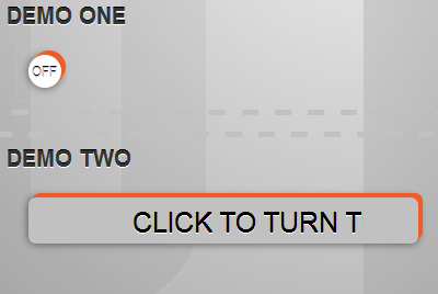
It's not support IE.There is no doubt that websites are edging more and more into the web app, or interactive arena, rather than the static websites that most of us began with. As links and buttons are being used now to trigger more than simple submissions and links to new pages our design needs to reflect these new functions.
First we need to create the button. Then we can worry about creating the interactions.
The Markup (HTML)
A simple anchor tag will do the trick here. We will use the class 'button' to apply general styles that can be used site-wide in case you need more than one button.
Tip: Always develop with the expectation to expand. Separating a few styles now makes adding another button later a cinch. The ID will come in handy for styles specific to this one button. We will also use this ID to reference this anchor tag in our jQuery later.
The text in our button should be set to the initial value. In this case, the button begins in the 'off' state. We will set the href value to a simple # since we are not actually linking to another document.
The Style (CSS)
I'll post the full CSS first and then we will break it down line by line. It looks a bit daunting at first but I promise that it is actually quite simple.
a.button {
    box-shadow:
        1px -1px 0 rgb(241,91,38),
        2px -2px 0 rgb(241,91,38),
        3px -3px 0 rgb(241,91,38),
        4px -4px 0 rgb(241,91,38),
        0 0 10px rgba(0,0,0,0.6);
        -webkit-box-shadow: /* Safari, Chrome */
            1px -1px 0 rgb(241,91,38),
            2px -2px 0 rgb(241,91,38),
            3px -3px 0 rgb(241,91,38),
            4px -4px 0 rgb(241,91,38),
            0 0 10px rgba(0,0,0,0.6);
        -moz-box-shadow: /* Firefox */
            1px -1px 0 rgb(241,91,38),
            2px -2px 0 rgb(241,91,38),
            3px -3px 0 rgb(241,91,38),
            4px -4px 0 rgb(241,91,38),
            0 0 10px rgba(0,0,0,0.6);
        -o-box-shadow: /* Opera */
            1px -1px 0 rgb(241,91,38),
            2px -2px 0 rgb(241,91,38),
            3px -3px 0 rgb(241,91,38),
            4px -4px 0 rgb(241,91,38),
            0 0 10px rgba(0,0,0,0.6);
    color: rgb(193,193,193);
    display: block;
    font-size: 12px;
    margin: 0;
    text-align: center;
    text-transform: uppercase;
}
a#tutorial-toggle {
    background: rgb(255,255,255);
    border-radius: 25px;
        -webkit-border-radius: 25px; /* Safari, Chrome */
        -moz-border-radius: 25px; /* Firefox */
        -o-border-radius: 25px; /* Opera */
    height: 30px;
    line-height: 30px;
    width: 30px;
}
    a.on {
        box-shadow:
            1px -1px 0 rgb(241,91,38),
            2px -2px 0 rgb(241,91,38),
            0 0 6px rgba(0,0,0,0.6);
            -webkit-box-shadow: /* Safari, Chrome */
                1px -1px 0 rgb(241,91,38),
                2px -2px 0 rgb(241,91,38),
                0 0 6px rgba(0,0,0,0.6);
            -moz-box-shadow: /* Firefox */
                1px -1px 0 rgb(241,91,38),
                2px -2px 0 rgb(241,91,38),
                0 0 6px rgba(0,0,0,0.6);
            -o-box-shadow: /* Opera */
                1px -1px 0 rgb(241,91,38),
                2px -2px 0 rgb(241,91,38),
                0 0 6px rgba(0,0,0,0.6);
        color: rgb(0,0,0);
        margin: -2px -2px 2px 2px;
    }
    a.button:active,
    a.on:active {
        box-shadow:
            1px -1px 0 rgb(241,91,38),
            0 0 3px rgba(0,0,0,0.3);
            -webkit-box-shadow: /* Safari, Chrome */
                1px -1px 0 rgb(241,91,38),
                0 0 3px rgba(0,0,0,0.3);
            -moz-box-shadow: /* Firefox */
                1px -1px 0 rgb(241,91,38),
                0 0 3px rgba(0,0,0,0.3);
            -o-box-shadow: /* Opera */
                1px -1px 0 rgb(241,91,38),
                0 0 3px rgba(0,0,0,0.3);
        margin: -3px -3px 3px 3px;
    }
General Button Styles
First we will set the general styles for the class 'button'. These are the styles that will be applied to every button on our site.
a.button {
    box-shadow:
        1px -1px 0 rgb(241,91,38),
        2px -2px 0 rgb(241,91,38),
        3px -3px 0 rgb(241,91,38),
        4px -4px 0 rgb(241,91,38),
        0 0 10px rgba(0,0,0,0.6);
        -webkit-box-shadow: /* Safari, Chrome */
            1px -1px 0 rgb(241,91,38),
            2px -2px 0 rgb(241,91,38),
            3px -3px 0 rgb(241,91,38),
            4px -4px 0 rgb(241,91,38),
            0 0 10px rgba(0,0,0,0.6);
        -moz-box-shadow: /* Firefox */
            1px -1px 0 rgb(241,91,38),
            2px -2px 0 rgb(241,91,38),
            3px -3px 0 rgb(241,91,38),
            4px -4px 0 rgb(241,91,38),
            0 0 10px rgba(0,0,0,0.6);
        -o-box-shadow: /* Opera */
            1px -1px 0 rgb(241,91,38),
            2px -2px 0 rgb(241,91,38),
            3px -3px 0 rgb(241,91,38),
            4px -4px 0 rgb(241,91,38),
            0 0 10px rgba(0,0,0,0.6);
    color: rgb(193,193,193);
    display: block;
    font-size: 12px;
    margin: 0;
    text-align: center;
    text-transform: uppercase;
}
The real magic here is the CSS property 'box-shadow'. Within the box-shadow, we can define multiple shadows. In this example we have 5 shadows set. Each shadow is created by 4 values.
- First is the
Xvalue or horizontal offset1px. Just like in your high school geometry class, a positive value here moves the shadow to the right while a negative value moves the shadow to the left. - Second is the
Yvalue or vertical offset-1px. A positive value here moves the shadow down, while a negative value moves it up. - Third is the blur radius of the shadow. 0 creates a hard edge to your shadow while increasing the value creates a blurred shadow.
- Finally the shadow color is specified. This can be a word
red, hex value#fefefeor a rgb valuergb(241,91,38).
The box-shadow style is part of CSS3 and has slightly limited support across browsers. Until it is completely supported we define the box shadow separately for each of the main browsers. First a general declaration, then for webkit browsers (Safari & Chrome), then Firefox and finally Opera.
Tip: The CSS3 box-shadow property does not work in IE8 or earlier. If IE compatibility is important for you, check out CSS3PIE.
We can set multiple shadows within the box-shadow property. In this example we use four hard shadows, each one pixel farther away than the last to create a faux side to the button. The fifth shadow is positioned directly beneath the element with a blur of 10px to create the drop shadow.
The color value should be set to the initial state. As I mentioned earlier, in this example the initial state of this toggle is 'off' or 'deactivated' so I chose a muted gray as the initial color to represent this. The margin is set to '0' so that we have a clean slate for the next step. The text is centered in the button and I chose to make the button uppercase as a personal preference. It simply seemed to visually line up better.
Specific Button Styles
Next we have the styles assigned only to this one button. These are styles that you will most likely need to change according to what text is inside your button.
a#tutorial-toggle {
    background: rgb(255,255,255);
    border-radius: 25px;
        -webkit-border-radius: 25px; /* Safari, Chrome */
        -moz-border-radius: 25px; /* Firefox */
        -o-border-radius: 25px; /* Opera */
    height: 30px;
    line-height: 30px;
    width: 30px;
}
The border-radius property is another CSS3 style that for the time being needs vendor specific prefixes. In this example we are creating a round button so the border radius is almost equal to the width and height of our button.
Setting the line-height to the same value as the height is simply a quick way to vertically align text within an element.
Styling the ('On') State
Next we need to define the styles for when the button has been toggle on.
a.on {
    box-shadow:
        1px -1px 0 rgb(241,91,38),
        2px -2px 0 rgb(241,91,38),
        0 0 6px rgba(0,0,0,0.6);
        -webkit-box-shadow: /* Safari, Chrome */
            1px -1px 0 rgb(241,91,38),
            2px -2px 0 rgb(241,91,38),
            0 0 6px rgba(0,0,0,0.6);
        -moz-box-shadow: /* Firefox */
            1px -1px 0 rgb(241,91,38),
            2px -2px 0 rgb(241,91,38),
            0 0 6px rgba(0,0,0,0.6);
        -o-box-shadow: /* Opera */
            1px -1px 0 rgb(241,91,38),
            2px -2px 0 rgb(241,91,38),
            0 0 6px rgba(0,0,0,0.6);
    color: rgb(0,0,0);
    margin: -2px -2px 2px 2px;
}
Here we have decreased the hard box shadow from 4px to 2px thick. We also decrease the blur on the third value (remember, the third value creates the drop shadow) to reflect the shorter button. The color is also changed to black to show that it has been activated.
And finally the margins must be changed. When only the box shadow is changed the button itself is stationary when clicked. This doesn't reflect how a real button works at all! So we need to move the button up and to the right to simulate the it being depressed.
While the top and right margins are all that is needed to create this effect, these alone can cause some tricky behavior. Basically, you have moved the element so any other elements that may have been floated against it also move. So we add positive margins in the opposite directions of the movement to fill the space left by moving the element.
Styling the 'Active' State
We will wrap up the styles by defining how the button should look when it is depressed.
a.button:active,
a.on:active {
    box-shadow:
        1px -1px 0 rgb(241,91,38),
        0 0 3px rgba(0,0,0,0.3);
        -webkit-box-shadow: /* Safari, Chrome */
            1px -1px 0 rgb(241,91,38),
            0 0 3px rgba(0,0,0,0.3);
        -moz-box-shadow: /* Firefox */
            1px -1px 0 rgb(241,91,38),
            0 0 3px rgba(0,0,0,0.3);
        -o-box-shadow: /* Opera */
            1px -1px 0 rgb(241,91,38),
            0 0 3px rgba(0,0,0,0.3);
    margin: -3px -3px 3px 3px;
}
We are styling the depressed state of the link from the off position and also from the on position. Once again we decrease the box-shadow and then reflect the move in the margins.
The Interaction (jQuery)
Now comes the fun part. We need to write some simple jQuery to tie in these styles and fire the actions that the button is meant to do. In this example it is toggling the tutorial mode on and off which simply shows or hides links. This action can of course be changed per your needs.
Include the jQuery Library
First things first. Before we can write any jQuery, we need to include the jQuery library into our page.
This can be done one of two ways. One way is to head over the the jQuery download page and grab your own copy of jQuery.
<script src="jquery-1-1.4.2.min.js"></script>
Then include it into your page just before your closing tag.
Note: The script tag above is valid in HTML5. If you are validating in HTML4 you will need to include it like this:
<script src="jquery-1-1.4.2.min.js" type="text/javascript"></script>
The second way to include jQuery (and my preferred choice) is to include it straight from Google's repository like this:
<script src="http://ajax.googleapis.com/ajax/libs/jquery/1.4.2/jquery.min.js"></script>
Any jQuery scripts that you write (like the one we are about to write) must be included after the jQuery library.
The Tutorial Toggle Script
Finally, we add in return false; to stop the link's default behavior. This will allow the function to fire but will keep the ugly hash mark from appearing in the address bar.
$(document).ready(function(){
    // Find the link with an ID of 'tutorial-toggle' and listen for when it is clicked
    $("a#tutorial-toggle").click(function () {
        // When it get's clicked, toggle the class 'on'
        $(this).toggleClass("on");

        // If the class 'on' was added...
        if($('a#tutorial-toggle').hasClass('on'))
        {
            // Change the text to to 'on'
            $(this).text('on');
            // Then fade in all the dots
            $('a.dot').fadeIn();
        }
        // Otherwise, the class 'on' must have been removed, so...
        else
        {
            // Change the text to to 'off'
            $(this).text('off');
            // Fade the dots out
            $('a.dot').fadeOut();
        }
            return false;
    });
});
We begin with the document ready function. (line 1)
$(document).ready(function(){
});
This makes sure that the entire page has loaded before this script is run.
Next we find our toggle and add the .click function to it. (line 2)
$(document).ready(function(){
    $("a#tutorial-toggle").click(function () {

    });
});
The first thing we need to do when our button is clicked is to reflect the click by adding the class 'on' to our button. (line 3)
$(document).ready(function(){
    $("a#tutorial-toggle").click(function () {
        $(this).toggleClass("on");
    });
});
Next we will check for the class 'on' and if we find it we will trigger our next function; fade in any link with the class of 'dot'.
$(document).ready(function(){
    $("a#tutorial-toggle").click(function () {
        $(this).toggleClass("on");

        if($('a#tutorial-toggle').hasClass('on'))
        {
            $(this).text('on');
            $('a.dot').fadeIn();
        }
    });
});
But first we need to change the text in our button to it's 'on' state. $(this) references the button that was just clicked and .text replaces the text inside the button.
Next we tag on to the end of that 'if' statement with an 'else' statement.
$(document).ready(function(){
    $("a#tutorial-toggle").click(function () {
        $(this).toggleClass("on");

        if($('a#tutorial-toggle').hasClass('on'))
        {
            $(this).text('on');
            $('a.dot').fadeIn();
        }
        else
        {
            $(this).text('off');
            $('a.dot').fadeOut();
        }
    });
});
If our link has the class 'on' we change the text to 'on' and fade in the links, but if our link does not have the class 'on' then we must be wanting to change the text to 'off' and fade the links out.
$(document).ready(function(){
    $("a#tutorial-toggle").click(function () {
        $(this).toggleClass("on");

        if($('a#tutorial-toggle').hasClass('on'))
        {
            $(this).text('on');
            $('a.dot').fadeIn();
        }
        else
        {
            $(this).text('off');
            $('a.dot').fadeOut();
        }
            return false;
    });
});
Finally, we add in return false; to stop the link's default behavior. This will allow the function to fire but will keep the ugly hash mark from appearing in the address bar.
You might also like
Tags
accordion accordion menu animation navigation animation navigation menu carousel checkbox inputs css3 css3 menu css3 navigation date picker dialog drag drop drop down menu drop down navigation menu elastic navigation form form validation gallery glide navigation horizontal navigation menu hover effect image gallery image hover image lightbox image scroller image slideshow multi-level navigation menus rating select dependent select list slide image slider menu stylish form table tabs text effect text scroller tooltips tree menu vertical navigation menu

 Subscribe
 Follow Us
 14 years ago
 14384
14384 2151
2151


