ScrollectBox jQuery plugin

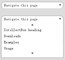
When used on a select-element, the ScrollectBox will act as a stylable clone, thus preserving the functionality of e.g. a form. Further down this page, in the Examples section, is a tryout form as well as a visualization of the connection between the select-element and the ScrollectBox.
When used for drop-down-menues, all that is needed is a bunch of links inside an element with a title attribute.
ScrollectBox in comparison to other similar plugins
ScrollectBox has a number of unique (as far as I know) features:
· Applicable to both drop-downs and <select>s.
· No ugly scrollbar.
· Four creative ways to scroll.
A basic scrollable drop-down menu (scroll by clicking)
This is probably how most people would expect a scrollable drop-down menu to work. (Note that I have set float to left for ul.demo-dropdown-1 to let it attain its width. To achieve this affect without floating you can use the listWidth property, see Usage.)
$("ul-dropdown-1").scrollectBox();
Customized drop-down menu (show/hide on click/blur, scroll when scroll buttons are being hovered), including custom event handler
// Custom selection event handler
var selectEvent = function($el){
   alert("You chose " + $el.html());
   return false; // Do not follow the link
};

$(".demo-dropdown-2").scrollectBox({
   preset: "dropdown",
   numVisibleOptions: 4,
   scrollOn: "hover",
   scrollInterval: 100,
   onSelectEvent: selectEvent,
   hideOnSelect: false,
   listWidth: 200
});
A scrollable, stylable <select> element (scroll using mouse wheel)
Here is an example of how ScrollectBox creates a scrollable, stylable port to a <select> tag. When the debug property is set to true, you can watch how the chosen option in the ScrollectBox will be sent to the corresponding <select> element.
Cheers to Brandon Aaron for his jQuery Mousewheel Plugin! Mighty useful.
$(".demo-select-1").scrollectBox({
   preset: "select",
   numVisibleOptions: 8,
   scrollOn: "scroll",
   debug: true
});
A complete form with all <select>s ported to ScrollectBoxes
This is a form containing two <select>s which are scrolled through using the value "hoveroutside" value for the scrollOn option. This imitates the behaviour of a well-populated <select> element displayed on a Mac; when the mouse pointer is inside the horizontal bound, scrolling can be achieved by moving it above/below the up/down scrolling button.
Try selecting some options and submit the form!
$("form#demo-form select").scrollectBox({
   preset: "select",
   numVisibleOptions: 5,
   scrollOn: "hoveroutside",
   scrollInterval: 150,
   listWidth: 250
});
Usage
Setting up the HTML
There are two purposes with the ScrollectBox plugin:
1) Create drop-down menues easily.
2) Create a stylable sibling to a <select> element.
A drop-down menu will need the following markup:
<div id="some_class" title="Navigate this page">
   <a href="#top">Page top</a>
   <a href="#page-heading">ScrollectBox heading</a>
   <a href="#Downloads">Downloads</a>
   <a href="#Examples">Examples</a>
   <a href="#Usage">Usage</a>
   <a href="#Releases">Releases</a>
   <a href="#Feedback">Feedback & Development</a>
   <a href="#comments">Comments</a>
   <a href="#pings">Trackbacks</a>
   <a href="#respond">Leave a reply</a>
</div>
A <select> element really just needs to be just that. For example:
<select name="some_name">
   <option>Choose another option</option>
   <option value="1">Option 1</option>
   <optgroup label="Some group">
      <option value="2">Option 2</option>
      <option value="3">Option 3</option>
   </optgroup>
   ...
   <option value="8">Option 8</option>
   <option value="9">Option 9</option>
</select>
Calling the plugin
With all default options sent along, the call to the plugin will look like this:
// Default options
$.scrollectBox.defaults = {
   preset: null, // 'dropdown', 'select'
   numVisibleOptions: 8,
   showOn: "mouseover", // "click"
   hideOn: "mouseout", // "blur"
   scrollOn: "click", // "hover", "hoveroutside", "scroll"
   scrollInterval: 250,
   followLink: true,
   hideOnSelect: true,
   onSelectEvent: null, // custom onselect event handler
   onSelectFunc: null, // custom extra function on select
   showCurrentOptionsAsHeadline: true,
   listWidth: null,
   debug: false
};
Documentation
preset
A string that allows you to use a preset regarding the showing and hiding of the list. Default is set to null.
"dropdown" (show/hide on hover)
"select" (show on click, hide on blur)
numVisibleOptions
How many options (including <optgroup>s) that should be visible at the same time. Default is set to 8.
showOn
The name of the event that will show the list. If preset is set, this value will be overridden.
"mouseover" (Default)
"click"
hideOn
The name of the event that will hide the list. If preset is set, this value will be overridden.
"mouseout" (Default)
"blur"
scrollOn
The name of the event that will trigger a scroll in the list.
"click" When a scroll button is clicked. (Default)
"hover" When a scroll button is hovered.
"hoveroutside" When a scroll button, or an area above/below is hovered.
"scroll" When the user scrolls (using the mouse wheel) inside the list.
scrollInterval
The time in milliseconds between each scroll (used when scrollOn is set to "hover" or "hoveroutside"). The default is 250.
followLink
Whether or not to follow the option’s link (used on drop-down menues).
true (Default)
false
hideOnSelect
Whether or not to hide the list once an option has been chosen.
true (Default)
false
onSelectEvent
A custom event handler for handling option selection. The function may take two parameters; the object (the link inside the option) clicked and the click-event, e.g.: var customSelectHandler = function($obj, event){...};. The default is null.
onSelectFunc
A function that will be called from within the default handler (at the beginning). The function may take two parameters; the object (the link inside the option) clicked and the click-event, e.g.: var extraFunc = function($obj, event){...};. The default is null.
showCurrentOptionAsHeadline
Whether or not to display the selected option in the headline. The default is true.
listWidth
A CSS-compatible number or string that gives the ScrollectBox a fixed width. The default is null.
debug
Whether or not to show the corresponding <select> element in debugging purposes. The element will be semi-transparent. The default is false.
You might also like
Tags
accordion accordion menu animation navigation animation navigation menu carousel checkbox inputs css3 css3 menu css3 navigation date picker dialog drag drop drop down menu drop down navigation menu elastic navigation form form validation gallery glide navigation horizontal navigation menu hover effect image gallery image hover image lightbox image scroller image slideshow multi-level navigation menus rating select dependent select list slide image slider menu stylish form table tabs text effect text scroller tooltips tree menu vertical navigation menu

 Subscribe
 Follow Us
 14 years ago
 9641
9641 2223
2223


