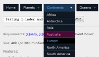
jQuery Dropdown Menu

Dropdown menus and menu bars have been heavily used since the early days of graphical user interfaces. Their use has become ubiquitous, and even expected, in desktop applications, and the web has quickly followed suit. This article is intended to describe an extremely basic, yet extremely powerful, technique for adding dropdown menus in your application user interface or website design.
Getting Started
To begin, we need to define our basic menu hierarchy. In order to maintain a structured and semantic approach to this, we will use nothing more than unordered lists of standard links. We’ll use the following code as an example:
<ul id="cssdropdown">
<li class="headlink">
 <a href="mine.html?search_engines">Search Engines</a>
  <ul>
   <li><a href="http://google.com/">Google</a></li>
   <li><a href="http://yahoo.com/">Yahoo</a></li>
   <li><a href="http://live.com/">Live Search</a></li>
  </ul>
  </li>
   <li class="headlink">
   <a href="mine.html?shopping">Shopping</a>
         <ul>
   <li><a href="http://amazon.com/">Amazon</a></li>
   <li><a href="http://ebay.com/">eBay</a></li>
   <li><a href="http://craigslist.com/">CraigsList</a></li>
  </ul>
 </li>
</ul>
Creating Dropdown Lists
With our semantic HTML and link structure written out, we can proceed to apply some basic hover techniques that are included in CSS. The :hover pseudo-class is invoked when the mouse is placed over the list item.
We can use CSS to hide the child unordered lists by default, and show them with the :hover pseudo-class, like so:
 li.headlink ul { display: none; }
 li.headlink:hover ul { display: block; }
The Issue with Internet Explorer
Unfortunately, while the :hover pseudo-class may be elegant, it does not work in Internet Explorer. At this point, a short bit of JavaScript is required to provide a clean fix. All we need to do is select all unordered lists that are within a list item that has the class .headlink and add onmouseover and onmouseout events to them. This can be done in twelve simple lines of code:
 window.onload = function()
 {
  var lis = document.getElementsByTagName('li');
  for(i = 0; i < lis.length; i++)
  {
   var li = lis[i];
   if (li.className == 'headlink')
   {
    li.onmouseover = function() { this.getElementsByTagName('ul').item(0).style.display = 'block'; }
    li.onmouseout = function() { this.getElementsByTagName('ul').item(0).style.display = 'none'; }
   }
  }
 }
Those using jQuery are privileged to an even easier solution:
$(document).ready(function(){
  $('li.headlink').hover(
   function() { $('ul', this).css('display', 'block'); },
   function() { $('ul', this).css('display', 'none'); });
 });
Putting It All Together
The dropdown menu is now functional in the major browsers, and is ready to be styled, cleaned up, and shipped.
It is advantageous to start by applying a basic style that's a little more appealing than the standard lists. This allows us to visualize how this will fit into our application or design.
Adding Some Flare
With a few extra lines of CSS, the menu is styled and ready to fit into our site.
Wrapping Up
One important aspect of writing a generic dropdown list is to segregate the CSS and JavaScript to ensure that there are no conflicts. The easiest way to do this is to add the #cssdropdown selector in front of every element.
Finally, we check to see if the #cssdropdown div can be moved around freely. This ensures that dropdown menu we have created will flow nicely when integrated with our existing site design or application user interface.
You might also like
Tags
accordion accordion menu animation navigation animation navigation menu carousel checkbox inputs css3 css3 menu css3 navigation date picker dialog drag drop drop down menu drop down navigation menu elastic navigation form form validation gallery glide navigation horizontal navigation menu hover effect image gallery image hover image lightbox image scroller image slideshow multi-level navigation menus rating select dependent select list slide image slider menu stylish form table tabs text effect text scroller tooltips tree menu vertical navigation menu

 Subscribe
 Follow Us
 14 years ago
 11426
11426 2123
2123


