Middle Box Links jQuery
 14 years ago
  8964
8964  2195
2195
 n/a
n/a
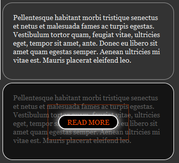
It covers a variety of things I thought were interesting:
- jQuery 1.4′s new element creation syntax which is pretty cool and we haven’t covered
- Writing a little plugin to prevent repeated code (and keep it in the spirit of jQuery)
- Touches on what I am starting to consider object-oriented CSS
The Goal
What we have here is some boxes of content. The goal is that when you mouse over them, they darken and a link appears in the exact center of them. I realize this isn’t going to be an ideal UI choice for many things. Making things unreadable as you mouse over them is an unusual design choice. But it might be perfect in some circumstances. Moral of the story: don’t make snap judgments based on demos.
HTML
Just a div with some text in it…
<div class="widget widget-one rounded">
  <p>Pellentesque habitant morbi tristique senectus et netus et malesuada fames ac turpis egestas. Vestibulum tortor quam, feugiat vitae, ultricies eget, tempor sit amet, ante. Donec eu libero sit amet quam egestas semper. Aenean ultricies mi vitae est. Mauris placerat eleifend leo.</p>
</div>
What you might want to do is include a hyperlink in each widget that will go to the same place the link we are going to add with JavaScript does (degradability). Again, this is just a demo and the circumstances will be different in live scenarios.
CSS
I’m calling our little boxes “widgets”. Notice I gave the div wrapper a class of widget. This is the basic widget:
.widget {
   width: 300px;
   padding: 20px;
   border: 1px solid #999;
   margin: 0 20px 20px 0;
   float: left;
   position: relative;
}
But note that in the live demo and the image above, the widgets have rounded corners. We all know how to make rounded corners in CSS by now. There is the standard border-radius and its sister vendor extensions. Why aren’t we adding them right to the widget CSS itself? This is where the object-oriented CSS comes in…
The way my brain and CSS typically work is that I try and keep the HTML as absolutely clean and semantic as possible. I was always taught than using a CSS class name like “red” is mega bad practice because “red” isn’t semantic, is specifically descriptive. Instead you should use something like “important” or “warning”, because then later if you decide that those things should been green instead of red, your “red” class is embarrassingly irrelevant.
Object oriented CSS throws some of that thinking on it’s head. Object oriented CSS uses class names specifically to describe design characteristics of that “object” (page element). Notice I also gave the widget a class of “rounded”. In our CSS, the rounded class will be this:
.rounded {
   -moz-border-radius: 20px;
   -webkit-border-radius: 20px;
   border-radius: 20px;
}
Blasphemy? I used to think so, but lately I’m really liking this approach. There may be 20 things on the page that are “rounded”. Now all we need to do is apply the rounded class name to each of them and they become rounded. Need to adjust that border radius? Adjust it in a single place and all the rounded objects match. Without doing it this way we’d be updating 60 different places in our CSS.
This may be right for some sites and not for others. That feels like a cop-out thing to say, but it’s true. Perhaps it’s unrealistic for a site with loads of legacy content. It might be brilliant for a brand new site with less content where there just nearly just as much CSS as there is HTML.
The JavaScript is ultimately going to apply a new div to our widgets, which will have the job of darkening the widget. We’ll call this class “overlay”. Here is the CSS for that:
.overlay {
    position: absolute; top: 0; left: 0; right: 0; bottom: 0;
    background: url(../images/black75.png);
    background: rgba(0,0,0,0.6);
    text-align: center;
}
It uses RGBa to do the darkening for modern browsers (more flexibility, may save an HTTP Request), and falls back to an alpha-transparent PNG (for IE 7). Another way to deal with this would be to use a solid black background color and use regular transparency, but since in this demo we’re going to have the “middle box link” inside the overlay, and we don’t want that to be transparent as well, this works fine.
jQuery JavaScript
To repeat our goal quickly: when a widget is rolled over, we want to darken it and add a link in the dead center of it. In our demo we have four widgets. Some of them are of a different height, so we’ll need to accommodate for that. Each widget also has different text displayed as the “middle button link” and also a different URL. That means some of this code will be different, but much will be the same. This calls for some abstraction. In JavaScript we could go right for a custom function, which we could call for each widget. In the spirit of jQuery though, let’s make it a little plugin. This means that we’ll keep intact sweet jQuery-specific features like chainability.
Notice that we’ve added a unique class name to each widget. That is so we can target widgets individually with that hook in the JavaScript. We could have used ID’s as well, which is a bit more efficient, but hey, you might have two widgets on the same page that use the same text and link. Using the same class name will work in that circumstances while ID’s would not. This is the abstraction we desire:
$(function() {

    $(".widget-one").middleBoxButton("Read More", "#read");
    $(".widget-two").middleBoxButton("Go to the Store", "#store");
    $(".widget-three").middleBoxButton("Continue", "#more");
    $(".widget-four").middleBoxButton("Behold!", "#bazinga");

});
Of course “middleBoxButton” isn’t a function. That’s what we’ll be creating as our plugin. Here’s the whole shebang:
var $el, $tempDiv, $tempButton, divHeight = 0;

$.fn.middleBoxButton = function(text, url) {

    return this.hover(function(e) {

        $el = $(this).css("border-color", "white");
        divHeight = $el.height() + parseInt($el.css("padding-top")) + parseInt($el.css("padding-bottom"));

        $tempDiv = $("<div />", {
            "class": "overlay rounded"
        });

        $tempButton = $("<a />", {
            "href": url,
            "text": text,
            "class": "widget-button rounded",
            "css": {
                top: (divHeight / 2) - 7 + "px"
            }
        }).appendTo($tempDiv);

        $tempDiv.appendTo($el);

    }, function(e) {

        $el = $(this).css("border-color", "#999");

        $(".overlay").fadeOut("fast", function() {
            $(this).remove();
        })

    });

}
So when a widget is rolled over, a brand new <div> is created. This div has a class of “overlay” and “rounded”. We already know what “rounded” means (OOCSS). We also already know what the “overlay” is, it ensures the div is exactly the same size is the div by setting absolute positioning and the top, right, bottom, and left values all to zero and deals with darkening. Nothing is done with this div quite yet though.
Then we create an anchor link. We give it the text and href attribute that we passed the plugin explicitly for this purpose. Then we append this link to the overlay div we just created and then append them both together to the widget. This element creation business is made nice and succient by jQuery 1.4′s new element creation syntax. This part:
$("<a />", {
    "href": url,
    "text": text,
    "class": "widget-button rounded",
    "css": {
        "top": (divHeight / 2) - 7 + "px"
    }
});
Notice that I have all the “keys” (the part before the colon) in quotes. Most of the keys will work without quotes, but I was having issues with the key “class” not working in IE. Turns out it’s not a bug, it’s just that “class” is a reserved word in JavaScript, and it’s bad form not to quote it. Also turns out it’s good form to just quote everything when using JSON-like syntax like this uses.
Since one of our goals here is that the link appears in the exact middle, let’s talk about that. Centered it horizontally is easy, the overlay div has text-align: center, so that’s that. Vertical centering is a bit trickier. There are CSS ways of dealing with it, but none that are super clean and easy. We’re using JavaScript anyway, so let’s exploit that. We’ll just measure the height of the widget, cut it in half, and kick the link down that distance. The one kinda kludge-y part is the value “7″. You gotta hate hard-coding a value like that when what I really mean is “half the height of the button”. The problem is I couldn’t calculate the height of the button because it doesn’t exist yet when I’m setting the other attributes. If you have an idea, let me know. Also note, the height of the widget is calculated not just by using the .height() function, but by using that and adding in the top and bottom padding.
The callback function for the hover (mouse out), just sets the border back to its original color and fades out (then removes) the overlay div. Done!
You might also like
Tags
accordion accordion menu animation navigation animation navigation menu carousel checkbox inputs css3 css3 menu css3 navigation date picker dialog drag drop drop down menu drop down navigation menu elastic navigation form form validation gallery glide navigation horizontal navigation menu hover effect image gallery image hover image lightbox image scroller image slideshow multi-level navigation menus rating select dependent select list slide image slider menu stylish form table tabs text effect text scroller tooltips tree menu vertical navigation menu

 Subscribe
 Follow Us