jquery beautiful notification boxes

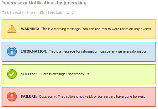
Wouldn’t you love your designs to have some kind of notifications? It might be errors, success, warnings or just anything in general.
But you would also want the users to have the capability of just removing these notifications, just in case if they do not want to read that information anymore? and today we will do just that by using only “Two Lines of javascript”.
Lets say we need 4 types of notification boxes.
- Warning: To warn the users eg: system maintaince
- Information: To inform the users eg: new site features
- Success: If they do something cool eg: click a link or complete a particular task
- Failure: To notify them if there were any errors eg: forms not submitted, or a wrong captcha
so, lets just do the html and css for the notifications.
Here goes the Html
<div class="main_container">

<div class="notification warning hideit">

<strong>WARNING: </strong>
                This is a warning message. You can use this to warn users on any events</div>

<div class="notification information hideit">

<strong>INFORMATION: </strong>
                This is a message for information, can be any general information.</div>

<div class="notification success hideit">

<strong>SUCCESS: </strong>
                 Success message! hoooraaay!!!!</div>

<div class="notification failure hideit">

<strong>FAILURE: </strong>
                Oops sorry. That action is not valid, or our servers have gone bonkers</div>
</div>
and now lets add some styles to our notification boxes
body {
 font-family: Tahoma, Arial, Verdana, sans-serif;
 font-size: 12px;
 color: #999999;
 }
 p {
 color: #999;
 line-height: 18px
 }
 .main_container {
 width: 800px;
 margin: 0 auto;
 }
 .notification {
 line-height: 30px;
 cursor: pointer;
 clear: both;
 height: 30px;
 margin: 8px 0px 8px 0px;
 padding: 20px 25px 10px 60px;
 -moz-border-radius: 4px;
 -webkit-border-radius: 4px;
 }
 .notification strong {
 margin-right: 5px;
 }
 .notification p {
 font-size: 11px;
 padding: 0px;
 margin: 0px;
 color: #333333;
 }
 .message p {
 font-size: 11px;
 }
 .warning {
 background-image: url(../images/error.png);
 background-position: 15px center;
 background-repeat: no-repeat;
 border: 2px solid #FFC237;
 background-color: #FFEAA8;
 color: #826200;
 }
 .success {
 background-image: url(../images/accept.png);
 background-position: 15px center;
 background-repeat: no-repeat;
 border: 2px solid #99C600;
 background-color: #EFFFB9;
 color: #3C5A01;
 }
 .failure {
 background-image: url(../images/exclamation.png);
 background-position: 15px center;
 background-repeat: no-repeat;
 border: 2px solid #EB5339;
 background-color: #FCCAC2;
 color: #AC260F;
 }
 .information {
 background-image: url(../images/information.png);
 background-position: 15px center;
 background-repeat: no-repeat;
 border: 2px solid #418ACC;
 background-color: #D0E4F4;
 color: #235685;
 }
 .lightbulb {
 background-image: url(../images/lightbulb.png);
 background-position: 15px center;
 background-repeat: no-repeat;
 border: 2px solid #D3A350;
 background-color: #FEF0CB;
 color: #835F21;
 }
 .messages {
 background-image: url(../images/email.png);
 background-position: 15px center;
 background-repeat: no-repeat;
 border: 2px solid #42B4FF;
 background-color: #9DDFFF;
 color: #835F21;
 }
There all nice and neat.
We have added a class called class”hideit” in the notification boxes. And this is what will do the trick.
Now we need to create a javascript that enables the notifictaions to fade away on click. Lets create the javascript.
As usual lets start with
$(document).ready (function() {
And here goes the javascript
$(document).ready (function() {
    // Closing notifications
    // this is the class that we will target
    $(".hideit").click(function() {
    //fades the notification out
    $(this).fadeOut(700);
    });
)};
Remember the “hideit” class we added? that will do the magic.
Thats it. we have made notification boxes, that you can just click to make it go away.
But we would also want a few notifications to stay where they are and not fade away, even when the users click on them. There is no need to write a separate javascript for that. All you need to do is not include the class “hideit” to the notifications with the rest of the classes.
for eg:
<div class="notification information">

<strong>INFORMATION: </strong>
                This is a message for information, can be any general information.</div>
and this box will just not go away!
You might also like
Tags
accordion accordion menu animation navigation animation navigation menu carousel checkbox inputs css3 css3 menu css3 navigation date picker dialog drag drop drop down menu drop down navigation menu elastic navigation form form validation gallery glide navigation horizontal navigation menu hover effect image gallery image hover image lightbox image scroller image slideshow multi-level navigation menus rating select dependent select list slide image slider menu stylish form table tabs text effect text scroller tooltips tree menu vertical navigation menu

 Subscribe
 Follow Us
 13 years ago
 16558
16558 4423
4423


