Stylize Input Element Using CSS3
 14 years ago
  9297
9297  1440
1440
 n/a
n/a

Stylizing input element is a common task for us as a web developer, we can make it look nicer by putting stylized input image (color gradient, smooth border, box shadow, etc) as an input background. Nice but the images also take some of our bandwidth, thankfully CSS3 adds some support for element styling, so we can replace them with only CSS.
The Needs and The Basic
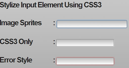
While developing web apps I always meet a task to create some input forms, using default input without any style will ruin my web apps theme thus I always styling them. The common way to styling an input element is by putting an image as an input background and then positioning the background properly. Take a look at following example :
Photoshop Effect vs CSS3 Properties
At above example, the image is only using some Photoshop technique : color gradient, stroke and drop shadow. Rather than take some time creating images, we can stylize them using only CSS. For replacing the Photoshop techniques we can use CSS3 properties :
- Color Gradient replace with -webkit-gradient or -moz-linear-gradient property.
- Stroke replace with border property.
- Drop Shadow replace with -webkit-box-shadow, -moz-box-shadow or box-shadow property.
- For rounded corner we can use -webkit-boder-radius, -moz-border-radius or boder-radius property.
Step By Step Styling Them
First we create the default input element using HTML.
<input name="sample" type="text" size="40" />

Add some styling for the text effect : padding, font-size, and text-shadow.
input {
 padding: 5px;
 font-size: 15px;
 text-shadow: 0px 1px 0px #fff;
}
![]()
Manipulate the input background with linear gradient with starting color with grey (#bcbcbe) and ending color with white (#ffffff).
input {
 padding: 5px;
 font-size: 15px;
 text-shadow: 0px 1px 0px #fff;
 outline: none;
 background: -webkit-gradient(linear, left top, left bottom, from(#bcbcbe), to(#ffffff));
 background: -moz-linear-gradient(top,  #bcbcbe,  #ffffff);
}
![]()
To make the input rounded and having a stroke effect we set its border radius with 3pixels and border thickness with 1pixels using darker grey color (#717171).
input {
 padding: 5px;
 font-size: 15px;
 text-shadow: 0px 1px 0px #fff;
 outline: none;
 background: -webkit-gradient(linear, left top, left bottom, from(#bcbcbe), to(#ffffff));
 background: -moz-linear-gradient(top,  #bcbcbe,  #ffffff);
 -webkit-border-radius: 3px;
 -moz-border-radius: 3px;
 border-radius: 3px;
 border: 1px solid #717171;
}
![]()
Now add drop shadow effect by setting box-shadow property with 1pixels distance on the right and 1pixels distance on the bottom, set 0 for shadow blur and white (#ffffff) for the shadow color.
input {
 padding: 5px;
 font-size: 15px;
 text-shadow: 0px 1px 0px #fff;
 outline: none;
 background: -webkit-gradient(linear, left top, left bottom, from(#bcbcbe), to(#ffffff));
 background: -moz-linear-gradient(top,  #bcbcbe,  #ffffff);
 -webkit-border-radius: 3px;
 -moz-border-radius: 3px;
 border-radius: 3px;
 border: 1px solid #717171;
 -webkit-box-shadow: 1px 1px 0px #efefef;
 -moz-box-shadow: 1px 1px 0px #efefef;
 box-shadow:  1px 1px 0px #efefef;
}
![]()
If the input has focus state we add a box shadow effect like Safari, we just need to set the box-shadow property with 0pixels distance on the left and on the bottom, set 5pixels for shadow blur and light blue (#007eff) for the shadow color. This will make a similar effect like Photohop’s Outer Glow effect.
input:focus {
 -webkit-box-shadow: 0px 0px 5px #007eff;
 -moz-box-shadow: 0px 0px 5px #007eff;
 box-shadow: 0px 0px 5px #007eff;
}

You might also like
Tags
accordion accordion menu animation navigation animation navigation menu carousel checkbox inputs css3 css3 menu css3 navigation date picker dialog drag drop drop down menu drop down navigation menu elastic navigation form form validation gallery glide navigation horizontal navigation menu hover effect image gallery image hover image lightbox image scroller image slideshow multi-level navigation menus rating select dependent select list slide image slider menu stylish form table tabs text effect text scroller tooltips tree menu vertical navigation menu

 Subscribe
 Follow Us


