Stylish Contact Form with CSS3 HTML5

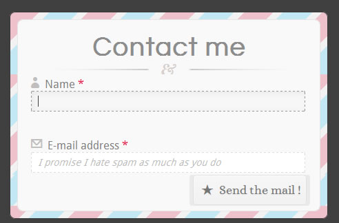
we will show you the code step by step to create a full HTML5 CSS3 contact form like the one above, without using any images. First, a little disclaimer. HTML5 and CSS3 are still working drafts; the goal of this tutorial is to show what we can do with those technologies. This form has some compatibility issues with old browsers, so if you want to use it in production, do so at your own risks.
The form we will build is a simple contact form with basic information: name, email, URL, subject and message.
For the sanity of the code, I omitted the vendor prefixes in this article, but you will find them in the complete file (or by viewing the source code of the example)
HTML5 New Form Elements
HTML5 specs introduce many new form elements to enhance form functionalities. For this tut, here are the ones we will use in our form:
- Input type = email can be used when user needs to enter an email address. Browsers that support it will be able to detect if what the user entered was an email address or not.
- Input type = url can be used to check if the user entered a correct and valid URL.
- Autocomplete = on attribute can be placed either on the form, or on single inputs. When autocomplete = "on", if the a user has already completed a form, the autocomplete attribute enables him to find what he already entered.
- Require = required attribute sets the state of a form element as required. For browsers which support it, the user won’t be able to send the form until all the required fields have been completed. By default the user can’t see required fields until he submits the form, so the web designer still has to add a visual indication.
- Placeholder this attribute represents a short hint so that the user knows what he can enter as data, for example the format for email. The placeholder disappears when the user clicks on the field, and reappears when the cursor is moved and the field is still empty.
Now that you are more familiar with the new elements, let’s see the HTML code for our nice little form :
<div id="content">
<h1> Contact me </h1>

<form action=" " method="post"  autocomplete="on">
<p> <label for="username" class="iconic user" > Name <span class="required">*</span></label> <input type="text" name="username" id="username"  required="required" placeholder="Hi friend, how may I call you ?"  /> </p>

<p> <label for="usermail" class="iconic mail-alt"> E-mail address <span class="required">*</span></label> <input type="email" name="usermail" id="usermail" placeholder="I promise I hate spam as much as you do" required="required"  /> </p>

<p> <label for="usersite" class="iconic link"> Website </label> <input type="url" name="usersite" id="usersite"  placeholder="e.g.: http://www.miste.com" /> </p>

<p> <label for="subject" class="iconic quote-alt"> Subject </label> <input type="text" name="subject" id="subject"  placeholder="What would you like to talk about?" /> </p>

<p> <label for="message" class="iconic comment"> Message  <span class="required">*</span></label> <textarea placeholder="Don't be shy, live me a friendly message and I'll answer as soon as possible "  required="required" ></textarea> </p>

<p class="indication"> All fields with a <span class="required">*</span> are required</p>

<input type="submit" value=" ★  Send the mail !" />
</form>
</div>
Not many ids or classes, the goal here is to use as less HTML as possible and to use CSS3 to style the form. And don’t forget to use the HTML5 doctype !
Creating the Striped Background
Let's start with general layout and let's give this form a background.To create the striped border, we will only style one element : #content. The idea here is pretty simple : we will create a full striped background on this element using CSS3 gradients like this :
#content{
position:relative;
margin:50px auto;
width:400px;
min-height:200px;
z-index:100;
padding:30px;
border:1px solid #383838;
background: #D1D1D1;
/* My stripped background */
background: repeating-linear-gradient(-45deg, #EFC1CB , #EFC1CB 30px, #F2F2F2 30px, #F2F2F2 40px, #C2E8F5 40px, #C2E8F5 70px,#F2F2F2 70px, #F2F2F2 80px);
border-radius:8px;
box-shadow:0px 1px 6px #3F3F3F;
}
Read more:http://www.onextrapixel.com/2012/01/23/full-css3-html5-contact-form-with-no-images/
You might also like
Tags
accordion accordion menu animation navigation animation navigation menu carousel checkbox inputs css3 css3 menu css3 navigation date picker dialog drag drop drop down menu drop down navigation menu elastic navigation form form validation gallery glide navigation horizontal navigation menu hover effect image gallery image hover image lightbox image scroller image slideshow multi-level navigation menus rating select dependent select list slide image slider menu stylish form table tabs text effect text scroller tooltips tree menu vertical navigation menu

 Subscribe
 Follow Us
 12 years ago
 27924
27924 6285
6285


