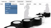
we will create a full page cufonized menu that has two nice features: when hovering over the menu items we will move a hover-state item that adapts to the width of the current item, and we will slide out a description bar from the left side of the page, reaching towards the current menu item.
We will use jQuery for the effect and some CSS3 properties for the style. We are not going to use any images.
So, let’s start!
The Markup
The HTML structure will consist of an unordered list that represents our menu and a div for the description elements:
<div id="slidingMenuDesc" class="slidingMenuDesc"> |
<div><span>Description for "About"</span></div> |
<ul id="slidingMenu" class="slidingMenu"> |
<li><a href="#">Home</a></li> |
<li><a href="#">About</a></li> |
<li><a href="#">Portfolio</a></li> |
<li><a href="#">Work</a></li> |
<li><a href="#">Contact</a></li> |
<li><a href="#">Get a quote</a></li> |
We leave out the description for “Home” since there is nothing to describe. The sliding divs should just appear when we hover over the other items.
The CSS
First, we will style the menu and its navigation items and then we will style the description elements.
Let’s reset some styles:
body, ul, li, h1, h2, span{ |
The background is going to be dark gray:
The list for the menu items is going to be positioned absolutely at the right side of the screen:
font-family: Arial, Helvetica, sans-serif; |
The menu items are hoing to float right:
The “mover” element will be positioned absolutely and we will give it a top and a width dynamically:
-moz-border-radius: 8px 0px 0px 8px; |
-webkit-border-top-left-radius: 8px; |
-webkit-border-bottom-left-radius: 8px; |
border-top-left-radius: 8px; |
border-bottom-left-radius: 8px; |
-moz-box-shadow:1px 1px 5px #000; |
-webkit-box-shadow:1px 1px 5px #000; |
box-shadow:1px 1px 5px #000; |
We will give this moving hover element a very subtle background gradient and some box shadow.
The style for the link element will be as follows:
text-transform:uppercase; |
The descriptions will be in a relatively positioned container. We set the margin-top to the same value like the top of the menu list:
The div with the description span inside is going to have the same background-gradient like the mover and the same box shadow. The rounded borders are going to be on the opposite corners:
-moz-box-shadow:1px 1px 5px #000; |
-webkit-box-shadow:1px 1px 5px #000; |
box-shadow:1px 1px 5px #000; |
-moz-border-radius: 0px 8px 8px 0px; |
-webkit-border-top-right-radius: 8px; |
-webkit-border-bottom-right-radius: 8px; |
border-top-right-radius: 8px; |
border-bottom-right-radius: 8px; |
We need to set these element absolute, since we will adjust the top to the according current list element that we are hovering.
The description span is going to be positioned absolutely as well. This is not required but it gives you more options if you would like to apply other animation effects:
.slidingMenuDesc div span { |
And now, let’s take a look at the JavaScript!
The JavaScript
First, we will add the following scripts to our HTML head:
<script src="cufon-yui.js" type="text/javascript"></script> |
<script src="BabelSans_500.font.js" type="text/javascript"></script> |
<script src="jquery.easing.1.3.js" type="text/javascript"></script> |
And we will add the following script:
Cufon.replace('a, span').CSS.ready(function() { |
var $menu = $("#slidingMenu"); |
var $selected = $menu.find('li:first'); |
var $moving = $('<li />',{ |
top : $selected[0].offsetTop + 'px', |
width : $selected[0].offsetWidth + 'px' |
$('#slidingMenuDesc > div').each(function(i){ |
$this.css('top',$menu.find('li:nth-child('+parseInt(i+2)+')')[0].offsetTop + 'px'); |
$menu.bind('mouseleave',function(){ |
.bind('mouseenter',function(){ |
var offsetLeft = $this.offset().left - 20; |
$('#slidingMenuDesc > div:nth-child('+ parseInt($this.index()) +')').stop(true).animate({'width':offsetLeft+'px'},400, 'easeOutExpo'); |
.bind('mouseleave',function(){ |
var offsetLeft = $this.offset().left - 20; |
$('#slidingMenuDesc > div:nth-child('+ parseInt($this.index()) +')').stop(true).animate({'width':'0px'},400, 'easeOutExpo'); |
function moveTo($elem,speed){ |
$moving.stop(true).animate({ |
top : $elem[0].offsetTop + 'px', |
width : $elem[0].offsetWidth + 'px' |
}, speed, 'easeOutExpo'); |
After we cufonize the font (all “a” elements and all “span” elements), the main function gets executed. We select the first item by default which is our “Home”. When we hover over a menu item we will move the li.move to the right position and slide out the according description item.
And that’s it! We hope you enjoyed it and find it useful!
 Subscribe
 Follow Us
 14 years ago
  14563
14563  2769
2769
 n/a
n/a

