nice Apple-Style Icon Slide Out Navigation with CSS and jQuery
 14 years ago
  22200
22200  4031
4031
 n/a
n/a
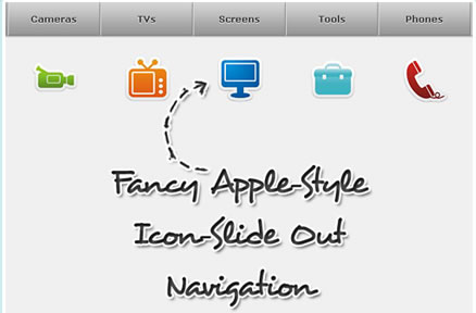
This menu looks very similar to the Apple-style navigation but it reveals some icons when hovering over it. The icons slide out from the top and when the mouse leaves the link, the icon slides back under the link element. This creates a neat “card-shuffle” effect.
1. The HTML
The markup just consists of a div with an unordered list inside. The list elements contain a span for the icon and the link element:
<div class="navigation">
 <ul class="menu" id="menu">
 <li><span class="ipod"></span><a href="" class="first">Players</a></li>
 <li><span class="video_camera"></span><a href="">Cameras</a></li>
 <li><span class="television"></span><a href="">TVs</a></li>
 <li><span class="monitor"></span><a href="">Screens</a></li>
 <li><span class="toolbox"></span><a href="">Tools</a></li>
 <li><span class="telephone"></span><a href="">Phones</a></li>
 <li><span class="print"></span><a href="" class="last">Printers</a></li>
 </ul>
</div>
2. The CSS
The style of the navigation container and the unordered list will be the following:
.navigation{
    position:relative;
    margin:0 auto;
    width:915px;
}
ul.menu{
    list-style:none;
    font-family:"Verdana",sans-serif;
    border-top:1px solid #bebebe;
    margin:0px;
    padding:0px;
    float:left;
}
ul.menu li{
    float:left;
}
Since we are making the list float, we will need some relative wrapper for the icons. You see, the icons which will be the background-images of the spans in our list, will have absolute positioning. That comes handy when you need to define a z-index, i.e. saying that some element is on top or under another one. Since we want the icons to appear on top and then dissapear under the link element, we will have to deal with z-indeces. And absolute positioning of elements in a relative container will makes things easier.
Now, let’s define the style for the link elements:
ul.menu li a{
    text-decoration:none;
    background:#7E7E7E url(../images/bgMenu.png) repeat-x top left;
    padding:15px 0px;
    width:128px;
    color:#333333;
    float:left;
    text-align:center;
    border-right:1px solid #a1a1a1;
    border-left:1px solid #e8e8e8;
    font-weight:bold;
    font-size:13px;
    -moz-box-shadow: 0 1px 3px #555;
    -webkit-box-shadow: 0 1px 3px #555;
    text-shadow: 0 1px 1px #fff;
}
We want to give the link elements a fixed width and some background gradient. The borders will create a nice inset effect.
The next hover class will be applied using jQuery, since the :hover pseudo class creates an unwanted effect: When the icon slides out it covers the link for a few milliseconds, making the hover style dissapear in that time. That is perceived as a flicker and we will avoid that by defining a class that we will simply add with jQuery when we do the icon slide out effect:
ul.menu li a.hover{
    background-image:none;
    color:#fff;
    text-shadow: 0 -1px 1px #000;
}
The first and last link element should have a rounded border on the respective side, so we define two classes for those:
ul.menu li a.first{
    -moz-border-radius:0px 0px 0px 10px;
    -webkit-border-bottom-left-radius: 10px;
    border-left:none;
}
ul.menu li a.last{
    -moz-border-radius:0px 0px 10px 0px;
    -webkit-border-bottom-right-radius: 10px;
}
The common style for all the icon spans will be the following:
ul.menu li span{
    width:64px;
    height:64px;
    background-repeat:no-repeat;
    background-color:transparent;
    position:absolute;
    z-index:-1;
    top:80px;
    cursor:pointer;
}
The single styles for the specific icons will contain the background-image and the x-position:
ul.menu li span.ipod{
    background-image:url(../icons/ipod.png);
    left:33px; /*128/2 - 32(half of icon) +1 of border*/
}
ul.menu li span.video_camera{
    background-image:url(../icons/video_camera.png);
    left:163px; /* plus 128 + 2px of border*/
}
ul.menu li span.television{
    background-image:url(../icons/television.png);
    left:293px;
}
ul.menu li span.monitor{
    background-image:url(../icons/monitor.png);
    left:423px;
}
ul.menu li span.toolbox{
    background-image:url(../icons/toolbox.png);
    left:553px;
}
ul.menu li span.telephone{
    background-image:url(../icons/telephone.png);
    left:683px;
}
ul.menu li span.print{
    background-image:url(../icons/print.png);
    left:813px;
}
As you can see, we are positioning the icons in such a way, that they are centered inside of the list element. The top position is 80px initially since we want to show them to the user when the page get’s loaded. Then we will hide them in a stair-like fashion to create an awesome effect!
3. The JavaScript
First, we want to create the effect of the icons dissapearing in a stair-like fashion and then we will define the hover function for the list elements:
$(function() {
    var d=1000;
    $('#menu span').each(function(){
        $(this).stop().animate({
            'top':'-17px'
        },d+=250);
    });

    $('#menu > li').hover(
        function () {
            var $this = $(this);
            $('a',$this).addClass('hover');
            $('span',$this).stop().animate({
                'top':'40px'
            },300).css({
                'zIndex':'10'
            });
        },
        function () {
            var $this = $(this);
            $('a',$this).removeClass('hover');
            $('span',$this).stop().animate({
                'top':'-17px'
            },800).css({
                'zIndex':'-1'
            });
        }
    );
});
When hovering, we add the class “hover” to the link element, make the icon appear from the top, and increase the z-Index, so that the icon stays on top of the link. When the mouse goes out, we do exactly the opposite, which creates the effect that the icon dissapears behind the link element. For that we will allow more time (800 milliseconds) because it’s such a fun effect that the user might want to enjoy a little bit!
You might also like
Tags
accordion accordion menu animation navigation animation navigation menu carousel checkbox inputs css3 css3 menu css3 navigation date picker dialog drag drop drop down menu drop down navigation menu elastic navigation form form validation gallery glide navigation horizontal navigation menu hover effect image gallery image hover image lightbox image scroller image slideshow multi-level navigation menus rating select dependent select list slide image slider menu stylish form table tabs text effect text scroller tooltips tree menu vertical navigation menu

 Subscribe
 Follow Us