useful Table with CSS3

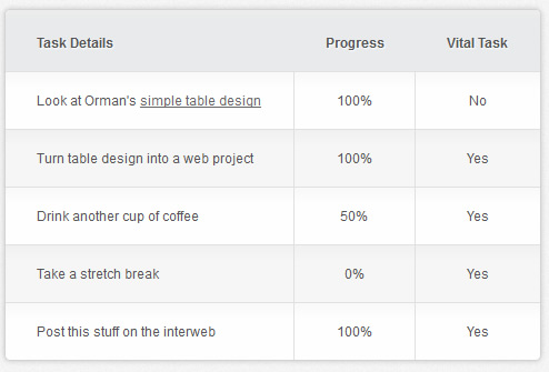
The goal was to have a cross browser compatible version that looked good in Chrome, Firefox, IE8, IE7, and IE6. Internet Explorer doesn’t support CSS3 rounded corners, gradients, or shadows, but it is still nice and functional. The zebra striping seemed essential for all browsers, so that was accomplished through jquery. Here’s what it looks like in IE6:
Firefox and Webkit browsers each have their own quirks when implementing CSS3 techniques. One that took a while to figure out is why the rounded corners looked fine in Firefox but were squared in Chrome.
This post explains how border radiuses are rendered differently and suggested the best solution was to round the interior elements that background colors were applied to in additional to the parent element. So that’s why you see rounded corner CSS applied the table and each of the corner td’s or th’s.
Internet Explorer (7,6) didn’t want to recognize background colors on row elements (tr) at all, so backgrounds were classed for the respective td’s and th’s instead.
JQuery
I used jquery to do the zebra striping. It applies the class “odd” to the odd numbered tr elements. I also used jquery to class the first column and the last column, so that I could have different text alignments and borders. Here’s what the code looks like:
<script type="text/javascript" src="http://ajax.googleapis.com/ajax/libs/jquery/1.4.4/jquery.min.js"></script>
<script type="text/javascript">
 $(function() {
        /* For zebra striping */
        $("table tr:nth-child(odd)").addClass("odd-row");
        /* For cell text alignment */
        $("table td:first-child, table th:first-child").addClass("first");
        /* For removing the last border */
        $("table td:last-child, table th:last-child").addClass("last");
});
</script>
The CSS
The CSS should be pretty straightforward, but be warned about CSS resets. I used a really basic one here- but most use border-collapse for table elements. When you do this, the border will disappear from table. Unfortunately, this means you need to go with an inline cellspacing=”0″ on the table instead. If anyone has a pure CSS solution, I’d love to see it.
html, body, div, span, object, iframe,
h1, h2, h3, h4, h5, h6, p, blockquote, pre,
abbr, address, cite, code,
del, dfn, em, img, ins, kbd, q, samp,
small, strong, sub, sup, var,
b, i,
dl, dt, dd, ol, ul, li,
fieldset, form, label, legend,
table, caption, tbody, tfoot, thead, tr, th, td {
    margin:0;
    padding:0;
    border:0;
    outline:0;
    font-size:100%;
    vertical-align:baseline;
    background:transparent;
}

body {
    margin:0;
    padding:0;
    font:12px/15px "Helvetica Neue",Arial, Helvetica, sans-serif;
    color: #555;
        background:#f5f5f5 url(bg.jpg);
}

a {color:#666;}

#content {width:65%; max-width:690px; margin:6% auto 0;}

/*
*/

table {
    overflow:hidden;
    border:1px solid #d3d3d3;
    background:#fefefe;
    width:70%;
    margin:5% auto 0;
    -moz-border-radius:5px; /* FF1+ */
    -webkit-border-radius:5px; /* Saf3-4 */
    border-radius:5px;
    -moz-box-shadow: 0 0 4px rgba(0, 0, 0, 0.2);
    -webkit-box-shadow: 0 0 4px rgba(0, 0, 0, 0.2);
}

th, td {padding:18px 28px 18px; text-align:center; }

th {padding-top:22px; text-shadow: 1px 1px 1px #fff; background:#e8eaeb;}

td {border-top:1px solid #e0e0e0; border-right:1px solid #e0e0e0;}

tr.odd-row td {background:#f6f6f6;}

td.first, th.first {text-align:left}

td.last {border-right:none;}

/*
Background gradients are completely unnecessary but a neat effect.
*/

td {
    background: -moz-linear-gradient(100% 25% 90deg, #fefefe, #f9f9f9);
    background: -webkit-gradient(linear, 0% 0%, 0% 25%, from(#f9f9f9), to(#fefefe));
}

tr.odd-row td {
    background: -moz-linear-gradient(100% 25% 90deg, #f6f6f6, #f1f1f1);
    background: -webkit-gradient(linear, 0% 0%, 0% 25%, from(#f1f1f1), to(#f6f6f6));
}

th {
    background: -moz-linear-gradient(100% 20% 90deg, #e8eaeb, #ededed);
    background: -webkit-gradient(linear, 0% 0%, 0% 20%, from(#ededed), to(#e8eaeb));
}

/*
I know this is annoying, but we need additional styling so webkit will recognize rounded corners on background elements.
And, since we've applied the background colors to td/th element because of IE, Gecko browsers also need it.
*/

tr:first-child th.first {
    -moz-border-radius-topleft:5px;
    -webkit-border-top-left-radius:5px; /* Saf3-4 */
}

tr:first-child th.last {
    -moz-border-radius-topright:5px;
    -webkit-border-top-right-radius:5px; /* Saf3-4 */
}

tr:last-child td.first {
    -moz-border-radius-bottomleft:5px;
    -webkit-border-bottom-left-radius:5px; /* Saf3-4 */
}

tr:last-child td.last {
    -moz-border-radius-bottomright:5px;
    -webkit-border-bottom-right-radius:5px; /* Saf3-4 */
}
Markup
And, finally, the markup:
<div id="content">

    <table cellspacing="0">
    <tr><th>Task Details</th><th>Progress</th><th>Vital Task</th></tr>
    <tr><td>Look at Orman's <a href="#">simple table design</a></td><td>100%</td><td>No</td></tr>
    <tr><td>Turn table design into a web project</td><td>100%</td><td>Yes</td></tr>
    <tr><td>Drink another cup of coffee</td><td>50%</td><td>Yes</td></tr>
    <tr><td>Take a stretch break</td><td>0%</td><td>Yes</td></tr>
    <tr><td>Post this stuff on the interweb</td><td>100%</td><td>Yes</td></tr>
    </table>

</div>
You might also like
Tags
accordion accordion menu animation navigation animation navigation menu carousel checkbox inputs css3 css3 menu css3 navigation date picker dialog drag drop drop down menu drop down navigation menu elastic navigation form form validation gallery glide navigation horizontal navigation menu hover effect image gallery image hover image lightbox image scroller image slideshow multi-level navigation menus rating select dependent select list slide image slider menu stylish form table tabs text effect text scroller tooltips tree menu vertical navigation menu

 Subscribe
 Follow Us
 13 years ago
 19108
19108 4878
4878


