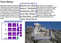
When layout constraints bump up against the need for large images, finding a quality solution can be difficult. Mospromstroy uses a creative technique to handle this situation: a "drag and drop" control bar that allows users to pan through images.
We can accomplish something similar using jQuery UI's draggable behavior.
Mark-Up and CSS
First let's set up some mark-up for the content and controls:
<div id="full-sized-area"> |
<div id="full-sized-content"> |
<div id="drag-controls-area"> |
<div id="drag-controls"></div> |
Next, let's apply some basic CSS:
Here we applied an absolute position to both the #full-sized-content and #drag-controls, and we also hid any overflow from the large image. Additionally, we applied some arbitrary dimensions to the content and drag controls wrappers; make sure to adjust these as needed.
Building Interactivity With jQuery
Now, let's use jQuery UI to build the interaction. Begin by including jQuery UI with the draggable module.
Before attaching the controls, let's resize the drag control box to the right dimensions:
var $fullArea = $('#full-sized-area'); |
var $fullContent = $('#full-sized-content', $fullArea); |
var contentRatio = $fullArea.width() / $fullContent.width(); |
var $controlsArea = $('#drag-controls-area'); |
var $controls = $('#drag-controls', $controlsArea); |
$controls.css('width', $controlsArea.width() * contentRatio); |
Here, we've determined what portion of the content is visible in the content area and then scaled the width of the control box accordingly.
Next, let's attach the draggable behavior:
var $fullArea = $('#full-sized-area'); |
var $fullContent = $('#full-sized-content', $fullArea); |
var contentRatio = $fullArea.width() / $fullContent.width(); |
var $controlsArea = $('#drag-controls-area'); |
var $controls = $('#drag-controls', $controlsArea); |
$controls.css('width', $controlsArea.width() * contentRatio); |
var scaleRatio = $controlsArea.width() / $fullContent.width(); |
drag : function(ev, ui) { |
$fullContent.css('left', -1 * ui.position.left / scaleRatio ); |
Here, we've attached a draggable event and set a couple options. First, we set axis to restrict dragging to the x-axis, and then we set containment to confine dragging to the parent element (i.e. the controls wrapper).
Finally, we set up a drag listener to move the full-sized content according to how far the user has dragged the control. For this, we negatively positioned the content to the left by the drag amount multiplied by the ratio of the controls to the content.
Custom Cursors
The draggable content is working, but we still have room for improvement.
First let's add some more styling to the control box to make it more interactive. jQuery UI's draggable attaches two class names that we can use for this: ui-draggable and ui-draggable-dragging.
#drag-controls.ui-draggable { |
cursor: -moz-grab !important; |
cursor: -webkit-grab !important; |
#drag-controls.ui-draggable-dragging { |
cursor: -moz-grabbing !important; |
cursor: -webkit-grabbing !important; |
In addition to applying a new border color to the active controls, this snippet also attaches a number of cursor properties, which use proprietary UI cursors available in Firefox and Safari, with a back-up for IE.
Because of the implementation of the cursor property, we had to "bootstrap" this together using !important. This ensures that the proprietary cursors are used if available, while allowing the default cursor to overwrite them in IE. Unfortunately, Chrome does not currently support -webkit-grab, so we leave it out of this implementation. If you'd prefer to use the back-up e-resize cursor in both Chrome and Safari, just remove the -webkit-grab and -webkit-grabbing properties.
Parallax Effect
Let's make the sliding animation more three-dimensional by adding a two-layer parallax effect. To do so, we simply add a background to our full-sized content area and animate it at a slower rate.
Add the mark-up first:
<div id="full-sized-area"> |
<div id="full-sized-background"> |
<div id="full-sized-content"> |
<div id="drag-controls-area"> |
<div id="drag-controls"></div> |
And then some basic styling:
Here, we use absolute positioning to lock the background in place. Note that we did not need to attach a z-index, because we placed the background element before the content area in the mark-up.
Finally, let's add the background animation to our drag event:
$fullBackground = $('#full-sized-background'); |
drag : function(ev, ui) { |
var newContentPosition = -1 * ui.position.left / scaleRatio; |
$fullContent.css('left', newContentPosition); |
$fullBackground.css('left', newContentPosition * .4); |
Here, we simply used the new position that we calculated for the main content and applied 40% of that change to the background. Adjust this value to change the speed of the parallax.


 Subscribe
 Follow Us
 14 years ago
 11114
11114 1624
1624


