MooTools Brilliant Animated Tabs
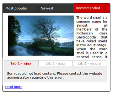
There are times when we need to display a bit too much content in a small space. One way to do it is by using tabs. Fancy tabs is a tabs navigation display that tries to cover most situations, from AJAX loaded tabs to auto navigation and multi purpose usage. To make things easier when designing the interface, all CSS is all external giving the possibility to change skins very easily without interacting with the JavaScript code.
Main features for this tab navigation system are:
- tabs can be rotated automatically but setting the number of milliseconds between them;
- ajax content in tabs;
- auto resizing according to tab content;
- tab highlight with smooth effect between classes in CSS;
- highly customizable from CSS;
- multiple entrance tab content effect ( fade, slide-fade );
- allows setting the entry direction for tab content ( left or right ) and the effect;
- if auto rotate is on, there’s an option for stopping auto rotating on tab trigger click;
- if auto rotate is on, when user has mouse over the tab content, auto rotate stops and resumes on mouse out;
- can take regular tabs with text in HTML or tabs with content pulled by AJAX calls into the same class instance;
- ajax calls made only once, when the tab trigger is clicked. Any clicks after that will not trigger a new ajax call.
To set up the tab navigation and make it work as expected, there are a number of parameters that can be set. Below is the full list.
PARAMETERS
- tabs: tab triggers are all inside a parent container. To tell the script where are the tabs, give a parent-descendants value ( for example, if the tab triggers are inside #tabs_container and have class .tab, parameter will be: ‘#tabs_container .tab’ )
- contentContainer: simiar to tabs, content containers are all locaed inside an overall container. This parameter takes the id of that container ( please note for ajax tabs you still have to put containers but they will be empty; number of tab triggers and content containers need to be equal )
- contentElement: CSS class for tab content elements ( use it as .class – ie: .myContent )
- tabFx.classSelected: CSS class to morph to when a tab is selected. Do not use descendants for this class in your css. Simply declare it inside stylesheet as .mySelectedClass { … }
- tabFx.classDefault: similar to the above but for the default state of tabs.
- fxStyle: when a tab trigger is clicked, the content can perform different effects meaning it can fade or slide in and fade. To make it fade, give this parameter value 1, to make it slide in and fade set this to 2
- slideEnter: if for the above parameter you use 2 ( slide in ), you can further set direction to slide in from left or right. Possible values are left or right.
- auto: when this parameter is set to a given number of milliseconds, it will automatically change tabs at the given number of milliseconds
- stopOnClick: when the above is set to a number of milliseconds, you can further set the script to stop auto rotating content when user clicks any tab trigger
When loading, if you want to set a specific tab as selected other than the first one, simply add it the class “selected” and it will be automatically displayed, even if it’s not the first ( ie: <a href=”#” class=”tab selected”… ).
INSTALL
To install this script, you’ll need the MooTools framework with at least these plugins:
MOOTOOLS CORE
- Core: all
- Native: all
- Class: all
- Element: all
- Utilities: Selectors, DomReady
- Fx: Fx, Fx.CSS, Fx.Morph, Fx.Transitions
- Request: Request, Request.HTML
After downloading the necessary MooTools file, add it and the FancyTabs class into your HTML document inside the head section ( … ) along with any CSS file to style the display.
STYLING
All CSS is external so you don’t need to change anything inside the JavaScript file if your goal is to change the skin. Some things to keep in mind:
- There are some CSS classes that are predefined meaning you’ll need to keep them into your stylesheet even after changing the skin and eventually any elements id’s inside you HTML.
These are:
- #FA_content .loadingAjax ( inside third_example.css ). This is used for displaying the loading state for the tab content - Each example has its own stylesheet for better understanding how it works.
You might also like
Tags
accordion accordion menu animation navigation animation navigation menu carousel checkbox inputs css3 css3 menu css3 navigation date picker dialog drag drop drop down menu drop down navigation menu elastic navigation form form validation gallery glide navigation horizontal navigation menu hover effect image gallery image hover image lightbox image scroller image slideshow multi-level navigation menus rating select dependent select list slide image slider menu stylish form table tabs text effect text scroller tooltips tree menu vertical navigation menu

 Subscribe
 Follow Us
 14 years ago
 16259
16259 3320
3320
