Very Useful CSS3 Rounded ImageS With jQuery

The other day I was trying to style CSS3 border-radius to image element and I realized that Firefox doesn’t display border-radius on images. Then I figured a way to work around it — wrap a span tag around with the original image as a background-image. Thanks to Darcy Clarke for the jQuery code which does the magic tag wrapping automatically.
Goal
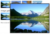
My goal to use the CSS3 border-radius and box-shadow feature to make the image element look like the screenshot below.

Problem
The problem is none of the modern browsers display rounded corners image the way I want it. Webkit does display the rounded corners, but the inset box shadow is not supported. In Firefox, the border-radius doesn’t even display at all.

The CSS Trick
The trick is very simple: wrap a span tag around the image element. Specify the original image as background-image. To hide the original image, specify opacity:0 or display:none. I find using the opacity method is a better approach because the image will remain available for copy or download.
Final Solution With jQuery
To make things easier, we can use jQuery to automatically wrap a span tag around the image.
The jQuery code below will find any element with ".rounded-img" or "rounded-img2" (in my case, it is the image element) and wrap it with a span tag. The script finds the src, width, height, and CSS class attribute of the original image and apply them as inline styling in the span tag. Then it specifies the opacity of the image to 0 to hide it.
It works with any image dimension (with or without the width and height attribute). It can also be combined with other CSS classes. No additional markup is required.
<script type="text/javascript" src="jquery-1.4.2.min.js"></script>
<script type="text/javascript">
$(document).ready(function(){

  $(".rounded-img, .rounded-img2").load(function() {
    $(this).wrap(function(){
      return '<span class="' + $(this).attr('class') + '" style="background:url(' + $(this).attr('src') + ') no-repeat center center; width: ' + $(this).width() + 'px; height: ' + $(this).height() + 'px;" />';
    });
    $(this).css("opacity","0");
  });

});
</script>
Sample Usage
I hope you will find this trick useful. For example, you can use it to style your blog’s avatar or profile photos.
You might also like
Tags
accordion accordion menu animation navigation animation navigation menu carousel checkbox inputs css3 css3 menu css3 navigation date picker dialog drag drop drop down menu drop down navigation menu elastic navigation form form validation gallery glide navigation horizontal navigation menu hover effect image gallery image hover image lightbox image scroller image slideshow multi-level navigation menus rating select dependent select list slide image slider menu stylish form table tabs text effect text scroller tooltips tree menu vertical navigation menu

 Subscribe
 Follow Us
 14 years ago
 11359
11359 1643
1643


