iPhone Style Checkboxes With CSS3

Here’s some form input checkboxes styled with CSS3 to look like iPhone style on/off buttons. Just messing about again with CSS3.
It’s all done with an input ‘checkbox’ an a couple of labels. There’s no javascript to add any classes and the on/off text is added using the :before and :after pseudo classes in CSS with generated content, there are also no images used. It should work cross browser although I haven’t tested IE and Opera. Shoudn’t take too much tweaking if you want to try, I just didn’t have time.
There’s some -webkit- animations for Chrome and Safari. The clever bit is using the label to switch the checkbox off and on using the ‘for’ attribute whick targets the ‘id’ of the checkbox. Like this:
<input id="1" checked="checked" name="1" type="checkbox" value="1" />

<label class="check" for="1"></label>
The label is then styled to have a different position using :checked. The checkbox itself is hidden.
input[type=checkbox]:checked + label.check {

    top: 0px;

    left: 38px;

}
Ironically this doesn’t work on the iPhone!!?
P.S. This ‘experiment’ wasn’t intended to simulate any kind of ‘drag’ feature on the iPhone, it was just a try at making a pretty looking checkbox. It’s not a radiobox either, although you could probably use it for that too! All I was interested in was the CSS and just seeing if it was possible to achieve this kind of interface design without lots of extra bulky markup or JS. Sorry for any confusion or offence caused. ![]()
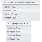
Update: Here’s a UI example that doesn’t look like the iPhone buttons. Maybe this is a bit clearer as to how it may be used.
You might also like
Tags
accordion accordion menu animation navigation animation navigation menu carousel checkbox inputs css3 css3 menu css3 navigation date picker dialog drag drop drop down menu drop down navigation menu elastic navigation form form validation gallery glide navigation horizontal navigation menu hover effect image gallery image hover image lightbox image scroller image slideshow multi-level navigation menus rating select dependent select list slide image slider menu stylish form table tabs text effect text scroller tooltips tree menu vertical navigation menu

 Subscribe
 Follow Us
 14 years ago
 13220
13220 2303
2303


