jQuery & CSS Tooltip Example

Websites and web applications alike are slowly but surely transitioning towards an environment filled with rich user interface gadgets. Tooltips are amongst this vast array of gadgets that should be in every web application developer’s toolbox, as they provide useful hints and help messages directly to the user in a discrete yet obvious manner.
Getting Started
As always, we should be aiming to maintain a minimal XHTML footprint in order to ensure that our code is well structured and sufficiently semantic. In the case of tooltips, we can make use of the title attribute provided for all tags, although most commonly used by the anchor tag and the image tag.
Furthermore, we can discretely signal our jQuery code to display a tooltip by using an uncommon and specific classname such as show-tooltip. Let’s start with the following basic example:
<a href="http://google.com/" class="show-tooltip" title="Start your search with Google!">Google.</a>
By using semantic attributes such as title, we ensure that the browser will degrade nicely for users without JavaScript enabled. The tooltip that loads by default by the browsers should be fairly familiar:
Using jQuery to Override Tooltips
Overriding the default tooltip using jQuery is simple. We construct a new span using jQuery’s $('<span/>'); for each link, fill it with the title tag, and then place this element directly after the anchor tag we found. We also clear the existing title tag to eliminate the default tooltip.
jQuery cuts these operations down significantly. Using the .each(), .html(), and .after() functions, this code is condensed into about a half dozen lines of code.
$('.show-tooltip').each(function(){
       $(this).after($('<span/>')
   .attr('class', 'show-tooltip-text')
   .html($(this).attr('title')))
   .attr('title', '');
  });
Alongside this block of code, our setup function also sets the .hover() callbacks that will be manually processing the showing and hiding of the tooltips. Within these callbacks, we can use e.pageX and e.pageY to determine the coordinates of the mouse, and use this to position our tooltip.
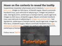
With a couple of lines of CSS, we end up with a rough imitation of the standard tooltip we are used to seeing.
Putting it All Together
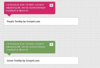
At this point, the only thing left to do is make it a bit prettier. As this now a normal element that is within our control, we are able use standard CSS on span.show-tooltip-text. This includes adding background images, changing font sizes or colors, and anything else you might want to do for your tooltip. The only real restriction is that you will usually want to keep position: absolute; on this to ensure that it is positioned properly.
Furthermore, we can use jQuery’s built in .fadeIn() and .fadeOut() to help the tooltip look even better.
Wrapping Up
The code to implementing these tooltips is extremely simple and concise, and this allows you to incorporate tooltips into your application without unnecessary bloat and hassle. Tooltips should be used wherever helpful advice can be provided, and now it’s just a matter of adding a title attribute and a classname.
Keep in mind that because we are using .html() instead of .text(), we can incorporate any HTML (including newlines and formatting) into our title, but do be warned that the standard tooltip will not format this properly and therefore degradation may not be ideal.
The Finished Product
You might also like
Tags
accordion accordion menu animation navigation animation navigation menu carousel checkbox inputs css3 css3 menu css3 navigation date picker dialog drag drop drop down menu drop down navigation menu elastic navigation form form validation gallery glide navigation horizontal navigation menu hover effect image gallery image hover image lightbox image scroller image slideshow multi-level navigation menus rating select dependent select list slide image slider menu stylish form table tabs text effect text scroller tooltips tree menu vertical navigation menu

 Subscribe
 Follow Us
 14 years ago
 7913
7913 1541
1541


