 Subscribe
 Follow Us
jQuery style menu with CSS3
 14 years ago
  14534
14534  3437
3437
 n/a
n/a
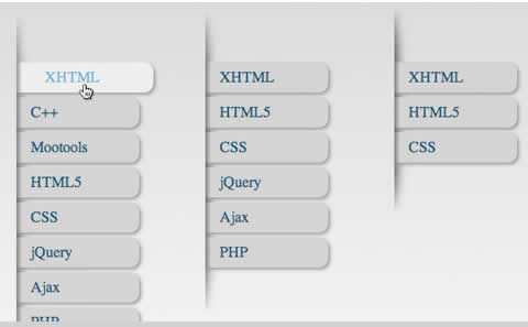
Here’s a quick experiment I did with CSS3. Again I was just mucking about with CSS3 transitions which could one day replace all the fancy jQuery animation tricks people use. The outcome was a really simple animated sliding verticle menu.
First off in the demo you might notice the gradient which is CSS too. Really easy to do that with this….
body { background: -webkit-gradient

           (linear, left top, left bottom, from(#ccc), to(#fff));

}
Now we’ll style the un-order list with some padding and a background image to create a ridge like effect that our menu items will appear out of. The cool thing about this is by using -webkit-background-size’ the image is stretched if you add more items to it making the whole thing a bit more dynamic.
ul#nav {

    list-style: none;

    display: block;

    width: 200px;

    position: relative;

    top: 100px;

    left: 100px;

    padding: 60px 0 60px 0;

    background: url(shad2.png) no-repeat;

    -webkit-background-size: 50% 100%;

}
Everything else is pretty bog standard really. A simple un-ordered list and that’s about it. The styling for the list item anchor tags is where it all happens. The addition of the ‘-webkit-transition:’ is going to allow us to animate to the ‘:hover’ state.
ul#nav li a {

    -webkit-transition: all 0.3s ease-out;

}
It says ‘all’ animatable properties should animate over 300ms using ‘ease-out’, similar to jQuerys easing functions.
Next we’ll add the styling for the anchor tags with some fancy -webkit-border-radius and -webkit-box-shadow to give it some shape and depth and complete it with a backgroung image for each item to enhance our interface effect, making them look like their coming from underneath the ridge.
ul#nav li a {
    -webkit-transition: all 0.3s ease-out;
    background: #cbcbcb url(border.png) no-repeat;
    color: #174867;
    padding: 7px 15px 7px 15px;
    -webkit-border-top-right-radius: 10px;
    -webkit-border-bottom-right-radius: 10px;
    width: 100px;
    display: block;
    text-decoration: none;
    -webkit-box-shadow: 2px 2px 4px #888;
}
The properties we’re going to style are color, background-color and left-padding so let’s add them to the hover: state.
ul.nav li a:hover {
    background: #ebebeb url(border.png) no-repeat;
    color: #67a5cd;
    padding: 7px 15px 7px 30px;
}
That’s about it really. No javascript and exactly the same effect. Probably be easy to make this degrade nicely for “certain” browsers. Now all you have to do is wait!
You might also like

Tags
accordion accordion menu animation navigation animation navigation menu carousel checkbox inputs css3 css3 menu css3 navigation date picker dialog drag drop drop down menu drop down navigation menu elastic navigation form form validation gallery glide navigation horizontal navigation menu hover effect image gallery image hover image lightbox image scroller image slideshow multi-level navigation menus rating select dependent select list slide image slider menu stylish form table tabs text effect text scroller tooltips tree menu vertical navigation menu