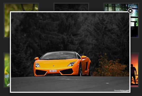
Thumbnails of photos is very common part of any website. We have seen a lot of innovation and beautiful representation of thumbnails. Recently I came across a beautiful hover effect on thumbnails. Without saying much first see what is this effect.
The Implementation of this effect is given in the following sections.
<div class="thumbnail-wrap">
<div class="thumbnail-div">
<div style="background-image: url(5_thumb.jpg);">
<img class="thumbnail-shadow" src="thumbnail-shadow.png" alt="bottom" />
<div class="sections-overlay">
<a rel="imagezoom" href="5.jpg">
<img class="zoom" src="zoom.png" alt="Some Title of the Image 5" />
</a>
<a class="readmore" href="#">read more >></a></div>
</div>
</div>
</div>
I think the code here is self explanatory.
The CSS
The CSS for the effect is a bit lengthy, as lots of hidden elements are involved.
.thumbnail-wrap {
	float:left;
	height:151px;
	margin:30px;
	width:151px;
}
.thumbnail-div {
	background-color:#313131;
	float:left;
	height:146px;
	padding:5px 0 0 5px;
	width:146px;
}
.thumbnail-shadow {
	float:left;
	height:33px;
	width:100%;
}
.thumbnail-div .sections-overlay {
	-moz-background-clip:border;
	-moz-background-inline-policy:continuous;
	-moz-background-origin:padding;
	background:transparent url(thumbnail-overlay.png) no-repeat scroll -40px -300px;
	float:left;
	margin-top:-33px;
}
.thumbnail-div div{
	height:141px;
	width:141px;
}
.sections-overlay {
	background-image:url(readmore-bg.png);
	opacity: 0;
	visibility:hidden;
	background-position: 0px -167px;
}
.thumbnail-div .sections-overlay .zoom {
	margin:60px 0 0 61px;
}
.sections-overlay .zoom {
	border:medium none;
	margin:165px 0 0 312px;
}
.readmore {
	background-image:url(readmore-bg.png);
	color:#FFFFFF;
	display:block;
	float:right;
	font-size:10px;
	margin:17px 0 0 40px;
	padding:5px 10px;
}
The Javascript : Mootools
And Finally the magic of Mootools to get the desired effect. All this effect is doing to decrease the margin-top of "thumbnail-div" by 10px and showing "sections-overlay" div using opacity:1.
$$('div.thumbnail-div').each(function(div){
  div.addEvents({
    'mouseover': function(){
      $(this).tween('marginTop', '-10px');
      $(this).getElements('div.sections-overlay').each(function(d){
        d.morph({opacity: 1, backgroundPosition: "-40px 0px"});
      });
    },
    'mouseout': function(){
      $(this).tween('marginTop', '0px');
      $(this).getElements('div.sections-overlay').each(function(d){
        d.morph({opacity: 0, backgroundPosition: "0px -167px"});
      });
    }
  });
});
Doing just this we'll get such an amazing effect on Thumbnails. This effect is just a demo of the possibilities. One can use the same technique to show the Title of the Image or RunTime and Title of Video Thumbnail.
 Subscribe
 Follow Us
 13 years ago
 22916
22916 4952
4952
