Creating a Rotating Billboard System with jQuery and CSS
 14 years ago
  16875
16875  3357
3357
 n/a
n/a

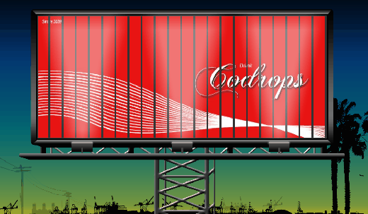
We will use some images, CSS and jQuery to create the effect of a rotating billboard with two ads. The idea is to make one set of image slices disappear while another one (the other ad) appear. We will decrease the width of each disappearing slice and increase the width of each appearing slice. This will give the effect of rotating slices, just like in a rotating billboard system.
1. The HTML
We will have quite a lot of markup for the image slices – it will be 22 slices for each ad:
<div class="container">
 <div class="ad">
  <div id="ad_1" class="ad_1">
   <img class="slice_1" src="ads/ad1_slice01.jpg"/>
   <img class="slice_2" src="ads/ad1_slice02.jpg"/>
   <img class="slice_3" src="ads/ad1_slice03.jpg"/>
   <img class="slice_4" src="ads/ad1_slice04.jpg"/>
   <img class="slice_5" src="ads/ad1_slice05.jpg"/>
   <img class="slice_6" src="ads/ad1_slice06.jpg"/>
   <img class="slice_7" src="ads/ad1_slice07.jpg"/>
   <img class="slice_8" src="ads/ad1_slice08.jpg"/>
   <img class="slice_9" src="ads/ad1_slice09.jpg"/>
   <img class="slice_10" src="ads/ad1_slice10.jpg"/>
   <img class="slice_11" src="ads/ad1_slice11.jpg"/>
   <img class="slice_12" src="ads/ad1_slice12.jpg"/>
   <img class="slice_13" src="ads/ad1_slice13.jpg"/>
   <img class="slice_14" src="ads/ad1_slice14.jpg"/>
   <img class="slice_15" src="ads/ad1_slice15.jpg"/>
   <img class="slice_16" src="ads/ad1_slice16.jpg"/>
   <img class="slice_17" src="ads/ad1_slice17.jpg"/>
   <img class="slice_18" src="ads/ad1_slice18.jpg"/>
   <img class="slice_19" src="ads/ad1_slice19.jpg"/>
   <img class="slice_20" src="ads/ad1_slice20.jpg"/>
   <img class="slice_21" src="ads/ad1_slice21.jpg"/>
   <img class="slice_22" src="ads/ad1_slice22.jpg"/>
  </div>
  <div id="ad_2" class="ad_2">
   <img class="slice_1" src="ads/ad2_slice01.jpg"/>
   <img class="slice_2" src="ads/ad2_slice02.jpg"/>
   <img class="slice_3" src="ads/ad2_slice03.jpg"/>
   <img class="slice_4" src="ads/ad2_slice04.jpg"/>
   <img class="slice_5" src="ads/ad2_slice05.jpg"/>
   <img class="slice_6" src="ads/ad2_slice06.jpg"/>
   <img class="slice_7" src="ads/ad2_slice07.jpg"/>
   <img class="slice_8" src="ads/ad2_slice08.jpg"/>
   <img class="slice_9" src="ads/ad2_slice09.jpg"/>
   <img class="slice_10" src="ads/ad2_slice10.jpg"/>
   <img class="slice_11" src="ads/ad2_slice11.jpg"/>
   <img class="slice_12" src="ads/ad2_slice12.jpg"/>
   <img class="slice_13" src="ads/ad2_slice13.jpg"/>
   <img class="slice_14" src="ads/ad2_slice14.jpg"/>
   <img class="slice_15" src="ads/ad2_slice15.jpg"/>
   <img class="slice_16" src="ads/ad2_slice16.jpg"/>
   <img class="slice_17" src="ads/ad2_slice17.jpg"/>
   <img class="slice_18" src="ads/ad2_slice18.jpg"/>
   <img class="slice_19" src="ads/ad2_slice19.jpg"/>
   <img class="slice_20" src="ads/ad2_slice20.jpg"/>
   <img class="slice_21" src="ads/ad2_slice21.jpg"/>
   <img class="slice_22" src="ads/ad2_slice22.jpg"/>
  </div>
 </div>
</div>

<div class="billboard"></div>
For these images, 22 slices (each slice 35 pixels wide) of a 770 pixel wide and 340 pixel high image were made. One might think that this is a lot of work and that we could actually take one whole picture and create divs acting like the slices with that background image and the right background position. But then we would not be able to create the same effect of a rotating slice (at least not with the JavaScript we created for this showcase).
The billboard will be an absolute positioned div with the billboard image. Since the image has some transparent spotlights, we want to lay it over the ad container.
2. The CSS
The style for the billboard frame will be the following:
.billboard{
    position:absolute;
    bottom:0px;
    left:50%;
    margin-left:-447px;
    width:916px;
    height:599px;
    background:transparent url(../images/billboard.png) no-repeat 0px 0px;
}
To position the element in the center of the page, we set the left value to 50% and the left margin negatively to half of the width of the element.
The container for the ads will have the same style like the billboard, except the background-image. We do that, because we need to position the containing elements at the same place like the billboard. We don’t want to place the ads inside of the billboard because we need the billboard to be on top of them. So, we do this trick and create another element with the same positioning:
.container{
    position:absolute;
    bottom:0px;
    left:50%;
    margin-left:-447px;
    width:916px;
    height:599px;
}
.ad{
    width:800px;
    height:336px;
    position:relative;
    margin:35px 0px 0px 60px;
    background-color:#333;
}
.ad_1 img{
    width:35px;
    height:336px;
    position:absolute;
}
.ad_2 img{
    width:0px;
    height:336px;
    margin-left:18px;
    position:absolute;
}
The slices of the ad images will be 35 pixels wide. The slices of the second ad will have the same width, but initially we need to set it to 0. We also need to set the left margin of the second slices to 18 pixels since we want to create the rotating effect. I will explain more about this value after we define the CSS for the slices.
The single slices need to be positioned:
.slice_1{left:0px;}
.slice_2{left:36px;}
.slice_3{left:72px;}
.slice_4{left:108px;}
.slice_5{left:144px;}
.slice_6{left:180px;}
.slice_7{left:216px;}
.slice_8{left:252px;}
.slice_9{left:288px;}
.slice_10{left:324px;}
.slice_11{left:360px;}
.slice_12{left:396px;}
.slice_13{left:432px;}
.slice_14{left:468px;}
.slice_15{left:504px;}
.slice_16{left:540px;}
.slice_17{left:576px;}
.slice_18{left:612px;}
.slice_19{left:648px;}
.slice_20{left:684px;}
.slice_21{left:720px;}
.slice_22{left:756px;}
By positioning the elements one more pixel to the left than they are actually wide, we create a little gap between the them. Now, the left margin has a value of 18 pixels because it is half of a slice plus its gap. We set this because we want the slices to appear (or disappear) from (or to) their center and not just from the side. If we simply set the width of a slice to 0 pixels the image will not seem to be rotating.
And that is all the CSS. For the additional fancy background images you can check out the downloadable version below.
Let’s create the rotating effect with jQuery.
3. The JavaScript
We will now create a function for rotating the slices. The function will make the first ad slices disappear by making their width 0 pixels. To achieve the rotating effect, we add a left margin of 18 pixels.
While the first ad slices disappear we make the others appear by removing the left margin of 18 pixels (that we initially set in the CSS) and giving them a width of 35 pixels. We call the rotate function like this:
$('#ad_1 > img').each(function(i,e){
       rotate($(this),500,3000,i);
   });
The whole script that we call will look like this:
$(function() {
    $('#ad_1 > img').each(function(i,e){
        rotate($(this),500,3000,i);
    });
    function rotate(elem1,speed,timeout,i){
        elem1.animate({'marginLeft':'18px','width':'0px'},speed,function(){
            var other;
            if(elem1.parent().attr('id') == 'ad_1')
                other = $('#ad_2').children('img').eq(i);
            else
                other = $('#ad_1').children('img').eq(i);
                other.animate({'marginLeft':'0px','width':'35px'},
                                  speed,function(){
                var f = function() { rotate(other,speed,timeout,i) };
                setTimeout(f,timeout);
            });
        });
    }
});
So, the rotate function performs the hiding of the current element (that it was called upon) and then identifies which element it’s currently dealing with, so that another call of the rotate function can be performed on the other ad slices.
The two times mentioned in the rotate function stand for the speed of the rotation effect (speed) and the duration between the swapping of the ads (timeout) in milliseconds.
You might also like
Tags
accordion accordion menu animation navigation animation navigation menu carousel checkbox inputs css3 css3 menu css3 navigation date picker dialog drag drop drop down menu drop down navigation menu elastic navigation form form validation gallery glide navigation horizontal navigation menu hover effect image gallery image hover image lightbox image scroller image slideshow multi-level navigation menus rating select dependent select list slide image slider menu stylish form table tabs text effect text scroller tooltips tree menu vertical navigation menu

 Subscribe
 Follow Us


