Countdown jQuery Slick Image Slider Plugin

Sick of confusing and bloated image sliders that never work?
Rock ZURB's Orbit for a mere 4KB
Note: Works best in Chrome, Safari, FF3.5+ (but is tested for IE7+, FF3.5+, Chrome and Safari)
The new version of the http://www.htmldrive.net/items/show/667/jQuery-Countdown-Image-Slider-Plugin
1.2.3 + 1.2.3 (3/17/2011): Fixed a number of issues including:
- Fixed issue of false parameters failing
- Can now have just 1 slide without it failing
- Reorganized kit download to isolate "demo" pieces and core code
- Included jQuery 1.5.1
- We've edited some of the docs here around "Content" slides
Quick Setup
The Code
So to get started you're going to need jQuery and the Orbit plugin (make sure jQuery is attached first).
<script src="js/jquery.min.js" type="text/javascript"></script>
<script src="js/jquery.orbit.min.js" type="text/javascript"></script>
Now we can quickly hookup the CSS we need:
<link rel="stylesheet" href="css/orbit.css">
And finally, let's dig into the markup.
<div id="featured">
     <img src="overflow.jpg" alt="Overflow: Hidden No More" />
     <img src="captions.jpg"  alt="HTML Captions" />
     <img src="features.jpg" alt="and more features" />
</div>
Now, just a couple notes before moving on...
- First, Orbit will dynamically determine the height and width of your set of images and scale accordingly, but make sure all your images are the same size or the larger images will peek out on the sides.
- Secondly, you'll notice that the "id" of the parent div is "featured", but it doesn't have to be. When you call the Orbit plugin, you set your own selector and the magical "orbit" class gets applied.
All we need to do now is activate the Orbit plugin.
<script type="text/javascript">
     $(window).load(function() {
         $('#featured').orbit();
     });
</script>
And there you have it. Orbit, implemented and ready to rock with all the default settings. If you want to see more options or to clean up your slider, checkout the "Advanced Options" below.
Advanced Options
Neato Options
Now, of course you want some other cool features like HTML captions, bullet navigation (now with thumbnails as well), or using content instead of images. Let's give you the low-down on how to get these going.
All Plugin Parameters
Here are all the plugin parameters with their defaults just listed. The options are commented out to the right. Go nuts.
$('#featured').orbit({
     animation: 'fade',                  // fade, horizontal-slide, vertical-slide, horizontal-push
     animationSpeed: 800,                // how fast animtions are
     timer: true, 			 // true or false to have the timer
     advanceSpeed: 4000, 		 // if timer is enabled, time between transitions
     pauseOnHover: false, 		 // if you hover pauses the slider
     startClockOnMouseOut: false, 	 // if clock should start on MouseOut
     startClockOnMouseOutAfter: 1000, 	 // how long after MouseOut should the timer start again
     directionalNav: true, 		 // manual advancing directional navs
     captions: true, 			 // do you want captions?
     captionAnimation: 'fade', 		 // fade, slideOpen, none
     captionAnimationSpeed: 800, 	 // if so how quickly should they animate in
     bullets: false,			 // true or false to activate the bullet navigation
     bulletThumbs: false,		 // thumbnails for the bullets
     bulletThumbLocation: '',		 // location from this file where thumbs will be
     afterSlideChange: function(){} 	 // empty function
});
Full HTML Captions
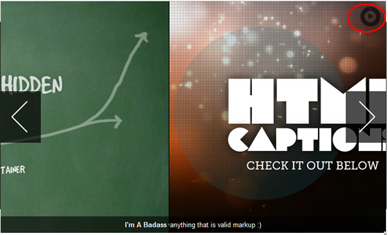
Orbit now has full HTML captions so you can add styles, links, lists, or whatever your coding heart desires.
- Add a span with the class "orbit-caption" and an ID of your very own choosing after the slider div. Put whatever HTML you'd like to appear in the caption inside. They're block level, so anything goes.
- Add the span ID you chose to the "data-caption" attribute on the corresponding image tag.
Check it out:
<div id="featured">
     <img src="overflow.jpg" alt="Overflow: Hidden No More" />
     <img src="captions.jpg"  alt="HTML Captions" data-caption="#htmlCaption" />
     <img src="features.jpg" alt="and more features" />
</div>
<!-- Captions for Orbit -->
<span class="orbit-caption" id="htmlCaption">I'm A Badass Caption</span>
Want to Animate Those Captions? Just change the captionAnimation parameter (fade, slideOpen, none).
Bullet Navigation
The glorious new bullet navigation is as easy as passing a parameter when you call the Orbit function. The bullet nav is natively an unordered list of increasing numbers, but for the example and the kit we've replaced them with nice, little round bullets (but changing this is a just a matter of changing the CSS how you like).
<script type="text/javascript">
     $(window).load(function() {
         $('#featured').orbit({
              bullets: true
         });
     });
</script>
You Want Thumbnails of Your Images?
Orbit can now pull thumbnails for your bullet navigation! First you need to create your thumbnail, save it somewhere in your file directory. Below is the HTML/JS/CSS to make it work:
<!-- THE MARKUP -->

<div id="featured">
     <img src="overflow.jpg" alt="Overflow: Hidden No More" />
     <img src="captions.jpg"  alt="HTML Captions" data-thumb="captions-thumb.jpg"/>
     <img src="features.jpg" alt="and more features" />
</div>
// The JS
<script type="text/javascript">
$(window).load(function() {
     $('#featured').orbit({
	  'bullets' : true,
	  'bulletThumbs': true,
          'bulletThumbLocation': 'orbit/'
     });
});
</script>
/* The CSS: Just provide a width and height for the thumb.
   All bullet navigation thumbs will have a class added "has-thumb"
*/

.orbit-bullets li.has-thumb {
    width: 100px;
    height: 75px; }
Using Content
Orbit is now content compatible! It can be mixed in with images, but just make sure your content is in a "div" tag and has a background of some type (otherwise images behind it become visible). To make sure your content looks nice, be sure to give it a background (so other images in Orbit dont bleed behind it). Just drop it right into the markup like so:
<div id="featured">
     <div class="content" style="">
          <h1>Orbit does content now.</h1>
          <h3>Highlight me...I'm text.</h3>
     </div>
     <img src="overflow.jpg" alt="Overflow: Hidden No More" />
     <img src="captions.jpg"  alt="HTML Captions" />
     <img src="features.jpg" alt="and more features" />
</div>
Using Only Content? Orbit relies on image sizes to get it's dimensions, but just get into the Orbit CSS and find the ".orbit div" declaration and set it to the exact pixel width and height you want!
Achieving Perfection
Making Orbit Shine
Orbit looks fantastic out of the box (so to speak), but really getting the polish requires a couple more pieces of love, especially getting a hot load before images pop in and fixing for some less fortunate browsers (IE).
Glorious, Seamless Loading State
For those who are in pursuit of the ultimate polish, we've made it easy to create a simple loading state for your slider. Anywhere in your CSS, just add the following declaration (just replace "featured" with your slider's ID, and use your own images' appropriate widths and heights):
<style type="text/css">
     #featured {
          width: 940px;
          height: 450px;
           background: #000 url('orbit/loading.gif') no-repeat center center; overflow: hidden; }
     #featured img,
     #featured div { display: none; }
</style>
Note: We need to apply the CSS to your unique slider ID because the plugin won't know the ID until after it loads. Adding this CSS will prevent seeing a flash of unstyled content before the plugin finishes loading. These styles are in the demo CSS in the kit.
Non-Relative Positioning
The way Orbit works is that your container actually gets wrapped by another container (for several reasons), but what this means is that if you are positioning your slider "absolute" or want to center it with "margin: 0 auto" and you apply those to your slider ID (#featured in this example) it won't work. The best way to solve that is to put all positioning pieces on your ID and "div.orbit-wrapper".
#featured, div.orbit-wrapper {
     position: absolute;
     top: 50px;
     left: 50px;
}
Note: You can also just position the parent container of the Orbit slider if it has one ;)
Fixing IE (Blerg!)
As we all know, IE is not a designer or developer's best friend, but we're going to try to make it easy on you. Orbit as of version 1.1 works in IE7+, but since CSS3 transforms or RGBA aren't available, we have to perform some magic to fix the timer and caption default background. The easiest way to fix these issues is to hide the timer and to use Microsoft's proprietary alpha solution. Use the following conditional declaration in the header of your document.
<!--[if IE]>
     <style type="text/css">
         .timer { display: none !important; }
         div.caption { background:transparent; filter:progid:DXImageTransform.Microsoft.gradient(startColorstr=#99000000,endColorstr=#99000000);zoom: 1; }
    </style>
<![endif]-->
The article source:http://www.zurb.com/playground/jquery_image_slider_plugin
You might also like
Tags
accordion accordion menu animation navigation animation navigation menu carousel checkbox inputs css3 css3 menu css3 navigation date picker dialog drag drop drop down menu drop down navigation menu elastic navigation form form validation gallery glide navigation horizontal navigation menu hover effect image gallery image hover image lightbox image scroller image slideshow multi-level navigation menus rating select dependent select list slide image slider menu stylish form table tabs text effect text scroller tooltips tree menu vertical navigation menu

 Subscribe
 Follow Us
 13 years ago
 27298
27298 6407
6407


