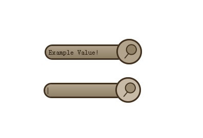
Useful CSS3 and jQuery Search Form

Most websites nowadays have a search form somewhere. I’m pretty sure I don’t need to explain why it’s a good idea to have a ‘search’ functionality built into a website and most Content Management Systems already come with the functionality built in. Usually the search area is in an easy to see/find place and it’s because of this reason it’s a good idea for it to look good – Or at least consistent with the rest of the website.
What should a search-form contain?
There are a few things I like a search-form to have:
- The search form should be consistent with the rest of the website – Which means that the input-field and submit-button should be styled appropriately.
- I think search forms should have a little ‘search’ image somewhere. Images can help people to know what something is without having to read. It’s pretty common to use a magnifying glass.
- People should know that the search form will do exactly that. So I think it’s a good idea to have the word ‘Search’ next to the form or within it.
The HTML
<form action="" id="search-form">
    <fieldset>
        <input type="text" id="search" name="search" />
        <input type="submit" id="search-submit" value="" />
    </fieldset>
</form>
The HTML is pretty standard. I've included action="" because the form will not validate without it and because something should happen once you click submit. So it's there to remind you to add that php.
value="" has been added to the submit buttons because some browsers like to add the text "submit" to the submit button automatically. This tells the browser not to do that.
The CSS
* { margin: 0; padding: 0; }
fieldset { border: none }

#search-form {
	width: 190px;
	position: relative;
}
#search {
	background: #b2a48c;
	border: 3px solid #402f1d;
	color: #2b1e11;
	height: 20px;
	line-height: 20px;
	width: 150px;
	padding: 2px 4px;
	position: absolute;
	top: 11px;
	left: 0
}
#search-submit {
	background: #b2a48c url(../images/search.png) no-repeat 12px 7px;
	border: 3px solid #402f1d;
	height: 50px;
	width: 50px;
	position: absolute;
	top: 0;
	right: 0
}

.empty {
	color: #524630;
}

/* CSS3 */
#search { border-radius: 20px;
	-moz-border-radius: 20px;
	-webkit-border-radius: 20px;
	background: -webkit-gradient(linear, left top, left bottom, from(#b2a48c), to(#9b8d74));
	background: -moz-linear-gradient(top, #b2a48c, #9b8d74);
	text-shadow: rgba(0,0,0,.2) 0 0 5px;
}

#search-submit {
	border-radius: 50px;
	-moz-border-radius: 50px;
	-webkit-border-radius: 50px;
	-mox-box-shadow: 0 0 5px black;

	/* Webkit-transition */
	-webkit-transition-property: background-color;
	-webkit-transition-duration: 0.4s, 0.4s;
	-webkit-transition-timing-function: linear, ease-in;
	}
I generally separate the CSS3 properties from the CSS2.1 like I've done above. It's just how I like writing my CSS.
The first two lines are a quick css-reset.
I've set the input field's line height to the height of itself so that the text will be forced to be centred in all browsers.
What I've done is given the form a set width and given it a relative positioning - The other items have been absolutely positioned so that the search-button can be placed on top of the input field. I've done this because I think it looks pretty cool.
The class of .empty was added to change the colour of the placeholder text.
The webkit-transition property is pretty cool. Have a look at the example in Chrome or Safari.
And that's about it. The javascript is an optional part of the tutorial to add a little bit more of an 'edge' to the form.
The jQuery Javascript
The javascript is used to achieve the word "Search.." that displays within the input field. If the input field is clicked and it contains the word "Search...", the input field is then emptied. If the input-field loses the focus and it is empty, the input field's value is changed back to "Search...".
I'm pretty sure you have seen this somewhere before, it's not really anything new, but it's a cool little space-saving addition to a search-form.
$(document).ready(function(){

	// Add the value of "Search..." to the input field and a class of .empty
	$("#search").val("Search...").addClass("empty");

	// When you click on #search
	$("#search").focus(function(){

		// If the value is equal to "Search..."
		if($(this).val() == "Search...") {
			// remove all the text and the class of .empty
			$(this).val("").removeClass("empty");;
		}

	});

	// When the focus on #search is lost
	$("#search").blur(function(){

		// If the input field is empty
		if($(this).val() == "") {
			// Add the text "Search..." and a class of .empty
			$(this).val("Search...").addClass("empty");
		}

	});

});
And that’s it!
The article source:http://css-plus.com/2010/06/create-a-search-form-with-css3-and-jquery/
You might also like
Tags
accordion accordion menu animation navigation animation navigation menu carousel checkbox inputs css3 css3 menu css3 navigation date picker dialog drag drop drop down menu drop down navigation menu elastic navigation form form validation gallery glide navigation horizontal navigation menu hover effect image gallery image hover image lightbox image scroller image slideshow multi-level navigation menus rating select dependent select list slide image slider menu stylish form table tabs text effect text scroller tooltips tree menu vertical navigation menu

 Subscribe
 Follow Us
 13 years ago
 6821
6821 1710
1710


