 Subscribe
 Follow Us
Pure CSS3 Social Media Icons
 13 years ago
 18072
18072 2212
2212

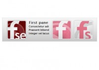
we'll experimenting with CSS3. we decide to recreate some of the social media icons using only CSS and HTML markup. Nothing is new here actually, except we are having fun in doing the icons. And we will share to you the result.
And please not this is only tested in latest version of Webkit and Mozilla (v3.6).
The sample markup used in creating the NetVibes icon.
 <div id="netvibes">
  <div class="netvibes s128 fl">
  <span>+</span>
  </div>
 <div class="netvibes s64 fl">
  <span>+</span>
  </div>
 <div class="netvibes s32 fl">
  <span>+</span>
  </div>
  </div>
The CSS used to style the icon
.netvibes {
    background: rgba(104,219,33,1);
    background : -webkit-gradient(linear, left top, left bottom, from(rgba(104,219,33,1)), to(rgba(19,130,16,1)));
    background : -moz-linear-gradient(top, rgba(104,219,33,1), rgba(19,130,16,1));
    color: #fff;
    text-align: center;
    border-color: #0c5f0c;
    border-style: solid;
    font-weight: bold;
    font-size: 178px;
 box-shadow: 0 0 4px rgba(0,0,0,0.4);
    -moz-box-shadow: 0 0 4px rgba(0,0,0,0.4);
    -webkit-box-shadow: 0 0 4px rgba(0,0,0,0.4);
}

#netvibes .s64 span{
    font-size: 88px;
}

#netvibes .s32 span{
    font-size: 42px;
}

.s128 {
  width: 128px;
  height: 128px;
  border-width: 3px;
  line-height: 128px;
  text-shadow: 0 -2px 0 rgba(0,0,0,0.5);
  border-radius: 10px;
  -moz-border-radius: 10px;
}

.s64 {
  width: 64px;
  height: 64px;
  border-width: 1px;
  line-height: 64px;
  text-shadow: 0 -1px 0 rgba(0,0,0,0.5);
  border-radius: 5px;
  -moz-border-radius: 5px;
}

.s32 {
  width: 32px;
  height: 32px;
  border-width: 1px;
  line-height: 32px;
  text-shadow: 0 -1px 0 rgba(0,0,0,0.5);
  border-radius: 3px;
  -moz-border-radius: 3px;
}
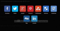
we also created linkedin, urkot, delicious, flickr and google.
we are using the new CSS properties like border-radius, text-shadow, box-shadow and gradients in creating the icons.
A Great tutorial about CSS3 gradients and the benefit of using it, are well explained by Chris Coyier in this post
You might also like
Tags
accordion accordion menu animation navigation animation navigation menu carousel checkbox inputs css3 css3 menu css3 navigation date picker dialog drag drop drop down menu drop down navigation menu elastic navigation form form validation gallery glide navigation horizontal navigation menu hover effect image gallery image hover image lightbox image scroller image slideshow multi-level navigation menus rating select dependent select list slide image slider menu stylish form table tabs text effect text scroller tooltips tree menu vertical navigation menu