Very Beautiful Parallax Slider with jQuery

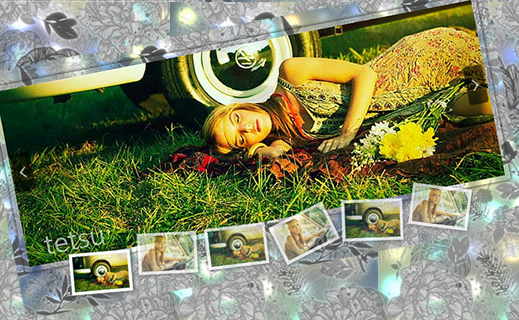
We will kick start 2011 with a vibrant image slider tutorial. We will make use of the parallax principle to move different backgrounds when we slide to an image in order to create some nice perspective. This will give a great depth to the whole slider when it’s in motion.
The Markup
The HTML structure is going to consist of a main container with the class “pxs_container”. We will add a wrapper for the three different backgrounds which we will animate differently to create the parallax. The background images will have some transparency since we want to see them moving on top of each other.
We will also add a loading element and the two unordered lists for the full images and the thumbnails. Further, we will add the navigation elements.
<div id="pxs_container" class="pxs_container">
 <div class="pxs_bg">
  <div class="pxs_bg1"></div>
  <div class="pxs_bg2"></div>
  <div class="pxs_bg3"></div>
 </div>
 <div class="pxs_loading">Loading images...</div>
 <div class="pxs_slider_wrapper">
  <ul class="pxs_slider">
   <li><img src="images/1.jpg" alt="First Image" /></li>
   <li><img src="images/2.jpg" alt="Second Image" /></li>
   ...
  </ul>
  <div class="pxs_navigation">
   <span class="pxs_next"></span>
   <span class="pxs_prev"></span>
  </div>
  <ul class="pxs_thumbnails">
   <li><img src="images/thumbs/1.jpg" alt="First Image" /></li>
   <li><img src="images/thumbs/2.jpg" alt="Second Image" /></li>
   ...
  </ul>
 </div>
</div>
Now, let’s take a look at the style.
The CSS
We will start with the main container. Since we will use the whole page for the width of the slider, we will set it to 100%. It will be of position relative because we will set all the element inside to position absolute (and we want them to be positioned relative to the container and not the page):
.pxs_container{
 width:100%;
 height:420px;
 position:relative;
 border-top:7px solid #333;
 border-bottom:7px solid #333;
 overflow:hidden;
 -moz-box-shadow:0px 0px 7px #000;
 -webkit-box-shadow:0px 0px 7px #000;
 box-shadow:0px 0px 7px #000;
}
The wrapper for the divs that will contain the parallax backgrounds will have a repeated background image. This image is just a simple gradient:
.pxs_bg{
 background:transparent url(../images/bg.png) repeat top left;
}
The divs inside of the wrapper will share the following style properties:
.pxs_bg div{
 position:absolute;
 top:0px;
 left:0px;
 height:420px;
 background-repeat:repeat;
 background-position:top left;
 background-color:transparent;
}
The width will be set dynamically in the JavaScript. The single background divs will have all a different background image:
.pxs_bg .pxs_bg1{
 background-image:url(../images/bg1.png);
}
.pxs_bg .pxs_bg2{
 background-image:url(../images/bg2.png);
}
.pxs_bg .pxs_bg3{
 background-image:url(../images/bg3.png);
}
We will also set the left value of these divs dynamically. But we will come back to that later. Let’s take a look at the other elements’ style.
The following wrapper will be invisible in the beginning:
.pxs_slider_wrapper{
 display:none;
}
It contains all the elements that we want to load in the beginning, so once loading is done, we will show the wrapper and all its content.
Let’s reset the style for both lists:
.pxs_container ul{
 margin:0px;
 padding:0px;
 list-style:none;
}
The main idea for the slider list is that we make a really long list with all the li elements having a width of the whole window. So, what you see on screen of the slider is actually one whole li. We will set the width of the ul dynamically to be the window width times the number of images in the list. Making the li elements float left and the correct width of the ul will ensure that the li elements are lined up next to each other:
ul.pxs_slider{
 position:absolute;
 left:0px;
 top:0px;
 height:420px;
}
ul.pxs_slider li{
 height:420px;
 float:left;
 position:relative;
}
The slider image inside of the li will be centered horizontally by applying auto margins to the left and right:
ul.pxs_slider li img{
 display:block;
 margin:35px auto 0px auto;
 -moz-box-shadow:0px 0px 7px #222;
 -webkit-box-shadow:0px 0px 7px #222;
 box-shadow:0px 0px 7px #222;
 border: 8px solid transparent;
 -moz-border-radius:4px;
 -webkit-border-radius:4px;
 border-radius:4px;
}
Adding a transparent border and a box shadow will create a glass like effect around the image.
The thumbnails list will be positioned absolutely, too. We add a left of 50% because we want to center it, by dynamically setting its width and a negative left margin in the [removed]
ul.pxs_thumbnails{
 height:35px;
 position:absolute;
 top:320px;
 left:50%;
}
ul.pxs_thumbnails li{
 position:absolute;
 display:block;
}
We’ll add a white border around the thumbnails and give them a slick box shadow:
ul.pxs_thumbnails li img{
 border: 5px solid #FFFFFF;
 -moz-box-shadow:1px 1px 7px #555;
 -webkit-box-shadow:1px 1px 7px #555;
 box-shadow:1px 1px 7px #555;
 cursor:pointer;
 display:block;
 opacity:0.7;
}
The current image’s thumbnails should be completely opaque:
ul.pxs_thumbnails li.selected img{
 opacity:1.0;
}
The common style of the two navigation spans is the following:
.pxs_navigation span{
 position:absolute;
 width:30px;
 height:60px;
 -moz-box-shadow:0px 0px 2px #000;
 -webkit-box-shadow:0px 0px 2px #000;
 box-shadow:0px 0px 2px #000;
 top:145px;
 opacity:0.6;
 -moz-border-radius:4px;
 -webkit-border-radius:4px;
 border-radius:4px;
 cursor:pointer;
}
.pxs_navigation span:hover{
 opacity:0.9;
}
Let’s add an arrow to each navigation span:
.pxs_navigation span.pxs_prev{
 background:#000 url(../images/prev.png) no-repeat center center;
}
.pxs_navigation span.pxs_next{
 background:#000 url(../images/next.png) no-repeat center center;
}
We will set the left (pxs_prev) and the right (pxs_next) value dynamically in order to stick to the left and right side of the image.
And finally, we will style the loading element which will be centered:
.pxs_loading{
 color:#fff;
 font-size:20px;
 padding:15px 15px 15px 50px;
 position:absolute;
 background:#333 url(../images/ajax-loader.gif) no-repeat 10px 50%;
 -moz-border-radius:15px;
 -webkit-border-radius:15px;
 border-radius:15px;
 opacity:0.7;
 width:180px;
 position:absolute;
 top:150px;
 left:50%;
 margin-left:-90px;
}
And that’s all the style! Now, let’s add some kick-ass jQuery!
The JavaScript
The main idea of this slider is to slide the images (obviously) and to animate the three backgrounds differently to create some perspective. So, when we, for example, slide to the next image, we will animate the left value of the slider ul to minus the window width (because that’s the width of one li). We will also animate the background div that is visually the top-most background, but the animation will only be half of the window width. The background behind that one will move one quarter of the window width and so on. So the background which is “more far” will move less, just what the parallax principle describes.
We want to create a plugin out of this script, so we will initially define some options. We will start by caching the most important elements.
(function($) {
 $.fn.parallaxSlider = function(options) {
  var opts = $.extend({}, $.fn.parallaxSlider.defaults, options);
  return this.each(function() {
   var $pxs_container  = $(this),
   o     = $.meta ? $.extend({}, opts, $pxs_container.data()) : opts;

   //the main slider
   var $pxs_slider  = $('.pxs_slider',$pxs_container),
   //the elements in the slider
   $elems   = $pxs_slider.children(),
   //total number of elements
   total_elems  = $elems.length,
   //the navigation buttons
   $pxs_next  = $('.pxs_next',$pxs_container),
   $pxs_prev  = $('.pxs_prev',$pxs_container),
   //the bg images
   $pxs_bg1  = $('.pxs_bg1',$pxs_container),
   $pxs_bg2  = $('.pxs_bg2',$pxs_container),
   $pxs_bg3  = $('.pxs_bg3',$pxs_container),
   //current image
   current   = 0,
   //the thumbs container
   $pxs_thumbnails = $('.pxs_thumbnails',$pxs_container),
   //the thumbs
   $thumbs   = $pxs_thumbnails.children(),
   //the interval for the autoplay mode
   slideshow,
   //the loading image
   $pxs_loading = $('.pxs_loading',$pxs_container),
   $pxs_slider_wrapper = $('.pxs_slider_wrapper',$pxs_container);

   //first, preload all the images
   var loaded  = 0,
   $images  = $pxs_slider_wrapper.find('img');

   $images.each(function(){
    var $img = $(this);
    $('<img/>').load(function(){
     ++loaded;
     if(loaded == total_elems*2){
      $pxs_loading.hide();
      $pxs_slider_wrapper.show();

      //width of an image
      //(assuming all images have the same sizes)
      var one_image_w  = $pxs_slider.find('img:first').width();

      /*
      set the width of the slider,
      of each one of its elements, and of the
      navigation buttons
       */
      setWidths($pxs_slider,
      $elems,
      total_elems,
      $pxs_bg1,
      $pxs_bg2,
      $pxs_bg3,
      one_image_w,
      $pxs_next,
      $pxs_prev);

      /*
      set the widths of the thumbs
      and spread them evenly
       */
      $pxs_thumbnails.css({
       'width'   : one_image_w + 'px',
       'margin-left'  : -one_image_w/2 + 'px'
      });
      var spaces = one_image_w/(total_elems+1);
      $thumbs.each(function(i){
       var $this  = $(this);
       var left = spaces*(i+1) - $this.width()/2;
       $this.css('left',left+'px');

       if(o.thumbRotation){
        var angle  = Math.floor(Math.random()*41)-20;
        $this.css({
         '-moz-transform' : 'rotate('+ angle +'deg)',
         '-webkit-transform' : 'rotate('+ angle +'deg)',
         'transform'   : 'rotate('+ angle +'deg)'
        });
       }
       //hovering the thumbs animates them up and down
       $this.bind('mouseenter',function(){
        $(this).stop().animate({top:'-10px'},100);
       }).bind('mouseleave',function(){
        $(this).stop().animate({top:'0px'},100);
       });
      });

      //make the first thumb to be selected
      highlight($thumbs.eq(0));

      //slide, when clicking the navigation buttons
      $pxs_next.bind('click',function(){
       ++current;
       if(current >= total_elems)
        if(o.circular)
         current = 0;
       else{
        --current;
        return false;
       }
       highlight($thumbs.eq(current));
       slide(current,
       $pxs_slider,
       $pxs_bg3,
       $pxs_bg2,
       $pxs_bg1,
       o.speed,
       o.easing,
       o.easingBg);
      });
      $pxs_prev.bind('click',function(){
       --current;
       if(current < 0)
        if(o.circular)
         current = total_elems - 1;
       else{
        ++current;
        return false;
       }
       highlight($thumbs.eq(current));
       slide(current,
       $pxs_slider,
       $pxs_bg3,
       $pxs_bg2,
       $pxs_bg1,
       o.speed,
       o.easing,
       o.easingBg);
      });

      /*
      clicking a thumb will slide to the respective image
       */
      $thumbs.bind('click',function(){
       var $thumb = $(this);
       highlight($thumb);
       //if autoplay interrupt when user clicks
       if(o.auto)
        clearInterval(slideshow);
       current  = $thumb.index();
       slide(current,
       $pxs_slider,
       $pxs_bg3,
       $pxs_bg2,
       $pxs_bg1,
       o.speed,
       o.easing,
       o.easingBg);
      });

      /*
      activate the autoplay mode if
      that option was specified
       */
      if(o.auto != 0){
       o.circular = true;
       slideshow = setInterval(function(){
        $pxs_next.trigger('click');
       },o.auto);
      }

      /*
      when resizing the window,
      we need to recalculate the widths of the
      slider elements, based on the new window width;
      we need to slide again to the current one,
      since the left of the slider is no longer correct
       */
      $(window).resize(function(){
       w_w = $(window).width();
       setWidths(
        $pxs_slider,
        $elems,
        total_elems,
        $pxs_bg1,
        $pxs_bg2,
        $pxs_bg3,
        one_image_w,
        $pxs_next,
        $pxs_prev
        );
       slide(
        current,
        $pxs_slider,
        $pxs_bg3,
        $pxs_bg2,
        $pxs_bg1,
        1,
        o.easing,
        o.easingBg
        );
      });

     }
    }).error(function(){
     alert('here')
    }).attr('src',$img.attr('src'));
   });
  });
 };

 //the current window width
 var w_w    = $(window).width();

 var slide   = function(current,
 $pxs_slider,
 $pxs_bg3,
 $pxs_bg2,
 $pxs_bg1,
 speed,
 easing,
 easingBg){
  var slide_to = parseInt(-w_w * current);
  $pxs_slider.stop().animate({
   left : slide_to + 'px'
  },speed, easing);
  $pxs_bg3.stop().animate({
   left : slide_to/2 + 'px'
  },speed, easingBg);
  $pxs_bg2.stop().animate({
   left : slide_to/4 + 'px'
  },speed, easingBg);
  $pxs_bg1.stop().animate({
   left : slide_to/8 + 'px'
  },speed, easingBg);
 }

 var highlight  = function($elem){
  $elem.siblings().removeClass('selected');
  $elem.addClass('selected');
 }

 var setWidths  = function($pxs_slider,
 $elems,
 total_elems,
 $pxs_bg1,
 $pxs_bg2,
 $pxs_bg3,
 one_image_w,
 $pxs_next,
 $pxs_prev){
  /*
  the width of the slider is the window width
  times the total number of elements in the slider
   */
  var pxs_slider_w = w_w * total_elems;
  $pxs_slider.width(pxs_slider_w + 'px');
  //each element will have a width = windows width
  $elems.width(w_w + 'px');
  /*
  we also set the width of each bg image div.
  The value is the same calculated for the pxs_slider
   */
  $pxs_bg1.width(pxs_slider_w + 'px');
  $pxs_bg2.width(pxs_slider_w + 'px');
  $pxs_bg3.width(pxs_slider_w + 'px');

  /*
  both, the right and left of the
  navigation next and previous buttons will be:
  windowWidth/2 - imgWidth/2 + some margin
  (not to touch the image borders)
   */
  var position_nav = w_w/2 - one_image_w/2 + 3;
  $pxs_next.css('right', position_nav + 'px');
  $pxs_prev.css('left', position_nav + 'px');
 }

 $.fn.parallaxSlider.defaults = {
  auto   : 0,
  speed   : 1000,
  easing   : 'jswing',
  easingBg  : 'jswing',
  circular  : true,
  thumbRotation : true
 };
 //easeInOutExpo,easeInBack
})(jQuery);
We also add the following script to initiate our slider:
$(function() {
 var $pxs_container = $('#pxs_container');
 $pxs_container.parallaxSlider();
});
The options for the slider are the following:
- auto: How many seconds to periodically slide the content. If set to 0 then autoplay is turned off.
- speed: Speed of each slide animation
- easing: Easing effect for the slide animation
- easingBg: Easing effect for the background animation
- circular: Circular slider
- thumbRotation: The thumbs will be randomly rotated
And that’s all! We hope you enjoyed the tutorial and find it useful!
You might also like
Tags
accordion accordion menu animation navigation animation navigation menu carousel checkbox inputs css3 css3 menu css3 navigation date picker dialog drag drop drop down menu drop down navigation menu elastic navigation form form validation gallery glide navigation horizontal navigation menu hover effect image gallery image hover image lightbox image scroller image slideshow multi-level navigation menus rating select dependent select list slide image slider menu stylish form table tabs text effect text scroller tooltips tree menu vertical navigation menu

 Subscribe
 Follow Us
 14 years ago
 46070
46070 8774
8774


