Custom Content Slider with jQuery
 14 years ago
  15825
15825  2976
2976
 n/a
n/a

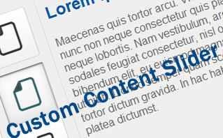
create a custom content slider. The concept behind it is pretty simple, when you click on a button, it uses jQuery scroll-To plugin to scoll the content and display the right content.
1. HTML
HTML is a little bit long this time. Basically, it has two sections:
- UL List: This is the list of buttons, you can add as many as you want, or style the layout the way you want.
- Slider: Slider is where we put all the content for the panels, in this case, we have 3 panels with unique ID panel-1, panel-2 and panel-3. We hide the panel with overflow hidden set in the Mask Div.
<div id="hero-slider">
 <ul>
  <li><a href="#" rel="#panel-1" class="active">Item 1</a></li>
  <li><a href="#" rel="#panel-2">Item 2</a></li>
  <li><a href="#" rel="#panel-3">Item 3</a></li>
 </ul>
 <div class="mask">
  <div class="slider-body">
   <div class="panel" id="panel-1">
    <h2>Title 1</h2>
    <p>Paragraph</p>
   </div>
   <div class="panel" id="panel-2">
    <h2>Title 2</h2>
    <p>Paragraph</p>
   </div>
   <div class="panel" id="panel-3">
    <h2>Title 3</h2>
    <p>Paragraph</p>
   </div>
  </div>
 </div> <!-- .mask -->
 <div class="clear"></div>
</div> <!-- #hero-slider -->
2. CSS
The only tricky part of the CSS would be the mask. You have to make sure it has overflow set to hidden to hide panels. Also, the dimension of the panel and mask must be the same.
#hero-slider {
 text-align:left;
 background-color:#efefef;
 border:1px solid #ccc; width:450px;
 -moz-border-radius:10px;
 -webkit-border-radius:10px;
 margin:0 auto;
 font-family:arial;
}

#hero-slider .mask {
 float:left;
 width:300px;
 height:280px;
 margin:15px 0 0 10px;
 overflow:hidden;
}

#hero-slider .panel {
 width:300px;
 height:280px;
 text-align:left;
}

#hero-slider ul {
 margin:0;
 padding:15px 15px 0 15px;
 list-style:none;
 float:left;
 border-right:1px solid #dedede;
 height:285px;
}

#hero-slider ul li {
 margin:10px 0;
}

#hero-slider ul a {
 outline:none;
 text-decoration: underline;
 display:block;
 width:75px;
 height:74px;
 text-indent:-999em;
}

#hero-slider a {
 background: url(button.png) no-repeat 0 0;
}

#hero-slider ul a.active {
 background-position: -75px;
}

.panel h2 {
 padding:15px 0 0 0;
 color:#0058a9;
}

.panel p {
 color:#666;
}

.clear {clear:both}
3. Javascript
Javascript is short and simple, I have added comments to explain every line of the javascript
//append click event to the UL list anchor tag
$('#hero-slider ul a').click(function () {

 //reset all the items
 $('#hero-slider ul a').removeClass('active');

 //set current item as active
 $(this).addClass('active');

 //scroll it to the right position
 $('.mask').scrollTo($(this).attr('rel'), 300);

 //disable click event
    return false;

});
Conclusion
That's it, a simple script that will able to make your website more interactive. Most importantly, it able to help you use the space wisely and display information in an interesting way. It's simple, and I believe it will be pretty handy for your upcoming web projects.
You might also like
Tags
accordion accordion menu animation navigation animation navigation menu carousel checkbox inputs css3 css3 menu css3 navigation date picker dialog drag drop drop down menu drop down navigation menu elastic navigation form form validation gallery glide navigation horizontal navigation menu hover effect image gallery image hover image lightbox image scroller image slideshow multi-level navigation menus rating select dependent select list slide image slider menu stylish form table tabs text effect text scroller tooltips tree menu vertical navigation menu

 Subscribe
 Follow Us


