Simplism jQuery Facebook-like dialog/overlay

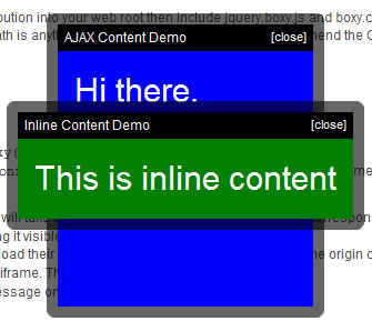
Boxy is a flexible, Facebook-style dialog box for jQuery with support for dragging and size tweening. It differs from other overlays I've seen by providing an object interface to control dialogs after they've been created. And for simple usage scenarios, boxy also provides a jQuery plugin for automatically hooking up links and forms, as well as an ask() helper for presenting multiple choices to the user.
Setup
Drop the assets in the src directory of the distribution into your web root then include jquery.boxy.js and boxy.css in your page. If your images directory's absolute path is anything other than /images/ you'll need to amend the CSS file accordingly.
We're good to go now.
Using the jQuery Plugin
To use the jQuery plugin, put $(selector).boxy(); in your document.ready, substituting "selector" as appropriate, e.g. "a[rel=boxy],form.with-confirmation". This will attach behaviours to matched elements as follows:
- Anchors with an
hrefattribute containing#will take as their content the DOM element with the corresponding ID, adding the classboxy-contentand making it visible in the process. - Anchors with any other
hrefwill attempt to load their content with AJAX. Ideally, we'd have a same origin check and delegate cross-domain requests to an iframe. That one's on the to-do list. - Forms will display a modal confirmation message on submit.
- All other elements are ignored.
<script type='text/javascript'>
$(function() {
  $('.boxy').boxy();
});
</script>
Note that boxy automatically works out the size of your inner content region and positions itself appropriately; there's no need to explicitly set the dimensions of the wrapper.
The plugin method understands a single option; any other options are passed onto boxy's constructor (see constructor options, below), or for AJAX operations, Boxy.load.
| Option | Description | Default |
|---|---|---|
message |
Message displayed for form confirmation hooks. | "Please confirm:" |
Additionally, the title attribute of each matched anchor will be used as the title of its corresponding dialog.
Creating Instances Manually
Using boxy in manual mode is easy - just create a new instance of Boxy, passing the inner content and a hash of any additional options. By default, dialogs will become visible immediately, centred in the viewport, with dragging enabled. All of these settings can be overridden by additional options passed to the constructor - see constructor options, below, for more details.
The content passed to the constructor can be any valid parameter to jQuery's $() function - a DOM element, an HTML fragment or another jQuery object. Whatever is provided will be set to display: block and have the class boxy-content added prior to its insertion within the dialog.
Asking Questions
Using the Boxy.ask(), Boxy.alert() and Boxy.confirm() helpers it is possible to prompt the user to select from a varying number of choices and fire an optional callback on completion. Click on one of the links below for a demo and refer to the API documentation for more information.
<script type='text/javascript'>
$(function() {
  $('#ask-actuator').click(function() {
    Boxy.ask("How are you feeling?", ["Great", "OK", "Not so good"], function(val) {
      alert("You chose: " + val);
    }, {title: "This is a question..."});
    return false;
  });
  $('#alert-actuator').click(function() {
    Boxy.alert("File not found", null, {title: 'Message'});
    return false;
  });
  $('#confirm-actuator').click(function() {
    Boxy.confirm("Please confirm:", function() { alert('Confirmed!'); }, {title: 'Message'});
    return false;
  });
});
</script>
API
- Boxy.load(url, options)
- Load content from a URL and display in a Boxy dialog. The following options are supported:
type- HTTP method, defaults toGET.cache- iftrue, cache content for successive calls. Equivalent to passingcacheoption to jQuery'sajaxmethod. Default:false.filter- jQuery expression used to filter remote content.
(any additional options you specify will be passed to the Boxy constructor)
- Boxy.get(element)
- Returns the Boxy instance containing
element, e.g.<a href="#" onclick="Boxy.get(this).hide();">Close dialog</a>. - Boxy.ask(question, answers, callback, options)
- Displays a modal, non-closeable dialog allowing the user to select from a set of options.
questionis the message to be displayed to the user.answersis an array or hash of all possible responses.callbackwill receive the selected response; this will be the value or corresponding key depending on whether an array or hash of answers was provided.optionsis an optional set of additional options to be passed to the dialog's constructor. - Boxy.alert(message, callback, options)
- Displays a modal, non-closeable dialog displaying a message to the user.
Note: this method is not intended to replace the nativewindow.alert()function provided by browsers as it does not have the capability to block program execution while the dialog is visible. - Boxy.confirm(message, callback, options)
- Displays a modal, non-closeable dialog displaying a message with OK and Cancel buttons. Callback will only be fired if user selects OK.
Note: this method is not intended to replace the nativewindow.confirm()function provided by browsers as it does not have the capability to block program execution while the dialog is visible. - Boxy.linkedTo(ele)
- Returns the Boxy instance which has been linked to DOM element
elevia theactuatorconstructor option. - Boxy.isModalVisible()
- Returns
trueif any modal dialog is currently visible,falseotherwise. - new Boxy(element, options)
- Constructor; create a new Boxy dialog.
elementis the dialog content; any valid parameter to jQuery's$()function is also valid here.optionsis a hash of configuration options, see the detailed documentation below. - estimateSize()
- Estimate the size of the dialog box while invisible. Do not use this method if dialog is currently visible; use
getSize()instead. - getSize()
- Returns the size of the dialog as an array of
[width, height]. - getContentSize()
- Returns the size of the dialog's content region - by default this is everything within the dialog's frame, excluding title bar.
- getPosition()
- Returns the co-ords of the dialog's top-left as an array of
[x,y]. - getCenter()
- Returns the co-ords of the dialog's center as an array of
[x,y]. - getInner()
- Returns a jQuery object wrapping the dialog's inner region - everything inside the frame, including the title bar. Chances are you want
getContent(), below, instead. - getContent()
- Returns a jQuery object wrapping the dialog's content region - everything inside the frame, excluding the title bar.
- setContent(newContent)
- Sets the dialog content; any valid parameter to
$()is valid fornewContent. Chainable. - moveTo(x,y)
- Moves the dialog so that its top-left is at (x,y). Make either value
nullto center on a single co-ordinate. Chainable. - centerAt(x,y)
- Moves the dialog so that its center is at (x,y). Chainable.
- center(axis)
- Moves the dialog so that it is centered in the viewport. Optional parameter
axiscan be'x'or'y'to center on a single axis only. Chainable. - resize(w,h,after)
- Resizes the dialog to [w,h], firing optional callback
afteron completion. The callback will receive the Boxy instance as an argument. Chainable. - tween(w,h,after)
- Tweens the dialog to [w,h], firing optional callback
afteron completion. The callback will receive the Boxy instance as an argument. Chainable. - isVisible()
- Returns
trueif this dialog is currently visible,falseotherwise. - show()
- Show the dialog. Chainable.
- hide(after)
- Hide the dialog, firing optional callback
afteron completion. Chainable. - toggle()
- Toggle visibility of the dialog. Chainable.
- hideAndUnload(after)
- Hide the dialog and then immediately unload.
aftercallback will be fired before unloading. Chainable. - unload()
- Remove this dialog from the DOM and sever its actuator link, if any. Once a dialog has been unloaded any further operations on it are undefined.
- toTop()
- Move this dialog above all others. Chainable.
- getTitle()
- Returns the title for this dialog as HTML.
- setTitle(t)
- Sets the title HTML of this dialog to
t. Chainable.
Complete list of constructor options
| Option | Description | Default |
|---|---|---|
title |
Title to display in auto-generated title bar. | null |
closeable |
Whether a close-dialog actuator should be added to the auto-generated title bar. No effect if title is unspecified. | true |
closeText |
Text to use for close link in title bar, if enabled. | "[close]" |
draggable |
Whether this dialog should be draggable via the titlebar. No effect if title is unspecified. | true |
clone |
Should the dialog's content element and event handlers be cloned before being placed in the inner region? | false |
actuator |
DOM element (not jQuery object) which triggered this dialog. A link between the two will be set up allowing a reference to the dialog to be later retrieved from the element by doing Boxy.linkedTo(element). The link will be automatically severed when the dialog is unloaded. |
null |
center |
Should the dialog be centred on screen? | true |
fixed |
Should we use fixed, rather than absolute, positioning? Dialogs with fixed positions will on-screen irrespective of scrolling. IE6 does not support fixed positioning and will always drop back to absolute. | true |
show |
Should the dialog be shown immediately? If false, you'll need to call dialog.show() manually. |
true |
modal |
Should the dialog be modal? Modal dialogs "black out" the screen, preventing other elements from receiving events. | false |
x |
x (left) coordinate of dialog. Passing this option overrides center. Pass null to center on this coordinate only. |
50 |
y |
y (top) coordinate of dialog. Passing this option overrides center. Pass null to center on this coordinate only. |
50 |
unloadOnHide |
If true, this dialog will be unloaded (e.g. removed from the DOM) after it is hidden. | false |
clickToFront |
If true, clicking anywhere on this dialog (as opposed to the just the title bar) will cause it to come to the top. |
false |
behaviours |
Function used to apply custom behaviours to dialog content. Invoked after each call to setContent(), and executes in the context of the Boxy object. Will receive a jQuery object wrapping the content region as a parameter. |
function(r) {} |
afterDrop |
Callback invoked after this dialog has been dropped; executes in the context of the Boxy object. |
function() {} |
afterShow |
Callback invoked after this dialog becomes visible; executes in the context of the Boxy object. Can be used to focus on form inputs. |
function() {} |
afterHide |
Callback invoked after this dialog is hidden; executes in the context of the Boxy object. |
function() {} |
beforeUnload |
Callback invoked before this dialog is unloaded; executes in the context of the Boxy object. |
function() {} |
CSS Selectors
Boxy's appearance can be fully customized via CSS; here's a list of the selectors you're likely to be interested in.
- .boxy-wrapper .title-bar
divwrapping the auto-generated title bar.- .boxy-wrapper .title-bar h2
- Contents of the title bar.
- .boxy-wrapper .title-bar.dragging
- Title bar while with drag in progress.
- .boxy-wrapper .title-bar .close
- Default close-dialog actuator
- .boxy-inner
- Internal region, including title bar.
- .boxy-content
- Internal region, excluding title bar. This class will be automatically added to any element passed to Boxy's constructor.
- .boxy-wrapper .question
- Wraps question text for dialogs created via
Boxy.ask(). - .boxy-wrapper .answers
- Wraps response buttons for dialogs created via
Boxy.ask(). - .close
- Any elements with this class will be hooked up to close the dialog on click.
TODO
- Ability to pass display options via URL like Thickbox and Facebox, e.g. <a href="#foobar?modal=true" rel="boxy">Open dialog</a>
- Fade between "pages" on a dialog, like in OS X preference panes. I've written a tab plugin for this already, hopefully integration will be easy.
You might also like
Tags
accordion accordion menu animation navigation animation navigation menu carousel checkbox inputs css3 css3 menu css3 navigation date picker dialog drag drop drop down menu drop down navigation menu elastic navigation form form validation gallery glide navigation horizontal navigation menu hover effect image gallery image hover image lightbox image scroller image slideshow multi-level navigation menus rating select dependent select list slide image slider menu stylish form table tabs text effect text scroller tooltips tree menu vertical navigation menu

 Subscribe
 Follow Us
 14 years ago
 15355
15355 2524
2524


