Pure CSS3 cool Tables effect

we'll going to show you how to use some neat CSS3 properties to beautify your tables. With so many new selectors we can address specific table cells and rows in order to create a unique style without adding classes to the markup.
We will be applying the -webkit and -moz gradients for creating a great look without images and learn how to insert content into elements with a specific class.
Let’s start with the markup.
The Markup
The following will be our basic table structure:
<table class="table1">
 <thead>
  <tr>
   <th></th>
   <th scope="col" abbr="Starter">Smart Starter</th>
   <th scope="col" abbr="Medium">Smart Medium</th>
   <th scope="col" abbr="Business">Smart Business</th>
   <th scope="col" abbr="Deluxe">Smart Deluxe</th>
  </tr>
 </thead>
 <tfoot>
  <tr>
   <th scope="row">Price per month</th>
   <td>$ 2.90</td>
   <td>$ 5.90</td>
   <td>$ 9.90</td>
   <td>$ 14.90</td>
  </tr>
 </tfoot>
 <tbody>
  <tr>
   <th scope="row">Storage Space</th>
   <td>512 MB</td>
   <td>1 GB</td>
   <td>2 GB</td>
   <td>4 GB</td>
  </tr>
  <tr>
   <th scope="row">Bandwidth</th>
   <td>50 GB</td>
   <td>100 GB</td>
   <td>150 GB</td>
   <td>Unlimited</td>
  </tr>
  <tr>
   <th scope="row">MySQL Databases</th>
   <td>Unlimited</td>
   <td>Unlimited</td>
   <td>Unlimited</td>
   <td>Unlimited</td>
  </tr>
  <tr>
   <th scope="row">Setup</th>
   <td>19.90 $</td>
   <td>12.90 $</td>
   <td>free</td>
   <td>free</td>
  </tr>
  <tr>
   <th scope="row">PHP 5</th>
   <td><span class="check"></span></td>
   <td><span class="check"></span></td>
   <td><span class="check"></span></td>
   <td><span class="check"></span></td>
  </tr>
  <tr>
   <th scope="row">Ruby on Rails</th>
   <td><span class="check"></span></td>
   <td><span class="check"></span></td>
   <td><span class="check"></span></td>
   <td><span class="check"></span></td>
  </tr>
 </tbody>
</table
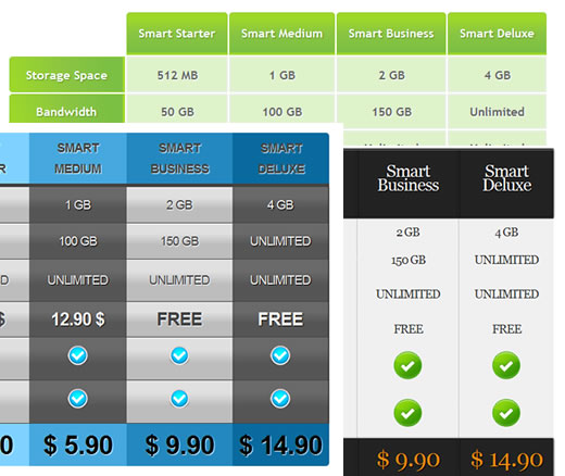
We have all the elements a table needs, a header, a body and a footer. In this tutorial we will use a hosting plan comparison table as example. The three following styles can be applied to this table by changing the class to table1, table2 or table3.
CSS Table 1
The first table will be in green tones with some gradients for the descriptive cells, the “th” elements. Let’s start with the general style for the table:
table.table1{
    font-family: "Trebuchet MS", sans-serif;
    font-size: 16px;
    font-weight: bold;
    line-height: 1.4em;
    font-style: normal;
    border-collapse:separate;
}
We want to have some space between the table cells, so we will make the border-collapse separate.
I usually take the style for the font from Typechart, a really useful site with nice font examples and the CSS code ready for copy.
The th elements of the head will have the following style:
.table1 thead th{
    padding:15px;
    color:#fff;
    text-shadow:1px 1px 1px #568F23;
    border:1px solid #93CE37;
    border-bottom:3px solid #9ED929;
    background-color:#9DD929;
    background:-webkit-gradient(
        linear,
        left bottom,
        left top,
        color-stop(0.02, rgb(123,192,67)),
        color-stop(0.51, rgb(139,198,66)),
        color-stop(0.87, rgb(158,217,41))
        );
    background: -moz-linear-gradient(
        center bottom,
        rgb(123,192,67) 2%,
        rgb(139,198,66) 51%,
        rgb(158,217,41) 87%
        );
    -webkit-border-top-left-radius:5px;
    -webkit-border-top-right-radius:5px;
    -moz-border-radius:5px 5px 0px 0px;
    border-top-left-radius:5px;
    border-top-right-radius:5px;
}
We use the gradient property for Firefox and for Webkit browsers (Safari and Chrome) to create a beautiful gradient with three colors. The border-radius property rounds the top left and top right border of the cells.
Now, we need to take care of that on th that is empty. With CSS3 selectors we can do some incredible things, and this is one of them: select the th that is empty. And this is how:
.table1 thead th:empty{
    background:transparent;
    border:none;
}
The footer of the table will have the following style:
.table1 tfoot td{
    color: #9CD009;
    font-size:32px;
    text-align:center;
    padding:10px 0px;
    text-shadow:1px 1px 1px #444;
}
.table1 tfoot th{
    color:#666;
}
Nothing special about that, just some text shadow to enhance the font.
The inner table cells will have a light green background and a white text shadow for an engraved effect:
.table1 tbody td{
    padding:10px;
    text-align:center;
    background-color:#DEF3CA;
    border: 2px solid #E7EFE0;
    -moz-border-radius:2px;
    -webkit-border-radius:2px;
    border-radius:2px;
    color:#666;
    text-shadow:1px 1px 1px #fff;
}
We also add some very subtle border and border radius to the cells. This will invoke a slight glowing effect. We could also use some box shadow to create a similar effect.
Now, we want to add an icon to all the cells that have a span with the class “check”. With the following CSS with can achieve that:
.table1 tbody span.check::before{
    content : url(../images/check0.png)
}
This property allows us to add some specific content (in this case it is an image) inside of the element. We could have also added some text here. We can say “::before” or “::after” which would insert it after the content.
And that’s all the style for the first table! Let’s take a look at the second one.
CSS Table 2
The second table will be more of the elegant type, with a black header and footer.
This table will not have any space in between the cells, so we collapse it:
table.table2{
    font-family: Georgia, serif;
    font-size: 18px;
    font-style: normal;
    font-weight: normal;
    letter-spacing: -1px;
    line-height: 1.2em;
    border-collapse:collapse;
    text-align:center;
}
The footer and the header are going to have a similar style, so we can define the common properties as follows:
.table2 thead th, .table2 tfoot td{
    padding:20px 10px 40px 10px;
    color:#fff;
    font-size: 26px;
    background-color:#222;
    font-weight:normal;
    border-right:1px dotted #666;
    border-top:3px solid #666;
    -moz-box-shadow:0px -1px 4px #000;
    -webkit-box-shadow:0px -1px 4px #000;
    box-shadow:0px -1px 4px #000;
    text-shadow:0px 0px 1px #fff;
    text-shadow:1px 1px 1px #000;
}
The th of the footer will have this style:
.table2 tfoot th{
    padding:10px;
    font-size:18px;
    text-transform:uppercase;
    color:#888;
}
The footer cells which we already defined together with the header cells, will need a different box shadow. The header box shadow points to the top and the footer one should point to the bottom. We also want to change the color of the text:
.table2 tfoot td{
    font-size:36px;
    color:#EF870E;
    border-top:none;
    border-bottom:3px solid #666;
    -moz-box-shadow:0px 1px 4px #000;
    -webkit-box-shadow:0px 1px 4px #000;
    box-shadow:0px 1px 4px #000;
}
Let’s get back to the header where we still need to define that the empty cell should not have any style:
.table2 thead th:empty{
    background:transparent;
    -moz-box-shadow:none;
    -webkit-box-shadow:none;
    box-shadow:none;
}
We also need to remove the box shadow that we defined for the header elements before.
With the :nth-last-child selector we can select the last cell element in our header and say that it should not have a right border, like the other ones:
.table2 thead :nth-last-child(1){
    border-right:none;
}
With the :first-child selector we can address the first cell in the header, which is empty and we don’t want it to have a border. We also want to remove the border from the last td elements in our table body:
.table2 thead :first-child,
.table2 tbody :nth-last-child(1){
    border:none;
}
Now, lets add some style to the outer left descriptions, the th elements of the table body:
.table2 tbody th{
    text-align:right;
    padding:10px;
    color:#333;
    text-shadow:1px 1px 1px #ccc;
    background-color:#f9f9f9;
}
And the following style will be applied to the other cells:
.table2 tbody td{
    padding:10px;
    background-color:#f0f0f0;
    border-right:1px dotted #999;
    text-shadow:-1px 1px 1px #fff;
    text-transform:uppercase;
    color:#333;
}
Now we just need to insert an icon for the check spans:
.table2 tbody span.check::before{
    content : url(../images/check1.png)
}
CSS Table 3
The third table will have a few more CSS properties since we want all the column headers to have a different color. I will show you how to do that by using selectors only.
The general table style will be the following:
table.table3{
    font-family:Arial;
    font-size: 18px;
    font-style: normal;
    font-weight: normal;
    text-transform: uppercase;
    letter-spacing: -1px;
    line-height: 1.7em;
    text-align:center;
    border-collapse:collapse;
}
The common style for all th cells in the header will be:
.table3 thead th{
    padding:6px 10px;
    text-transform:uppercase;
    color:#444;
    font-weight:bold;
    text-shadow:1px 1px 1px #fff;
    border-bottom:5px solid #444;
}
The empty cell will be treated as follows:
.table3 thead th:empty{
    background:transparent;
    border:none;
}
Now we want to select specific th cells in the header and td cells in the footer to give them a unique color. With the :nth-child(number) we can select the exact child:
.table3 thead :nth-child(2),
.table3 tfoot :nth-child(2){
    background-color: #7FD2FF;
}
.table3 tfoot :nth-child(2){
    -moz-border-radius:0px 0px 0px 5px;
    -webkit-border-bottom-left-radius:5px;
    border-bottom-left-radius:5px;
}
.table3 thead :nth-child(2){
    -moz-border-radius:5px 0px 0px 0px;
    -webkit-border-top-left-radius:5px;
    border-top-left-radius:5px;
}
.table3 thead :nth-child(3),
.table3 tfoot :nth-child(3){
    background-color: #45A8DF;
}
.table3 thead :nth-child(4),
.table3 tfoot :nth-child(4){
    background-color: #2388BF;
}
.table3 thead :nth-child(5),
.table3 tfoot :nth-child(5){
    background-color: #096A9F;
}
.table3 thead :nth-child(5){
    -moz-border-radius:0px 5px 0px 0px;
    -webkit-border-top-right-radius:5px;
    border-top-right-radius:5px;
}
.table3 tfoot :nth-child(5){
    -moz-border-radius:0px 0px 5px 0px;
    -webkit-border-bottom-right-radius:5px;
    border-bottom-right-radius:5px;
}
We also added a border radius to the selected corner cells.
The common style for all the td cells in the footer will be:
.table3 tfoot td{
    font-size:38px;
    font-weight:bold;
    padding:15px 0px;
    text-shadow:1px 1px 1px #fff;
}
Let’s add some padding to the cells:
.table3 tbody td{
    padding:10px;
}
We want the row of the prices for the setup to have a stronger font:
.table3 tbody tr:nth-child(4) td{
    font-size:26px;
    font-weight:bold;
}
The columns of the body of the table should have altering styles, so we will use again the :nth-child selector but this time with the values “even” and “odd”:
.table3 tbody td:nth-child(even){
    background-color:#444;
    color:#444;
    border-bottom:1px solid #444;
    background:-webkit-gradient(
        linear,
        left bottom,
        left top,
        color-stop(0.39, rgb(189,189,189)),
        color-stop(0.7, rgb(224,224,224))
        );
    background:-moz-linear-gradient(
        center bottom,
        rgb(189,189,189) 39%,
        rgb(224,224,224) 70%
        );
    text-shadow:1px 1px 1px #fff;
}
.table3 tbody td:nth-child(odd){
    background-color:#555;
    color:#f0f0f0;
    border-bottom:1px solid #444;
    background:-webkit-gradient(
        linear,
        left bottom,
        left top,
        color-stop(0.39, rgb(85,85,85)),
        color-stop(0.7, rgb(105,105,105))
        );
    background:-moz-linear-gradient(
        center bottom,
        rgb(85,85,85) 39%,
        rgb(105,105,105) 70%
        );
    text-shadow:1px 1px 1px #000;
}
We also add a right border to the last tds in a row:
.table3 tbody td:nth-last-child(1){
    border-right:1px solid #222;
}
The left description is going to have the following style:
.table3 tbody th{
    color:#696969;
    text-align:right;
    padding:0px 10px;
    border-right:1px solid #aaa;
}
Just the check icon is left:
.table3 tbody span.check::before{
    content : url(../images/check2.png)
}
And that’s it! Three differently styled tables with pure CSS!
You might also like
Tags
accordion accordion menu animation navigation animation navigation menu carousel checkbox inputs css3 css3 menu css3 navigation date picker dialog drag drop drop down menu drop down navigation menu elastic navigation form form validation gallery glide navigation horizontal navigation menu hover effect image gallery image hover image lightbox image scroller image slideshow multi-level navigation menus rating select dependent select list slide image slider menu stylish form table tabs text effect text scroller tooltips tree menu vertical navigation menu

 Subscribe
 Follow Us
 14 years ago
 35436
35436 4135
4135


