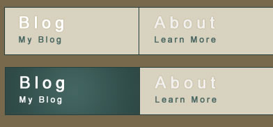
jQuery sprite Fade Navigation Menu

What is a sprite?
In case you aren’t sure, a CSS sprite is a large image, made up of all the smaller images you wish to use on your webpage. The benefits of using CSS sprites include:
- Page load speed
- Reduces HTTP requests
- Each image file contains extra unnecessary information. Using one image saves on file size.
- Save on editing time
- If I’m working on a navigation menu and I need to edit the hover states in photoshop, all I do is edit one of the layer styles and paste it over the rest of the button hover states, save and all is done. Doing this takes a matter of seconds.
- Easier to organize
- The more files there are, the greater the margin for confusion and error is. Also, I don’t enjoy a messy work environment.
Step 1 – The HTML
Alright, let’s get started.
First thing we need to do is create the html.
<ul id="nav">
<li class="home"><a href="#">Blog</a></li>
<li class="about"><a href="#">About</a></li>
<li class="contact"><a href="#">Contact</a></li>
<li class="freebies"><a href="#">Freebies</a></li>
</ul>
It is a very simple unordered list and I have given each of the list items class names so that we can target them individually.
We give the CSS the x and y co-ordinates of our sprite, this is how it knows which area to look at. Since each list item has a different class, we can target each of them and give them different sprite background-positions.
Step 2 – The CSS
I always import a css reset. I use a modified version of Eric Mayer’s CSS reset which include with these downloads.
ul#nav li, ul#nav li a { background: url(../images/nav-sprite.png) no-repeat left top; height: 67px; width: 192px; } /* We give the <li> and <a> the sprite as the background and set the button dimensions */
ul#nav li { float: left; border: 1px solid #243e3b; border-left: none; }
ul#nav li.home { border-left: 1px solid #243e3b; }
ul#nav li a { display: block; text-indent: -9999px; }

ul#nav li.home a { background-position: -1px -1px; } /* Here we set the background/sprite position */
ul#nav li.about a { background-position: -194px -1px; }
ul#nav li.contact a { background-position: -387px -1px; }
ul#nav li.freebies a { background-position: -580px -1px; }

ul#nav li.home a:hover { background-position: -1px -69px; } /* And now the hover background-position position */
ul#nav li.about a:hover { background-position: -194px -69px; }
ul#nav li.contact a:hover { background-position: -387px -69px; }
ul#nav li.freebies a:hover { background-position: -580px -69px; }
Step 3 – The jQuery
Before we do anything more, remember to always include the jQuery library when using any jQuery plugins or code.
We have to slightly modify the CSS before we can make us of the cool fade effect.
First we have to decide how we will go about creating the effect. I think the most efficient way would be to give the <li> item the default background state and the <a> link the hover state with an opacity of 0. When we hover it will fade to an opacity of 1, and when we mouse off it will fade back to 0, giving the fade effect.
We slightly modify the CSS selectors to look like this:
ul#nav li, ul#nav li a { background: url(../images/nav-sprite.png) no-repeat left top; height: 67px; width: 192px; }
ul#nav li { float: left; border: 1px solid #243e3b; border-left: none; }
ul#nav li a { display: block; text-indent: -9999px; }

ul#nav li.home { background-position: -1px -1px; border-left: 1px solid #243e3b; }
ul#nav li.about { background-position: -194px -1px; }
ul#nav li.contact { background-position: -387px -1px; }
ul#nav li.freebies { background-position: -580px -1px; }

ul#nav li.home a { background-position: -1px -69px; }
ul#nav li.about a { background-position: -194px -69px; }
ul#nav li.contact a { background-position: -387px -69px; }
ul#nav li.freebies a { background-position: -580px -69px; }
$(document).ready(function(){

 //Set the anchor link opacity to 0 and begin hover function
 $("ul#nav li a").css({"opacity" : 0}).hover(function(){

  //Fade to an opacity of 1 at a speed of 200ms
  $(this).stop().animate({"opacity" : 1}, 200);

  //On mouse-off
  }, function(){

  //Fade to an opacity of 0 at a speed of 100ms
  $(this).stop().animate({"opacity" : 0}, 100);

 });

});
stop() is necessary so that the animations don’t queue up if you mouse-on and off repeatedly very quickly.
And we are done in 3 easy steps. Pretty simple right?
You might also like
Tags
accordion accordion menu animation navigation animation navigation menu carousel checkbox inputs css3 css3 menu css3 navigation date picker dialog drag drop drop down menu drop down navigation menu elastic navigation form form validation gallery glide navigation horizontal navigation menu hover effect image gallery image hover image lightbox image scroller image slideshow multi-level navigation menus rating select dependent select list slide image slider menu stylish form table tabs text effect text scroller tooltips tree menu vertical navigation menu

 Subscribe
 Follow Us
 14 years ago
 12338
12338 1985
1985


