Sexy Tooltips with Just CSS3
 14 years ago
  12000
12000  2473
2473
 n/a
n/a

One of the most common mechanisms for providing extra details beyond what you can see on the page is the tooltip (a design pattern for showing tips about a particular element on a screen).
While many innovative solutions exist using CSS and JavaScript (with and without JavaScript frameworks like jQuery), it’s sometimes useful to look towards new technologies to examine the impact they may have on our current techniques.
Thus, we’re going to look at how using the evolving CSS standard can enhance some lovely cross-browser tooltips.
Leveraging Progressive Enhancement in Tooltips
As standards rapidly evolve and support for new techniques appear within browsers on a more consistent basis, the advances of CSS allow us to produce tooltips (which serve as a replacement for the somewhat boring browser defaults as shown in the image above) to a brand new level of detail and beauty.
If you already use a jQuery-powered example — fear not! — there are still many things JavaScript can accomplish which CSS cannot (like adding a delay on when tooltips disappear), but highlighting the ways we can use CSS to better equip our designs may inspire you to create some beautiful solutions of your own, outside of tooltips.

What We’re Going to Make
In this example, we are going to be producing a pure CSS tooltip mechanism that is aesthetically enhanced using CSS3 (rather than using it to achieve some higher purpose).
What this means is that it will work on browsers that don’t support CSS3 (such as Internet Explorer 8 and below) — it just will not look as pretty. This concept is known as progressive enhancement.
Subtle effects such as the colors, fonts, imagery and border you give your tooltip may differ depending on the end user’s machine (such as their browser, installed fonts or monitor contrast).
CSS3 Extras
Using simple yet effective extras like the now well-established border-radius property and the box-shadow property will give what used to be a generic-looking "boxy" popups a new and more sophisticated visual appearance.
Under the Hood
As always, it makes sense to get some basic code down in your chosen source code editor and we shall begin with the HTML source code for our examples.
Different Types of Tooltips
For the benefit of giving you enough ideas to build upon or implement directly into your own work, we shall produce five different tooltips.
Each will look very similar in order to maintain a standardised appearance, but you should feel free to experiment further and continue evolving these techniques.
Cross-Browser Compatibility
This mechanism should work across all browsers, however, if you feel the need, you can tweak it to better suit your own requirements.
Basic Markup
On the code block below, we have a generic XHTML 1.0 template with the usual <head> elements that are required.
As we add the CSS into the design, it’s worth pointing out right now that for the purpose of this tutorial, the CSS will be embedded into the document using the <style> tag.
Separating structure from style is (of course) important, I highly recommend putting your CSS into a separate stylesheet in production usage.
For ease of discussion, I decided to place the styles inside the HTML document.
I also highly recommend that if you feel that adding jQuery or other JavaScript enhancements may assist the usability of this lovely eye candy, feel free to do so!
HTML Markup
<!DOCTYPE html PUBLIC "-//W3C//DTD XHTML 1.0 Strict//EN" "http://www.w3.org/TR/xhtml1/DTD/xhtml1-strict.dtd">
<html xmlns="http://www.w3.org/1999/xhtml" lang="en">
<head>
  <meta http-equiv="content-type" content="text/html; charset=utf-8" />
  <title>ToolTips Example</title>
</head>
<body>
<h1>Examples of CSS ToolTips!</h1>
<p>Here are some examples of a <a class="tooltip" href="#">Classic<span class="classic">This is just an example of what you can do using a CSS tooltip, feel free to get creative and produce your own!</span></a>, <a class="tooltip" href="#">Critical<span class="custom critical"><img src="Critical.png" alt="Error" height="48" width="48" /><em>Critical</em>This is just an example of what you can do using a CSS tooltip, feel free to get creative and produce your own!</span></a>, <a class="tooltip" href="#">Help<span class="custom help"><img src="Help.png" alt="Help" height="48" width="48" /><em>Help</em>This is just an example of what you can do using a CSS tooltip, feel free to get creative and produce your own!</span></a>, <a class="tooltip" href="#">Information<span class="custom info"><img src="Info.png" alt="Information" height="48" width="48" /><em>Information</em>This is just an example of what you can do using a CSS tooltip, feel free to get creative and produce your own!</span></a> and <a class="tooltip" href="#">Warning<span class="custom warning"><img src="Warning.png" alt="Warning" height="48" width="48" /><em>Warning</em>This is just an example of what you can do using a CSS tooltip, feel free to get creative and produce your own!</span></a> CSS powered tooltip. This is just an example of what you can do so feel free to get creative and produce your own!</p>
</body>
</html>
Within the above code, you will notice that we have a heading (<h1>) element (nothing special so far) and a paragraph (<p>) of text which contains some anchor (<a>) elements (with a class value of tooltip).
Why Use Anchor Tags for Tooltips?
The reason why anchors rather than abbr, dfn or another element like span is used at this level is due to IE6’s total lack of support for the :hover pseudo-selector beyond anchor elements.
Therefore, for compatibility reasons I recommend using <a>, though if you don’t like IE6, you can change it.
Each anchor also contains a span with the content of the tooltip.

The anchor effectively acts as a point of reference for the hover effect to occur within, and as we add style into the document, the content of the spans will be hidden off-screen until they’re required.
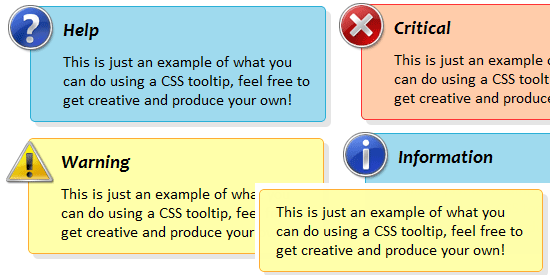
Each span in this example either has a class value of classic (denoting a general tooltip) or custom (with critical, help, info or warning to match denoting the color scheme to use).
Those using the custom style also have a couple of bonus features like the em element (denoting the overview text) and an image proceeding it (which acts as the icon for the tooltip, you can even use your own images).
Basic CSS
As you will now have the HTML on the page, it’s time we make these tooltips do their job (rather than spanning the page as normal linked text).
By adding in the code block below into your <head> element, you will give each link containing a tooltip a nice dotted underline (differentiating it from normal links which typically have a standard solid underline) and a help cursor (again for visual differentiation).
It’ll also remove the outline and set the color (so it feels less like a link and more like a general hover element).
The second bit of code simply hides the tooltips off-screen until their needed.
Easy as pie!
Basic CSS Styles for .tooltip Class
<style type="text/css">
.tooltip {
  border-bottom: 1px dotted #000000;
  color: #000000; outline: none;
  cursor: help; text-decoration: none;
  position: relative;
}
.tooltip span {
  margin-left: -999em;
  position: absolute;
}
</style>
Web Accessibility Considerations
On a note about maintaining accessibility: the outline is removed visually as the link is effectively redundant — it’s only included for the purpose of compatibility with old versions of IE.
Therefore, the outline itself isn’t needed to show that the tooltip is a clickable link unless you want it to be, in which case I advise removing that bit of code.
Also for the benefit of screen readers, the tooltip contents are being moved using a negative margin rather than using display: none or visibility: hidden as some screen readers may ignore the content – which would be bad news for screen reader users.

CSS for Displaying the Tooltips
At this stage, hovering over the links will do nothing.
Soon we will have a functioning tooltip that will look about the same through whichever browser you prefer to use, but for now, it’s time to place the next lines of CSS code in below what you already have.
By adding in the code block that follows, you should have a mechanism that works and displays the tooltips, though it will look very bland and will have little to no appeal (visually) apart from the fact that everything is contained within a box-like shape (which sets the standard for future code to customise further).
CSS for Showing the Tooltips
.tooltip:hover span {
  font-family: Calibri, Tahoma, Geneva, sans-serif;
  position: absolute;
  left: 1em;
  top: 2em;
  z-index: 99;
  margin-left: 0;
  width: 250px;
}
.tooltip:hover img {
  border: 0;
  margin: -10px 0 0 -55px;
  float: left;
  position: absolute;
}
.tooltip:hover em {
  font-family: Candara, Tahoma, Geneva, sans-serif;
  font-size: 1.2em;
  font-weight: bold;
  display: block;
  padding: 0.2em 0 0.6em 0;
}
.classic { padding: 0.8em 1em; }
.custom { padding: 0.5em 0.8em 0.8em 2em; }
* html a:hover { background: transparent; }
Star HTML Hack Necessity
You may have noticed that the very last line of code above uses the HTML star hack to apply a transparent background to IE6. Why was this included?
Well, while testing the tooltip, I encountered a strange quirk where the hover pseudo was not obeyed unless a background reference existed!
With the above code in place, everything works and is visible on the page. But it’s hard to read because there’s no color scheme that pulls the contrast out from the page and that’s something we need to fix right now to make them usable.
CSS for Giving the Tooltips Some Color
The below code will give each of the five styles of tooltip a color scheme which fits the icon (if one exists).
Upon giving your page a quick refresh and hovering over one of the links, you’ll see a pretty tooltip that looks and works equally across the various web browsers.
Though as you will soon discover, there’s a bit more to the story still to come!
CSS for Color Scheme
.classic { background: #FFFFAA; border: 1px solid #FFAD33; }
.critical { background: #FFCCAA; border: 1px solid #FF3334; }
.help { background: #9FDAEE; border: 1px solid #2BB0D7; }
.info { background: #9FDAEE; border: 1px solid #2BB0D7; }
.warning { background: #FFFFAA; border: 1px solid #FFAD33; }
With what you already have (as mentioned above), you’ll have something a bit basic, but that looks good and does its job in giving you a colourful tooltip that you can give your website design.
CSS3 for Progressive Enhancement of Sexiness
Before we leave the example, it’s worth bringing up CSS3 as we can (literally) take the edge off our tooltips, making it feel a bit less boxy using border-radius and give it a bit of extra depth using the box-shadow property.
Because neither of these elements is globally supported, it won’t work for every browser, but for those that it does work within, they’ll look a lot sleeker and sexier!

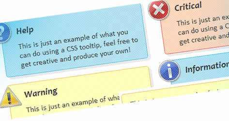
Much better! A little CSS3 gives the tooltip a visually unique appearance.
Add the below code into the .tooltip:hover span selector and refresh the page.
The visual effect of the border, shadow and opacity will help lift the tooltips from the page, and that may well make the information and contrast a bit easier to read.
You’ll see that not only are the official CSS3 properties provided but the Mozilla and WebKit proprietary extensions too.
It’s worth pointing out that this means your code may not validate (even though it’s an acceptable bending-of-the-rules scenario), but the experience benefit your visitors will get may well be worth the lack of validation.
Additional CSS for Modern Browsers
border-radius: 5px 5px;
-moz-border-radius: 5px;
-webkit-border-radius: 5px;
box-shadow: 5px 5px 5px rgba(0, 0, 0, 0.1);
-webkit-box-shadow: 5px 5px rgba(0, 0, 0, 0.1);
-moz-box-shadow: 5px 5px rgba(0, 0, 0, 0.1);

You might also like
Tags
accordion accordion menu animation navigation animation navigation menu carousel checkbox inputs css3 css3 menu css3 navigation date picker dialog drag drop drop down menu drop down navigation menu elastic navigation form form validation gallery glide navigation horizontal navigation menu hover effect image gallery image hover image lightbox image scroller image slideshow multi-level navigation menus rating select dependent select list slide image slider menu stylish form table tabs text effect text scroller tooltips tree menu vertical navigation menu

 Subscribe
 Follow Us


