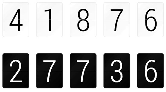
The split-flap displays with jQuery plugin

A jQuery number display
Flapper is a jQuery plugin that replicates the split-flap (or "Solari") displays that used to be common in train stations and airports, and your dad's alarm clock in the 70s.
To use, just attach Flapper to any input on your page. Whenever the input's change event is fired, Flapper will update the display.
For best results, you should load jquery.transform and jquery.numberformatter.
Options
Flapper accepts a hash of options:
var options = {
  width: 6,             // number of digits
  format: null,         // options for jquery.numberformatter, if loaded
  align: 'right',       // aligns values to the left or right of display
  padding: ' ',    // value to use for padding
  chars: null,          // array of characters that Flapper can display
  chars_preset: 'num',  // 'num', 'hexnum', 'alpha' or 'alphanum'
  timing: 250,          // the maximum timing for digit animation
  min_timing: 10,       // the minimum timing for digit animation
  threshhold: 100,      // the point at which Flapper will switch from
                        // simple to detailed animations
  transform: true       // Flapper automatically detects the jquery.transform
                        // plugin. Set this to false if you want to force
                        // transform to off
}
Generally, the only options you will care about are width and chars_preset. If you want to use a custom set of characters, specify chars instead of chars_preset. Flapper will use the first character in your array as the default glyph, so you'll usually want this to be either or 0.
Character presets are:
-
num: , 1-9, 0, dollar sign, decimal point, comma, colon -
hexnum: , 1-9, A-F, 0 -
alpha: , A-Z -
alphanum: All ofalphaandnum
The timing params timing, min_timing and threshhold control how fast the glyphs flash by as the display changes. You can set timing to a higher number if you'd like a slower, more obvious transform effect. You can set min_timing higher if you'd like the glyphs to flash by more slowly. You generally don't need to setthreshhold.
If you'd like to add commas to numbers, use money symbols, control the number of decimal points, and other fun things, you can load jquery.numberformatter and pass its options in format. You can also set paddingto 0 if you'd like to zero-pad numbers, and you're not using jquery.numberformatter.
Theming
You can control Flapper's built-in themes by adding classes to your inputs.
The classes XS, S, M, L, XL and XXL choose Flapper's six size presets. The default is M.
The classes light and dark choose Flapper's two color themes. The default is dark.
If you'd like to change Flapper's look, you can define your own theme in CSS. Just give your inputs a classmytheme and define two extra CSS selectors. Each Flapper digit consists of an outer div with four inner divs. The inner divs are positioned in two layers, a back layer with upper and lower halves, and a front layer with upper and lower halves.
Define .flapper.mytheme .digit to change the outer divs. In the default themes, this controls the border color and the stripe running horizontally through each digit (the background of this div shows through the space between the inner divs.)
Define .flapper.light .digit div to change the inner divs. In the default themes, this controls the background color of the digits.
The different size presets have font sizes and line heights that are specific to the font I've chosen as the default (Roboto Condensed.) If you're using your own font, you'll need to set your own metrics for the size(s). So, for example:
Define .flapper.mytheme to change the font that Flapper uses.
Define .flapper.mytheme.S to set font-size and line-height so that your digits are nicely centered in Flapper's display (in this case, for the small size.)
To change the border radius of Flapper's digits, change .flapper.mytheme.S .digit and.flapper.mytheme.S .digit div.
Flapper's size presets work like this:
.flapper.S sets the height of each digit.
.flapper.S .digit div sets the height (again!) and width of each digit.
.flapper.S .digit div.top clips the top half of each digit.
.flapper.S .digit div.bottom clips the bottom half of each digit, minus one pixel at the top (the horizontal stripe.)
Defining new sizes is a little tricky, but if you look a the src code you'll get the hang of it.
You might also like
Tags
accordion accordion menu animation navigation animation navigation menu carousel checkbox inputs css3 css3 menu css3 navigation date picker dialog drag drop drop down menu drop down navigation menu elastic navigation form form validation gallery glide navigation horizontal navigation menu hover effect image gallery image hover image lightbox image scroller image slideshow multi-level navigation menus rating select dependent select list slide image slider menu stylish form table tabs text effect text scroller tooltips tree menu vertical navigation menu

 Subscribe
 Follow Us
 11 years ago
 7904
7904 1981
1981


