Multiple Pure CSS3 Button Cross Browser

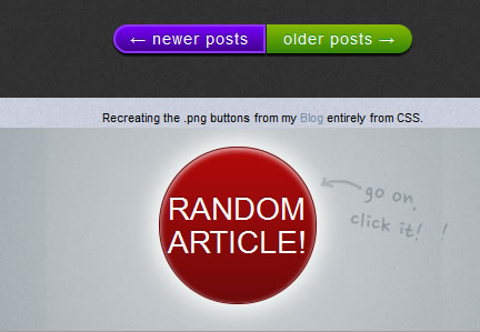
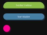
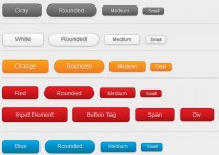
These buttons created entirely from CSS (no images used at all).
They have been tested using Safari 5, Firefox 5, Chrome 12 and Opera 11.5 on the Mac. Sorry if you're using any form of Internet Explorer, but as it doesn't have support for some of the CSS3 properties involved I haven't bothered even trying to see how they render.
The first creation is a transparent button using subtle gradients and box shadows. Basically it's a pure CSS3 emulation of some buttons that appear on the Apple site. The original buttons use .png graphics to create the effect.
a.transparent:link, a.transparent:visited {
        color: #fff;
        padding: 20px 40px;
        border-style: none;
        background-color: rgba(0,0,0,0);
        font: 14px/1 "Lucida Grande", Lucida, Verdana, sans-serif;
        text-shadow: #000 0 2px 2px;
        -moz-border-radius: 6px;
        -webkit-border-radius: 6px;
        border-radius: 6px;
        display: inline-block;
}

a.transparent:hover {
        -moz-box-shadow: rgba(255,255,255,.28) 0px 1px 1px, inset rgba(0,0,0,.5) 0 1px 4px;
        -webkit-box-shadow: rgba(255,255,255,.28) 0px 1px 1px, inset rgba(0,0,0,.5) 0 1px 4px;
        box-shadow: rgba(255,255,255,.28) 0px 1px 1px, inset rgba(0,0,0,.5) 0 1px 4px;
        background-image: -moz-linear-gradient(top, rgba(0,0,0,.1) 0%, rgba(0,0,0,0) 30%, rgba(0,0,0,.2) 100%);
        background-image: -webkit-gradient(linear, left top, left bottom, color-stop(0%,rgba(0,0,0,0.1)), color-stop(30%,rgba(0,0,0,0)), color-stop(100%,rgba(0,0,0,.2)));
        background-image: -webkit-linear-gradient(top, rgba(0,0,0,.1) 0%, rgba(0,0,0,0) 30%, rgba(0,0,0,.2) 100%);
        background-image: -o-linear-gradient(top, rgba(0,0,0,.1) 0%, rgba(0,0,0,0) 30%, rgba(0,0,0,.2) 100%);
        background-image: linear-gradient(top, rgba(0,0,0,.1) 0%, rgba(0,0,0,0) 30%, rgba(0,0,0,.2) 100%);
        -moz-background-clip: padding-box;
        -webkit-background-clip: padding-box;
        background-clip: padding-box;
}

a.transparent:active {
        background: rgba(0,0,0,.3);
        -moz-box-shadow: rgba(255,255,255,.28) 0px 1px 1px, inset rgba(0,0,0,.5) 0 1px 6px;
        -webkit-box-shadow: rgba(255,255,255,.28) 0px 1px 1px, inset rgba(0,0,0,.5) 0 1px 6px;
        box-shadow: rgba(255,255,255,.28) 0px 1px 1px, inset rgba(0,0,0,.5) 0 1px 6px;
}
Read more:http://www.midwinter-dg.com/permalink-cross-browser-pure-css3-button-demo-2011-07-21.html
You might also like
Tags
accordion accordion menu animation navigation animation navigation menu carousel checkbox inputs css3 css3 menu css3 navigation date picker dialog drag drop drop down menu drop down navigation menu elastic navigation form form validation gallery glide navigation horizontal navigation menu hover effect image gallery image hover image lightbox image scroller image slideshow multi-level navigation menus rating select dependent select list slide image slider menu stylish form table tabs text effect text scroller tooltips tree menu vertical navigation menu

 Subscribe
 Follow Us
 12 years ago
 14535
14535 3290
3290


