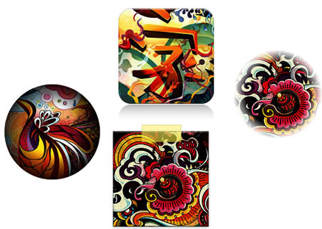
Multiple CSS3 Image Styles

When applying CSS3 inset box-shadow or border-radius directly to the image element, the browser doesn't render the CSS style perfectly. However, if the image is applied as background-image, you can add any style to it and have it rendered properly. Darcy Clarke and I put a quick tutorial together on how to use jQuery to make perfect rounded corner images dynamically. Today I'm going to revisit the topic and show you how much more you can do with the background-image CSS trick. I will show you how to use box-shadow, border-radius and transition to create various image styles.
Problem
Take a look at the demo and note that there is border-radius and inset box-shadow applied in the first row of images. Firefox does render border-radius on image element, but doesn't render the inset box-shadow. Chrome or Safari doesn't render the border-radius and inset box-shadow at all.
Workaround
To get the border-radius and inset box-shadow working, the workaround is to apply the actual image as background-image.
Read more:http://webdesignerwall.com/tutorials/css3-image-styles
You might also like
Tags
accordion accordion menu animation navigation animation navigation menu carousel checkbox inputs css3 css3 menu css3 navigation date picker dialog drag drop drop down menu drop down navigation menu elastic navigation form form validation gallery glide navigation horizontal navigation menu hover effect image gallery image hover image lightbox image scroller image slideshow multi-level navigation menus rating select dependent select list slide image slider menu stylish form table tabs text effect text scroller tooltips tree menu vertical navigation menu

 Subscribe
 Follow Us
 13 years ago
 16158
16158 3307
3307


