pure CSS Stationary Logo on Page Scroll
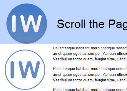
The Econsultancy marketing blog has an interesting little effect using CSS that causes their logo to change when the page is scrolled. Visit their page and scroll down. You’ll notice the logo changes from a solid version to an outline version.
First, in your graphics program you need to create two different logos, the solid version and the outline version.
The outline logo will be placed as a fixed background on our outermost container on the page, as shown in the CSS below:
#container {
 background: transparent url(images/demologo-wired.jpg) fixed no-repeat 30px 30px;
}
Notice the “fixed” background-attachment value, listed in shorthand immediately before the background-repeat value. I’ve also offset the background by 30px from the top and left, so it will line up nicely with the solid logo that overlays it.
Next, inside of our header div, we’ll place an anchor set to display: block with the solid logo set as the background image on the header that wraps the anchor:
#header {
 background: #bbd5fd url(demologo.jpg) fixed no-repeat 30px 30px;
 overflow: hidden;
 padding: 30px 0 30px 30px;
 height: 138px;
}

a#logo {
 display: block;
 width: 138px;
 height: 138px;
 float: left;
}
Again, the background is fixed, and offset by 30 pixels both on top and on the left, to match what we did with the outline logo. If we don’t “fix” the background image, then the logo will just scroll up as any item would, and the effect would be lost — even though you’d still see the same resulting outline version of the logo.
That’s pretty much all the CSS we need to create the effect. The only problem now is that when the page scrolls down, the logo is no longer clickable. We can solve this by placing a fixed positioned anchor over top of the logo inside the container div. This will add some extra markup to your code, but it’s an acceptable workaround.
Again, I emphasize that this is not an advanced CSS technique, but does open up some possibilities for creating a fixed watermark or other graphic that changes on page scroll. It should also be noted that this technique would not work on a layout that doesn’t have whitespace in the left sidebar, or else the outline logo would have to be changed to something that could be overlaid with other content without harming the user experience.
One drawback to this method is that it doesn’t work in IE6, but that can be resolved easily by correcting the background position with an IE6-only hack. All other styles and markup in the demo page are simply for layout purposes; the code that makes the effect work is shown above.
You might also like
Tags
accordion accordion menu animation navigation animation navigation menu carousel checkbox inputs css3 css3 menu css3 navigation date picker dialog drag drop drop down menu drop down navigation menu elastic navigation form form validation gallery glide navigation horizontal navigation menu hover effect image gallery image hover image lightbox image scroller image slideshow multi-level navigation menus rating select dependent select list slide image slider menu stylish form table tabs text effect text scroller tooltips tree menu vertical navigation menu

 Subscribe
 Follow Us
 14 years ago
 13847
13847 2214
2214
