Scalable Menu with jQuery CSS3

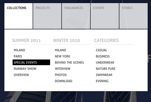
we are going to create a simple menu that will stand out once we hover over it by covering everything except the menu with a dark overlay. The menu will stay white and a submenu area will expand. We will create this effect using jQuery.
The Markup
The HTML structure will consist of a main wrapper div for the menu which will contain the overlay and the unordered list for the menu. The menu itself will have a link and a div element as submenu in its list elements. Each of the submenu elements will contain lists for the columns of the submenu where each one will have a heading list element:
<div class="oe_wrapper">
 <div id="oe_overlay" class="oe_overlay"></div>
 <ul id="oe_menu" class="oe_menu">
  <li>
   <a href="">Collections</a>
   <div>
    <ul>
     <li class="oe_heading">
      Summer 2011
     </li>
     <li><a href="#">Milano</a></li>
     ...
    </ul>
    <ul>
     ...
    </ul>
    <ul>
     ...
    </ul>
   </div>
  </li>
  <li>
   <a href="">Projects</a>
   <div style="left:-111px;">
    ...
   </div>
  </li>
  <li>
   <a href="">Fragrances</a>
   <div style="left:-223px;">
    <ul class="oe_full">
     <li class="oe_heading">
      Fashion Fragrances
     </li>
     <li><a href="#">Deálure</a></li>
     <li><a href="#">Violet Woman</a></li>
     <li><a href="#">Deep Blue for Men</a></li>
     <li><a href="#">New York, New York</a></li>
     <li><a href="#">Illusion</a></li>
    </ul>
   </div>
  </li>
  <li><a href="">Events</a>
   <div style="left:-335px;">
    ...
   </div>
  </li>
  <li><a href="">Stores</a>
   <div style="left:-447px;">
    ...
   </div>
  </li>
 </ul>
</div>
The submenu divs will each have an inline style for the left position. As we will see, when we look at the style, we need to set this value since we want the submenu to be of absolute position, but within a relatively positioned container. So, in order to position all of the submenu divs at the beginning of the whole menu, we need to “pull” each div more to the left, hence we will have a negative left value for each div (decrementing 112px).
Let’s look at the style.
The CSS
Make sure, that you reset the styles first (we don’t want any browser-defined padding or margin for the list). We will start by the overlay for the body, which is a simple div with an initial opacity of 0:
.oe_overlay{
 background:#000;
 opacity:0;
 position:fixed;
 top:0px;
 left:0px;
 width:100%;
 height:100%;
}
The position will be set to fixed, since we want it to always stay on the top left corner filling the whole screen.
The main menu list will have the following style:
ul.oe_menu{
 list-style:none;
 position:relative;
 margin:30px 0px 0px 40px;
 width:560px;
 float:left;
 clear:both;
}
You might want to adapt its floatiness once you are planning to integrate this somewhere on your site. What is important, is the positioning of the list items:
ul.oe_menu > li{
 width:112px;
 height:101px;
 padding-bottom:2px;
 float:left;
 position:relative;
}
They will be positioned relatively so that we can have the absolutely positioned submenu elements.
The anchor of the top layer menu will have the following style, forming the box:
ul.oe_menu > li > a{
 display:block;
 background-color:#101010;
 color:#aaa;
 text-decoration:none;
 font-weight:bold;
 font-size:12px;
 width:90px;
 height:80px;
 padding:10px;
 margin:1px;
 text-shadow:0px 0px 1px #000;
 opacity:0.8;
}
ul.oe_menu > li > a:hover,
ul.oe_menu > li.selected > a{
 background:#fff;
 color:#101010;
 opacity:1.0;
}
In our JavaScript we will add the class “hovered” to the main ul, once we move with the mouse over the menu, so that we can change all the anchors to white:
.oe_wrapper ul.hovered > li > a{
 background:#fff;
 text-shadow:0px 0px 1px #FFF;
}
The submenu element will not be visible at the beginning, but only slide in when we hover over a top layer list element:
ul.oe_menu div{
 position:absolute;
 top:103px;
 left:1px;
 background:#fff;
 width:498px;
 height:180px;
 padding:30px;
 display:none;
}
The style for the links inside of the submenu lists:
ul.oe_menu div ul li a{
 text-decoration:none;
 color:#222;
 padding:2px 2px 2px 4px;
 margin:2px;
 display:block;
 font-size:12px;
}
ul.oe_menu div ul li a:hover{
 background:#000;
 color:#fff;
}
One of our submenu lists will be alone, so we want it to take all the space:
ul.oe_menu div ul.oe_full{
 width:100%;
}
And if it’s not alone, we want it to have a width of 150px, so that we can have 3 floating next to each other:
ul.oe_menu li ul{
 list-style:none;
 float:left;
 width: 150px;
 margin-right:10px;
}
And finally, we want the heading of the submenu list to stand out:
li.oe_heading{
 color:#aaa;
 font-size:16px;
 margin-bottom:10px;
 padding-bottom:6px;
 border-bottom:1px solid #ddd;
}
And that’s all the style! Let’s continue with the effects using jQuery.
The JavaScript
The main idea is to make an overlay appear that darkens everything on the page except the menu. We guarantee that the overlay stays under the menu because we placed it before the menu in the HTML structure. And the overlay stays on top of everything else because it all comes before in the HTML stucture. So, the z-indexes are in the wanted order. Consider that if you integrate this menu somewhere.
Let’s first cache some elements:
var $oe_menu  = $('#oe_menu');
var $oe_menu_items = $oe_menu.children('li');
var $oe_overlay  = $('#oe_overlay');
When we hover any of the menu items, we will add the classes “slided” and “selected” to the item. The corresponding submenu div will get slided out and all the other ones will get hidden. We also give a very high z-index to the current submenu. When we move the mouse out, we will remove the class “selected”:
$oe_menu_items.bind('mouseenter',function(){
 var $this = $(this);
 $this.addClass('slided selected');
 $this.children('div').css('z-index','9999').stop(true,true).slideDown(200,function(){
  $oe_menu_items.not('.slided').children('div').hide();
  $this.removeClass('slided');
 });
}).bind('mouseleave',function(){
 var $this = $(this);
 $this.removeClass('selected').children('div').css('z-index','1');
});
The class “selected” is needed for the style, while the class “slided” is a helper class that let’s us identify which item is currently “in use”.
Now, we will take care of the overlay by defining what happens when we enter the whole menu wrapper. We will fade the overlay to an opacity of 0.6 and add the class “hovered” to the wrapper, so that the anchors stay white:
$oe_menu.bind('mouseenter',function(){
 var $this = $(this);
 $oe_overlay.stop(true,true).fadeTo(200, 0.6);
 $this.addClass('hovered');
}).bind('mouseleave',function(){
 var $this = $(this);
 $this.removeClass('hovered');
 $oe_overlay.stop(true,true).fadeTo(200, 0);
 $oe_menu_items.children('div').hide();
})
And that’s it! We hope you had fun with this tutorial and found it useful!
You might also like
Tags
accordion accordion menu animation navigation animation navigation menu carousel checkbox inputs css3 css3 menu css3 navigation date picker dialog drag drop drop down menu drop down navigation menu elastic navigation form form validation gallery glide navigation horizontal navigation menu hover effect image gallery image hover image lightbox image scroller image slideshow multi-level navigation menus rating select dependent select list slide image slider menu stylish form table tabs text effect text scroller tooltips tree menu vertical navigation menu

 Subscribe
 Follow Us
 14 years ago
 55614
55614 10045
10045


