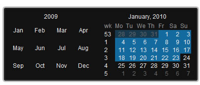
Date Picker - jQuery plugin

Date Picker component with a lot of options and easy to fit in your web application.
Features
- Flat mode - as element in page
- Multiple calendars in the component
- Allows single, multiple or range selection
- Mark dates as special, weekends, special days
- Easy to customize the look by changing CSS
- Localiation for months' and days' names
- Custom day to start the week
- Fits into the viewport
Attach the Javascript and CSS files to your document. Edit CSS file and fix the paths to images and change colors to fit your site theme.
<link rel="stylesheet" media="screen" type="text/css" href="css/datepicker.css" />
<script type="text/javascript" src="js/datepicker.js"></script>
Invocation code
All you have to do is to select the elements in a jQuery way and call the plugin.
$('input').DatePicker(options);
Options
A hash of parameters. All parameters are optional.
| eventName | string | The desired event to trigger the date picker. Default: 'click' |
| date | String, Date or array | The selected date(s) as string (will be converted to Date object based on teh format suplied) and Date object for single selection, as Array of strings or Date objects |
| flat | boolean | Whatever if the date picker is appended to the element or triggered by an event. Default false |
| start | integer | The day week start. Default 1 (monday) |
| prev | string | HTML inserted to previous links. Default '◀' (UNICODE black left arrow) |
| next | string | HTML inserted to next links. Default '▶' (UNICODE black right arrow) |
| mode | string ['single'|'multiple'|'range'] | Date selection mode. Default 'single' |
| view | string ['days'|'months'|'years'] | Start view mode. Default 'days' |
| calendars | integer | Number of calendars to render inside the date picker. Default 1 |
| format | string | Date format. Default 'Y-m-d' |
| position | string ['top'|'left'|'right'|'bottom'] | Date picker's position relative to the trigegr element (non flat mode only). Default 'bottom' |
| locale | hash | Location: provide a hash with keys 'days', 'daysShort', 'daysMin', 'months', 'monthsShort', 'week'. Default english |
| onShow | function | Callback function triggered when the date picker is shown |
| onBeforeShow | function | Callback function triggered before the date picker is shown |
| onHide | function | Callback function triggered when the date picker is hidden |
| onChange | function | Callback function triggered when the date is changed |
| onRender | function | Callback function triggered when the date is rendered inside a calendar. It should return and hash with keys: 'selected' to select the date, 'disabled' to disable the date, 'className' for additional CSS class |
Set date
If you want to set a diferent date selection.
$('input').DatePickerSetDate(date, shiftTo);
The 'date' argument is the same format as the option 'date' and the 'shiftTo' argument (boolean) moves the curent month view to the date selection provided.
Get date
Get date selection.
$('input').DatePickerGetDate(formated);
Set 'formated' to true if you whant to get teh selection formated.
Show and hide date picker
Show or hide a date picker.
$('input').DatePickerShow();

$('input').DatePickerHide();
Clear multiple selection
Clear selection in multiple and range mode
$('#datepicker').DatePickerClear();
You might also like
Tags
accordion accordion menu animation navigation animation navigation menu carousel checkbox inputs css3 css3 menu css3 navigation date picker dialog drag drop drop down menu drop down navigation menu elastic navigation form form validation gallery glide navigation horizontal navigation menu hover effect image gallery image hover image lightbox image scroller image slideshow multi-level navigation menus rating select dependent select list slide image slider menu stylish form table tabs text effect text scroller tooltips tree menu vertical navigation menu

 Subscribe
 Follow Us
 14 years ago
 16780
16780 3050
3050
