Tabbed Content with Navigation using jQuery UI
 14 years ago
  23631
23631  3569
3569
 n/a
n/a

This is a manual navigation using Tab function of jQuery UI library.
We will use jQuery UI Tab function to get our navigation for content slide working yeah there are many ways to do this but i just wanted to show you that we can done content slide with jquery UI too.
Step 1 : XHTML
So here first of all we need to wirte XHTML codes which holds all our elements. Here we need one main div (#main) which holds all our elements together in this, then navigation for content to slide(#nav). And in last we need 3 content holders with different ids (For example #1, #2, #3). Check out below codes for more clarification.
<div id="main">
<ul class="nav">
     <li><a href="#1"><p>1</p></a></li>
     <li><a href="#2"><p>2</p></a></li>
     <li><a href="#3"><p>3</p></a></li>
</ul>

<div id="1">
        <!--Content Here -->
</div>
<div id="2">
        <!--Content Here -->
</div>
<div id="3">
        <!--Content Here -->
</div>
</div>
Step 2 : Styling With CSS
Now we have our raw XHTML codes with us.. so its the time to style all our html elements. First we will set fixed height and width, background image and don’t forget to apply position relative.
/* Which hides the inactive content slide */
.ui-tabs-hide {
  display: none;
}
a {
 text-decoration:none;
}
#main {
 width:721px;
 height:354px;
 background-image:url(images/bg.png);
 background-repeat:no-repeat;
 position:absolute;
}
#tabcontent {
 position: absolute;
 bottom: 30px; left:30px;
 z-index: 100;
 text-align: center;
 line-height: 30px;
 border: 1px solid #000;
 background-color: #fff;
 border: 1px solid #000;
}
ul.nav {
 width:93px;
 height:32px;
 position: absolute;
 bottom: 30px; left:30px;
}
ul.nav li {
 width:31px;
 height:32px;
 background-image:url(images/nav.png);
 background-repeat:no-repeat;
 float:left;
}
.nav li {
 text-decoration:none;
 list-style-type:none;
}
.nav li p {
 padding-left:10px;
 padding-top:5px;
 text-decoration:none;
 color:#FFF;
 font-size:16px;
}
Note : Style Individual Content(#1,#2,#3) according to your requirement.
Step 3 : Jquery Time
We have our jQuery and jQuery UI library with us so will link both the files in head section of xhtml document. Also link one blank code.js file to xhtml document which holds all our codes in it.
<script type="text/javascript" src="jquery-1.2.6.min.js"></script>
<script type="text/javascript" src="jquery-ui-personalized-1.5.2.packed.js"></script>
<script type="text/javascript" src="code.js"></script>
Now here will use tab property of jQuery UI to get working our content slider. Will set height of active content to fadeOut when another navigation tab clicked and as soon as the inactive link clicked active content would be fadeout and opacity of clicked navigation links visibility toggles to get the desired effect. Check out below codes.
$(document).ready(function() {
 $('#main > ul').tabs({ fx: { height: 'fadeOut', opacity: 'toggle' } });
});
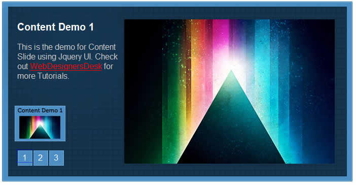
So now everything has been done just last thing is remaining. Here we want when mouse hover on Navigation then one Small image will pop up just to show the overview of the content which has to be displayed when that hovered link will clicked. Check out the screenshot just to understand what i am trying to say.
So to do this we will right jQuery codes to get it working. Here we will use variable offsetX and offsetY to to decide the position of popup image, then will select the particular navigation link and append the small popup image to it. Before writing jquery code add basic css property to style.css
#popimg {
 width:100px;
 height:70px;
        position: absolute;
}
Check out the below codes to get it working. Read comments for better understanding.
$(function() {
//Set the position of small popup image
 var offsetX = -20;
 var offsetY = -100;
//Select the element of navigation
 $('ul.nav li:first').hover(function(e) {
//Insert image
  $('<img id="popimg" src="images/11.png" alt="big image" />')
//Set css property to #popimage using .css
  .css('top', e.pageY + offsetY)
  .css('left', e.pageX + offsetX)
  .appendTo('body');
 }, function() {
//Hide Popup when mouseout
  $('#popimg').remove();
 });

 $('ul.nav li:first').mousemove(function(e) {
  $("#popimg").css('top', e.pageY + offsetY).css('left', e.pageX + offsetX);
 });

});
Note : Repeat above code for each navigation link popup.
You might also like
Tags
accordion accordion menu animation navigation animation navigation menu carousel checkbox inputs css3 css3 menu css3 navigation date picker dialog drag drop drop down menu drop down navigation menu elastic navigation form form validation gallery glide navigation horizontal navigation menu hover effect image gallery image hover image lightbox image scroller image slideshow multi-level navigation menus rating select dependent select list slide image slider menu stylish form table tabs text effect text scroller tooltips tree menu vertical navigation menu

 Subscribe
 Follow Us
