Sliding Jquery Menu
 14 years ago
  9294
9294  2012
2012
 n/a
n/a

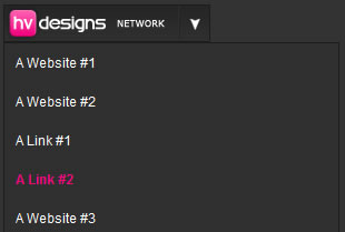
how to create a sliding menu button using jquery.When the button is clicked it rolls out a box full of links, when the button is clicked again it rolls back in. This can be done using jquery。
Now for the exciting bit open up notepad and save a blank notepad document as styles.css, save the file into a folder called sliding menu on your desktop. Once saved close notepad, open up your folder “sliding menu” create two new folders one called js and another called images. Goto the main jquery webpage and download the jquery libary “jquery-1.3.1.min.js” rename the file to just “jquery” and stick it into the folder js. Open up dreamweaver and create a new HTML file save the file straight away inside your sliding menu folder. (filename for the HTML file doesnt matter call it what you like, sliding_menu.html might be a good idea.) Now your in dreamweaver click the code view tab.
The most import thing we need to do first is reference our javascript and css files we do this by typing this chunk of code within the “HEAD TAGS”.
<link href="style.css" rel="stylesheet" type="text/css" />
 <script type="text/javascript" src="js/jquery.js"></script>
 <script type="text/javascript" src="js/slider.js"></script>
You will notice there are 3 files we have referenced styles.css, jquery.js and a third slider.js (but i havent got a slider.js file i hear you cry.) We need to create that now, open up notepad and save a blank notepad document as slider.js, save it inside your js folder. Open up your slider.js file inside dreamweaver and type out the code below.
$(document).ready(function () {
     $('img.menu_class').click(function () {
     $('ul.the_menu').slideToggle('medium');
     });
 });
Let me explain the code above the 1st line means when the document is loaded run the function in our case the sliding menu. The next line means once an image with a class of menu_class is clicked the menu will slide which brings me down to line 3. The menu will toggle down at a medium speed. You can change the speed if you wish from slow, medium or fast. The second and third line are important as they hold key elements refering to our CSS file which is img.menu_class and ul.the_menu. We havent wrote these yet but will do when we begin to write out our menu. Head over to your HTML in the code view so we can begin to write out our menu.
<img src="images/button.png" width="184" height="32" class="menu_class" />
 <ul class="the_menu">
 <li><a href="#">A Website #1</a></li>
 <li><a href="#">A Website #2</a></li>
 <li><a href="#">A Link #1</a></li>
 <li><a href="#">A Link #2</a></li>
 <li><a href="#">A Website #3</a></li>
 <li><a href="#">A Website #4</a></li>
 <li><a href="#">A Link #3</a></li>
 <li><a href="#">A Link #4</a></li>
 </ul>
The first bit of code you see is a simple image which is our button, we specify the width and height of our button we also give it a class. The class will be the images unique anchor point for the js file which we have already wrote. The class also lets us apply any styles via css using the class .menu_class. After that we have a simple unordered list.
Open up your CSS file in dreamweaver. Lets set a few style for the main part of our document.
body {
     font-family:Arial, Helvetica, sans-serif;
     font-size:12px;
     background-color: #333333;
 }
Just some simple text and background styling is needed, set your font family and desired font size, ive also changed the background from white to a darkish grey color. The next bit of styling were going to add is for the ordered and unordered lists, were also going to apply a border to our button image, you may do your border in photoshop on the actual image but i find it best to add it using CSS as changing abit of code is easier then opening up photoshop to change it.
ul, li {
     margin:0;
     padding:0;
     list-style:none;
 }

 .menu_class {
     border:1px solid #1c1c1c;
 }
The next bit of css styling refers to the menu that drops down once the button is clicked.
.the_menu {
     display:none;
     width:300px;
     border: 1px solid #1c1c1c;
 }
In these styles you can change the width of the open menu, mine has a width of 300px but this can be what ever you like. Ive also given it a 1px border the same as our button. The next bit of styling refers to the background color of our rolled out navigation and also the text colors, sizes and hovers.
.the_menu li {
     background-color: #302f2f;
 }

 .the_menu li a {
     color:#FFFFFF;
     text-decoration:none;
     padding:10px;
     display:block;
 }

 .the_menu li a:hover {
     padding:10px;
     font-weight:bold;
     color: #F00880;
 }
The_menu li is the color of the background when the navigation is rolled out, the text in the navigation links wont have any line underneath them as we have used text-decoration:none, we have also spaced out our links by adding 10px paddinig all the way around our links we also want to display the links in a block. The hover styles are pretty simple, padding the same as the last style, font weight bold = bold text and the color changed to a pinkish color. Thats it for the styles you menu should be ready to test
You might also like
Tags
accordion accordion menu animation navigation animation navigation menu carousel checkbox inputs css3 css3 menu css3 navigation date picker dialog drag drop drop down menu drop down navigation menu elastic navigation form form validation gallery glide navigation horizontal navigation menu hover effect image gallery image hover image lightbox image scroller image slideshow multi-level navigation menus rating select dependent select list slide image slider menu stylish form table tabs text effect text scroller tooltips tree menu vertical navigation menu

 Subscribe
 Follow Us


